Plotting in Python
Plotting in Python refers to the process of creating visual representations of data using Python's libraries such as Matplotlib and Seaborn. It involves generating various types of plots, including line plots, scatter plots, bar plots, and more, to effectively communicate and analyze data. Python's plotting capabilities make it a popular choice for data visualization and analysis tasks.
4 Key excerpts on "Plotting in Python"
- Yasha Hasija, Rajkumar Chakraborty(Authors)
- 2021(Publication Date)
- CRC Press(Publisher)
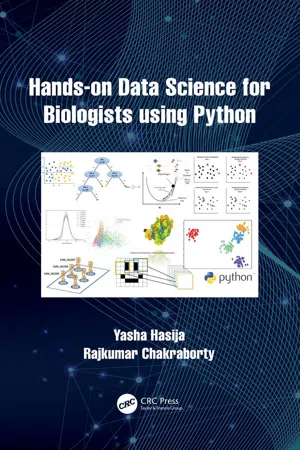
...5 Python for Data Visualization Introduction “Data science” is a buzzword in today’s age of high throughput biology. When we say data science, we handle enormous amounts of data and arrive at insights into biological findings. Up until this point, we have learned how to handle large datasets and how to do an efficient calculation on these. Data visualization is another way to derive insights from data through visualizations by using elements like graphs (e.g. scatterplots, histograms, etc), maps, or charts that allow for the understanding of complexities within the data by identifying local trends or patterns, forming clusters, locating outliers, and more. Data visualization is the preliminary step after loading the data to view the distribution of values. Cleaning the data, checking the quality of data, doing exploratory data analysis, and presenting data and results are some of the necessary tasks that a data scientist needs to do before applying any Machine Learning or statistical model on the data. In this chapter, we will describe one of the primary data visualization libraries of Python called “Matplotlib” and draw a few basic graphics. Next, we will browse through a library called “Seaborn” which provides a high-level interface for drawing beautiful and informative statistical graphs. Lastly, we will learn about interactive and geographical data plotting. Matplotlib Matplotlib is the most popular plotting library in the Python community. It gives us control over almost every aspect of a figure or plot. Its design is familiar with Matlab, which is another programming language with its own graphical plotting capabilities. The primary goal of this section is to go through the basics of plotting using Matplotlib. If we have Anaconda distribution, then we have acquired Matplotlib installed by default, or else we have to install it using a “pip” installer. Matplotlib is imported as “plt”, similar to “np” for NumPy and “pd” for pandas...
 eBook - ePub
Data Analysis for Corporate Finance
Building financial models using SQL, Python, and MS PowerBI
- Mariano F. Scandizzo CFA CQF(Author)
- 2021(Publication Date)
- Fulton Books, Inc.(Publisher)
...Chapter 8 Matplotlib Introduction Matplotlib is undeniably the fundamental stone when it comes to charts and visualizations in Python. Matplotlib is a plotting library for the Python programming language and its numerical mathematics extension NumPy and Scipy. It provides an object-oriented API for embedding plots into applications using general-purpose GUI toolkits such as Tkinter, wxPython, Qt, or GTK+. The structure of this chapter will resemble more of a cheat sheet than a typical book chapter. Why? You will notice as you get familiar with Python data science that while the analytical portion could be reduced to a reasonable number of lines of code, a professional, well-detailed visualization (chart), on the other hand, can take a considerable amount of time to produce. This could certainly make the visualization portion of your analysis quite burdensome, tedious, and time consuming. Thus, I have a two-fold recommendation: If you will use Matplotlib, Plotly, Seaborn, bokeh, or similar library, work on a series of standard templates ready to deploy. Follow your company brand guidelines, take the time to do a very granular customization and polishing of your charts, and then, never, never touch them again. Do not get me wrong, you might need to add new versions here and there. Nevertheless, the point is, if you do not standardize the visualizations to minimize the time it takes to make changes every time you need to do a new analysis, you will notice that 80 percent of the total time you spent building a report will go toward creating charts. My personal preference is the following: get your data from multiple sources and tables, preprocess and analyze your data with Python, SQL, MS Excel, or a combination of all of them, depending on the case, get output numbers, and then leverage platforms such as MS PowerBI or Google Data Studio...
 eBook - ePub
R and Python for Oceanographers
A Practical Guide with Applications
- Hakan Alyuruk(Author)
- 2019(Publication Date)
- Elsevier(Publisher)
...Chapter 3 Plotting Abstract In R and Python, it is possible to produce many types of plots like histogram, bar, line, scatter, box, and contour plots. In this chapter, basic introductions to plotting in R and Python are given with examples. Keywords R; Python; Plotting; Plotting commands; Scientific plots 3.1 Plots in R In R, there are many possibilities with a wide number of built-in plotting functions to visualize your data. Plotting functions are classified as high-level and low-level functions. High-level functions are used to create new plots with automatically generated axes, titles, labels, and other plot properties. Low-level functions provide the ability to add more information to an existing plot, such as texts, lines, and points. Besides these functions, it is also possible to customize plots by changing graphical parameters. In general, data and graphical parameters are introduced as arguments in these functions to generate a plot. 3.1.1 High-level plotting functions In R, high-level plotting functions are plot(), qqplot(), qqnorm(), qqline(), hist(), dotchart(), image(), contour() and persp()...
 eBook - ePub
- Phillip D. Brooker(Author)
- 2019(Publication Date)
- SAGE Publications Ltd(Publisher)
...14 Visualising Data Show Me the Code! Pandas 256 Pandas series 256 Pandas dataframes 262 Show Me the Code! Matplotlib 270 Line graphs in Matplotlib 271 Bar charts in Matplotlib 273 Taking visualisations further – formatting 275 Taking visualisations further – saving 279 Data visualisation as a sociological activity 282 Some Possible Applications/Projects 283 Chapter objectives Learn how to use the pandas library to create series and dataframes through which you can make visual sense of data. Learn how to use the matplotlib library to visualise data in graphic format. Learn how Python can help us reflect, social-scientifically, on the practice of producing (visual) representations of data. So far, we’ve covered lots of Python code for grabbing and working with data in various ways – visualising such data is the next logical step in many regards. As the datasets we’re dealing with get larger in volume and richer in content, it becomes imperative to have some way to see what is going on in them if we are to articulate any kind of story from them. This becomes all the more important if we’re dealing with datasets that originate outside the social sciences (such as open government datasets, data drawn from social media platforms, etc.), since such datasets are not primarily intended to have a social science relevance, and therefore they may contain lots of information that obscures the stuff that is relevant to our concerns. In these cases, we can make different kinds of (visual) representations of data in order to help us cut through the noise and draw out social science accounts of the data more clearly and explicitly. To that end, this chapter will walk you through using two Python libraries, pandas and matplotlib, which can help produce exactly these kinds of (visual) representations of data...