Scatter Chart Python
A scatter chart in Python is a type of data visualization that displays individual data points on a two-dimensional graph. It is commonly used to show the relationship between two variables and identify patterns or trends in the data. In Python, scatter charts can be created using libraries such as Matplotlib or Seaborn, providing flexibility in customization and presentation.
4 Key excerpts on "Scatter Chart Python"
- Yasha Hasija, Rajkumar Chakraborty(Authors)
- 2021(Publication Date)
- CRC Press(Publisher)
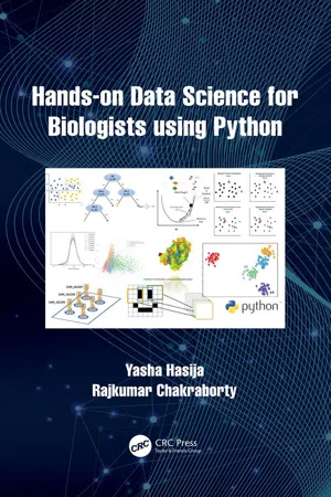
...5 Python for Data Visualization Introduction “Data science” is a buzzword in today’s age of high throughput biology. When we say data science, we handle enormous amounts of data and arrive at insights into biological findings. Up until this point, we have learned how to handle large datasets and how to do an efficient calculation on these. Data visualization is another way to derive insights from data through visualizations by using elements like graphs (e.g. scatterplots, histograms, etc), maps, or charts that allow for the understanding of complexities within the data by identifying local trends or patterns, forming clusters, locating outliers, and more. Data visualization is the preliminary step after loading the data to view the distribution of values. Cleaning the data, checking the quality of data, doing exploratory data analysis, and presenting data and results are some of the necessary tasks that a data scientist needs to do before applying any Machine Learning or statistical model on the data. In this chapter, we will describe one of the primary data visualization libraries of Python called “Matplotlib” and draw a few basic graphics. Next, we will browse through a library called “Seaborn” which provides a high-level interface for drawing beautiful and informative statistical graphs. Lastly, we will learn about interactive and geographical data plotting. Matplotlib Matplotlib is the most popular plotting library in the Python community. It gives us control over almost every aspect of a figure or plot. Its design is familiar with Matlab, which is another programming language with its own graphical plotting capabilities. The primary goal of this section is to go through the basics of plotting using Matplotlib. If we have Anaconda distribution, then we have acquired Matplotlib installed by default, or else we have to install it using a “pip” installer. Matplotlib is imported as “plt”, similar to “np” for NumPy and “pd” for pandas...

- Bruce B. Frey(Author)
- 2018(Publication Date)
- SAGE Publications, Inc(Publisher)
...Brandon LeBeau Brandon LeBeau LeBeau, Brandon Scatterplots Scatterplots 1457 1461 Scatterplots Scatterplots are graphical displays that explore relationships between variables by plotting points at the coordinates of the variables being plotted. The simplest scatterplots are used to explore bivariate relationships between two variables. These variables are traditionally both quantitative; however, this does not need to be the case. Scatterplots plot the (x, y) coordinates of the two variables of interest and every point in the plot represents an individual data point. This entry explores in more detail the creation, uses, and limitations of scatterplots in educational research. Basic Scatterplot Creation In the simplest most common case, scatterplots are made by plotting the (x, y) coordinates of two variables in a data set. The example in Figure 1 uses school district data to show the relationship between the percent proficient in Grade 3 on a standardized achievement test and the percentage of students eligible for free or reduced price lunch (FRL). Each point in the figure is plotted at its (x, y) coordinates and represents a unique school district. For example, the point farthest to the right has (x, y) coordinates of approximately (100, 60) indicating that this school district has 100% of their students eligible for FRL and that approximately 60% of their students were proficient in grade three. Similar statements could be made from every point shown in the scatterplot in Figure 1. Traditional scatterplots are two dimensional; however, three-dimensional scatterplots can be made that plot points using the (x, y, z) coordinates of three variables. Three-dimensional scatterplots can become difficult to view, particularly in print form; therefore, it is much more common to create two-dimensional scatterplots. An alternative to include additional variables, especially qualitative variables, is to change the shape of the points or facet the plot into separate panels...
 eBook - ePub
Statistics for Psychologists
An Intermediate Course
- Brian S. Everitt(Author)
- 2001(Publication Date)
- Psychology Press(Publisher)
...Here a pattern does emerge, and a dependence of failure on temperature is revealed. To end the chapter on a less sombre note, and to show that misperception and miscommunication are certainly not confined to statistical graphics, see Figure 2.35. Fig. 2.35. Misperception and miscommunication are sometimes a way of life. (© The New Yorker collection 1961 Charles E. Martin from cartoonbank.com. All Rights Reserved.) 2.10. Summary Graphical displays are an essential feature in the analysis of empirical data. In some case a graphical “analysis” may be all that is required (or merited). Stem-and-leaf plots are usually more informative than histograms for displaying frequency distributions. Box plots display much more information about data sets and are very useful for comparing groups. In addition, they are useful for identifying possible outliers. Scatterplots are the fundamental tool for examining relationships between variables. They can be enhanced in a variety of ways to provide extra information. Scatterplot matrices are a useful first step in examining data with more than two variables. Beware graphical deception! Software Hints SPSS Pie charts, bar charts, and the like are easily constructed from the Graph menu. You enter the data you want to use in the chart, select the type of chart you want from the Graph menu, define how the chart should appear, and then click OK. For example, the first steps in producing a simple bar chart would be as follows. Enter the data you want to use to create the chart. Click Graph, then click Bar...
 eBook - ePub
Data Analysis for Corporate Finance
Building financial models using SQL, Python, and MS PowerBI
- Mariano F. Scandizzo CFA CQF(Author)
- 2021(Publication Date)
- Fulton Books, Inc.(Publisher)
...Chapter 8 Matplotlib Introduction Matplotlib is undeniably the fundamental stone when it comes to charts and visualizations in Python. Matplotlib is a plotting library for the Python programming language and its numerical mathematics extension NumPy and Scipy. It provides an object-oriented API for embedding plots into applications using general-purpose GUI toolkits such as Tkinter, wxPython, Qt, or GTK+. The structure of this chapter will resemble more of a cheat sheet than a typical book chapter. Why? You will notice as you get familiar with Python data science that while the analytical portion could be reduced to a reasonable number of lines of code, a professional, well-detailed visualization (chart), on the other hand, can take a considerable amount of time to produce. This could certainly make the visualization portion of your analysis quite burdensome, tedious, and time consuming. Thus, I have a two-fold recommendation: If you will use Matplotlib, Plotly, Seaborn, bokeh, or similar library, work on a series of standard templates ready to deploy. Follow your company brand guidelines, take the time to do a very granular customization and polishing of your charts, and then, never, never touch them again. Do not get me wrong, you might need to add new versions here and there. Nevertheless, the point is, if you do not standardize the visualizations to minimize the time it takes to make changes every time you need to do a new analysis, you will notice that 80 percent of the total time you spent building a report will go toward creating charts. My personal preference is the following: get your data from multiple sources and tables, preprocess and analyze your data with Python, SQL, MS Excel, or a combination of all of them, depending on the case, get output numbers, and then leverage platforms such as MS PowerBI or Google Data Studio...