Mathematics
Correlation Math
Correlation in math refers to the statistical relationship between two or more variables. It measures the strength and direction of the linear relationship between the variables, with values ranging from -1 to 1. A correlation of 1 indicates a perfect positive relationship, -1 indicates a perfect negative relationship, and 0 indicates no relationship.
Written by Perlego with AI-assistance
Related key terms
1 of 5
12 Key excerpts on "Correlation Math"

- Alan R. Jones(Author)
- 2018(Publication Date)
- Routledge(Publisher)
If two drivers are perfectly correlated with each other the one of them is redundant as it adds no further information to the behaviour of the entity we want to estimate. Definition 5.1 Correlation Correlation is a statistical relationship in which the values of two or more variables exhibit a tendency to change in relationship with one other.These variables are said to be positively (or directly) correlated if the values tend to move in the same direction, and negatively (or inversely) correlated if they tend to move in opposite directions. Pattern observed Properties Conclusion Data pattern goes from bot- tom left to top right Both val- ues increase together; both values decrease together The two variables are positively cor- related (not neces- sarily linearly) Linearity, Dependence and Correlation | 257 Usually estimators often like to keep things simple and given the chance will try to think in straight lines and look for the ‘Best Fit’ straight-line relationships between two variables. This is, of course, an oversimplification as the estimating GEEKs will tell us ( What’s an estimating GEEK? Someone who has ‘Got estimating experience & knowledge’, or, to put it another way, those of us who have suffered estimator’s war wounds and learnt the hard way from earlier mistakes.) Consequently, we will be looking at Correlation from the perspective of both linear and non-linear relationships, beginning with Linear Correlation. In order to understand what the Linear Correlation Coefficient is measuring, we are better considering another statistic first – Covariance, which measures how much of the variance in one variable can be explained by a variance in the other variable. 5.1 Covariance If two variables are related, then we would expect that they ‘ track together’ in a broad sense.
- James E. De Muth(Author)
- 2014(Publication Date)
- Chapman and Hall/CRC(Publisher)
311 13 Correlation Both correlation and regression analysis are concerned with continuous variables. Correlation does not require an independent (or predictor) variable, which as we will see in the next chapter, is a requirement for the regression model. With correlation, two or more variables may be compared to determine if there is a relationship and to measure the strength of that relationship. Correlation describes the degree to which two or more variables show interrelationships within a given population. The correlation may be either positive or negative. Correlation results do not explain why the relation occurs, only that such a relationship exists. Unlike linear regression (Chapter 14), covariance and correlation do not define a line, but indicate how close the data is to falling on a straight line. If all the data points are aligned in a straight diagonal, the correlation coefficient would equal a +1.0 or –1.0. Graphic Representation of Two Continuous Variables Graphs offer an excellent way of showing relationships between continuous variables on interval or ratio scales. The easiest way to visualize this relationship graphically is by using a bivariate scatter plot . Correlation usually involves only dependent or response variables. If one or more variables are under the researcher’s control (for example, varying concentrations of a solution or specific speeds for a particular instrument) then the linear regression model would be more appropriate. Traditionally, with either correlation or regression, if an independent variable exists it is plotted on the horizontal x -axis of the graph or the abscissa . The second or dependent variable is plotted on the vertical y -axis or the ordinate (Figure 13.1). In the correlation model, both variables are evaluated with equal import, vary at random (both referred to as dependent variables), are assumed to be from a normally distributed population, and may be assigned to either axis. eBook - PDF
Biostatistics with R
An Introductory Guide for Field Biologists
- Jan Lepš, Petr Šmilauer(Authors)
- 2020(Publication Date)
- Cambridge University Press(Publisher)
13 Correlation: Relationship Between Two Quantitative Variables 13.1 Use Case Examples Calculating correlations among numerical variables is, to some extent, an approach comple- mentary to relating them via linear regression. Therefore, we start with a use case identical with one of the Chapter 12 examples. 1. We measure the diameter at breast height (DBH) and total height of a number of trees of a particular species. We want to understand the relation among these two quantitative variables. We are likely to find that the larger the tree height is, the larger the DBH value will be. This time (see Section 12.1, first example) we do not want to predict, say, the tree height from its DBH value, but to measure the strength and direction of the relationship of these two parameters. 2. We quantified conductivity and calcium ion concentrations in 33 water samples from various brooks in the Šumava mountains. We want to quantify the strength of their relationship (degree of mutual dependency). 13.2 Correlation as a Dependency Statistic for Two Variables on an Equal Footing In the linear regression model discussed in the preceding chapter, we assumed the functional relationship between the variables and were able to distinguish between dependent and independent variables, or at least the response variable and the predictor. We also assumed that the predictor is not subject to random variation, or that such a variation plays only a minor role. In correlation analysis, however, we do not focus on the existence of a functional relationship of one variable to another, the two variables are merely correlated and both variables are expected to exhibit random variation. We also assume (unless we use non-parametric correlations, see Section 13.4) that the two variables come from a two-dimensional normal distribution. This essentially means that variable Y has a normal distribution for each possible value of variable X, and X has a normal distribution for each possible value of Y .
- Harold O. Kiess, Bonnie A. Green(Authors)
- 2019(Publication Date)
- Cambridge University Press(Publisher)
To find if two variables covary, we measure a sample of people and obtain two scores from each person, such as a liking a professor score and an in-class attention score. Then a correlation coefficient is calculated. A correlation coefficient is a statistic that provides a numerical description of the extent of the relatedness of two sets of scores and the direc- tion of the relationship. Values of this coefficient may range from . Statistical hypothesis testing also enters into use with the correlation coefficient. There will always be some chance relationship between scores on two different variables. Thus, the question arises of whether an observed relation, given by the numerical value of the correlation coefficient, is greater than would be expected from chance alone. A statisti- cal test on the correlation coefficient provides an answer for this question. If the two sets of scores are related beyond chance occurrence, then we may be inter- ested in attempting to predict one score from the other. If you knew a subject’s liking of a professor score, could you predict his or her in-class attention score? And, if you could predict the in-class attention score, how accurate would your prediction be? Predicting a score on one variable from a score on a second variable involves using regression analysis. Correlation and regression analysis techniques are widely used in many areas of behav- ioral science to find relationships between variables and to find if one variable predicts another. This chapter introduces correlational studies and the statistics associated with them. Using correlated scores to predict one score from another is introduced in Chapter 14. Let us continue with our example of a possible relationship between liking a professor and in-class attention to introduce concepts of correlation and the correlation coefficient. No longer available |Learn more
- (Author)
- 2014(Publication Date)
- Library Press(Publisher)
________________________ WORLD TECHNOLOGIES ________________________ Chapter- 3 Correlation and Dependence In statistics, correlation and dependence are any of a broad class of statistical relationships between two or more random variables or observed data values. Familiar examples of dependent phenomena include the correlation between the physical statures of parents and their offspring, and the correlation between the demand for a product and its price. Correlations are useful because they can indicate a predictive relationship that can be exploited in practice. For example, an electrical utility may produce less power on a mild day based on the correlation between electricity demand and weather. Correlations can also suggest possible causal, or mechanistic relationships; however, statistical dependence is not sufficient to demonstrate the presence of such a relationship. Formally, dependence refers to any situation in which random variables do not satisfy a mathematical condition of probabilistic independence. In general statistical usage, correlation or co-relation can refer to any departure of two or more random variables from independence, but most commonly refers to a more specialized type of relationship between mean values. There are several correlation coefficients , often denoted ρ or r , measuring the degree of correlation. The most common of these is the Pearson correlation coefficient, which is sensitive only to a linear relationship between two variables (which may exist even if one is a nonlinear function of the other). Other correlation coefficients have been developed to be more robust than the Pearson correlation, or more sensitive to nonlinear relationships. ________________________ WORLD TECHNOLOGIES ________________________ Several sets of ( x , y ) points, with the Pearson correlation coefficient of x and y for each set.
- Brase/Brase, Charles Henry Brase, Corrinne Pellillo Brase(Authors)
- 2016(Publication Date)
- Cengage Learning EMEA(Publisher)
The situation may change for measurements larger than or smaller than the data values included in the sample. For instance, for infants, there may be a high positive correlation between age in months and weight. However, that correlation might not apply for people ages 20 to 30 years. The correlation coefficient is a mathematical tool for measuring the strength of a linear relationship between two variables. As such, it makes no implication about cause or effect. The fact that two variables tend to increase or decrease together does not mean that a change in one is causing a change in the other. A strong correlation between x and y is sometimes due to other (either known or unknown) variables. Such variables are called lurking variables . In ordered pairs ( x, y ), x is called the explanatory variable and y is called the response variable. When r indicates a linear correlation between x and y , changes in values of y tend to respond to changes in values of x according to a linear model. A lurking variable is a variable that is neither an explanatory nor a response variable. Yet a lurking variable may be responsible for changes in both x and y . Causation Lurking variables Problem 21 demonstrates an informal process for determining whether or not r is significant. Problem 22 explores the effect of sample size on the signifi-cance of r . It is good to emphasize that the concept of strength of relationship between random variables x and y should not be confused with the concept of a cause-and-effect relationship between the variables. Example 3 and Problems 7 to 10 can be used for a good class discus-sion regarding this point. CRITICAL THINKING continued Copyright 2017 Cengage Learning. All Rights Reserved. May not be copied, scanned, or duplicated, in whole or in part. Due to electronic rights, some third party content may be suppressed from the eBook and/or eChapter(s). No longer available |Learn more
Understandable Statistics
Concepts and Methods, Enhanced
- Charles Henry Brase, Corrinne Pellillo Brase(Authors)
- 2016(Publication Date)
- Cengage Learning EMEA(Publisher)
The situation may change for measurements larger than or smaller than the data values included in the sample. For instance, for infants, there may be a high positive correlation between age in months and weight. However, that correlation might not apply for people ages 20 to 30 years. The correlation coefficient is a mathematical tool for measuring the strength of a linear relationship between two variables. As such, it makes no implication about cause or effect. The fact that two variables tend to increase or decrease together does not mean that a change in one is causing a change in the other. A strong correlation between x and y is sometimes due to other (either known or unknown) variables. Such variables are called lurking variables . In ordered pairs ( x, y ), x is called the explanatory variable and y is called the response variable. When r indicates a linear correlation between x and y , changes in values of y tend to respond to changes in values of x according to a linear model. A lurking variable is a variable that is neither an explanatory nor a response variable. Yet, a lurking variable may be responsible for changes in both x and y . Extrapolation Causation Lurking variables Problem 21 demonstrates an informal process for determining whether or not r is significant. Problem 22 explores the effect of sample size on the significance of r . Problem 24 uses the value of r between two dependent variables to find the mean and standard deviation of a linear combination of the two variables. It is good to emphasize that the concept of strength of relationship between random variables x and y should not be confused with the concept of a cause-and-effect relationship between the variables. Example 3 and Problems 7 to 10 can be used for a good class discus-sion regarding this point. Copyright 201 Cengage Learning. All Rights Reserved. May not be copied, scanned, or duplicated, in whole or in part. eBook - PDF
- Barbara Illowsky, Susan Dean(Authors)
- 2016(Publication Date)
- Openstax(Publisher)
12 | LINEAR REGRESSION AND CORRELATION Figure 12.1 Linear regression and correlation can help you determine if an auto mechanic’s salary is related to his work experience. (credit: Joshua Rothhaas) Introduction Chapter Objectives By the end of this chapter, the student should be able to: • Discuss basic ideas of linear regression and correlation. • Create and interpret a line of best fit. • Calculate and interpret the correlation coefficient. • Calculate and interpret outliers. Professionals often want to know how two or more numeric variables are related. For example, is there a relationship between the grade on the second math exam a student takes and the grade on the final exam? If there is a relationship, what is the relationship and how strong is it? Chapter 12 | Linear Regression and Correlation 673 In another example, your income may be determined by your education, your profession, your years of experience, and your ability. The amount you pay a repair person for labor is often determined by an initial amount plus an hourly fee. The type of data described in the examples is bivariate data — "bi" for two variables. In reality, statisticians use multivariate data, meaning many variables. In this chapter, you will be studying the simplest form of regression, "linear regression" with one independent variable (x). This involves data that fits a line in two dimensions. You will also study correlation which measures how strong the relationship is. 12.1 | Linear Equations Linear regression for two variables is based on a linear equation with one independent variable. The equation has the form: y = a + bx where a and b are constant numbers. The variable x is the independent variable, and y is the dependent variable. Typically, you choose a value to substitute for the independent variable and then solve for the dependent variable. Example 12.1 The following examples are linear equations.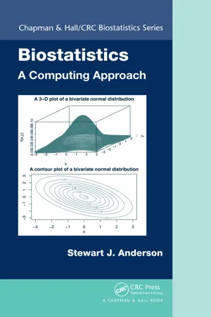 eBook - PDF
- Stewart Anderson(Author)
- 2011(Publication Date)
- Chapman and Hall/CRC(Publisher)
CHAPTER 4 Correlation and Regression 4.1 Introduction In many medical, biological, engineering, economic and other scientific applications, one wishes to establish a linear relationship between two or more variables. If there are only two variables, X and Y , then there are two ways a linear relationship can be characterized: (1) using the correlation coef fi cient ; and (2) using linear regression . One would typically use a correlation coefficient to quantify the strength and direc-tion of the linear association. If neither variable is used to predict the other, then both X and Y are assumed to be random variables, which makes inference more compli-cated. Linear regression is useful for answering the question: Given a value of X , what is the predicted value of Y ? For answering this type of question, values of X are assumed to be fixed (chosen) while values of Y are assumed to be random. In this chapter, we first review the Pearson correlation coefficient and then tackle simple, multiple, and polynomial regression models. Our primary approach for the presentation of the regression models is to use the general linear model involving matrices. We provide a short appendix at the end of the chapter to review matrix algebra. Our strategy for the presentation of regression in this chapter allows us to use the same approach for the different types of regression models. Also included in this chapter are strategies for visualizing regression data and building and assessing regression data. In the final section, we introduce two smoothing techniques, namely, the loess smoother and smoothing polynomial splines. To facilitate the discussion of the techniques covered in this chapter, we provide numerical examples with hand cal-culations to demonstrate how to fit simple models and also provide programs in SAS and R to demonstrate the implementation of calculations in more complex models. eBook - PDF
- Douglas G. Altman(Author)
- 1990(Publication Date)
- Chapman and Hall/CRC(Publisher)
While this way of looking at large numbers of variables can be helpful when one really has no prior hypotheses, significant associations really need to be confirmed in another set of data before credence can be given to them. Another common problem of interpretation occurs when we know that each of two variables is associated with a third variable. For example, if A is positively correlated with B and B is positively correlated with C it is tempting to infer that A must be positively correlated with C. Although this may indeed be true, such an inference is unjustified - we cannot say anything about the correlation between A and C. The same is true when one has observed no association. For example, in the data of Mazess et al. (1984) the correlation between age and weight was 0.05 and between weight and %fat it was 0.03 (Figure 11.3). This does not imply that the correlation between age and %fat was also near zero. In fact this correlation was 0.79, as we saw earlier (Figure 11.1). These three two-way relations are shown in Figure 11.8. Correlations cannot be inferred from indirect associations. Correlation is often used when it would be better to use regression methods, discussed in section 11.10 onwards. The two methods are compared in section 11.17. Interpretation of correlation 299 Figure 11.8 Scatter diagrams showing each two way relation between age, %fat, and weight of 18 normal adults (Mazess et al., 1984) . 11.9 P R E S E N T A T I O N OF C O R R E L A T I O N Where possible it is useful to show a scatter diagram of the data. In such a graph it is often helpful to indicate different categories of observations by using different symbols, for example to indicate patients' sex. The value of r should be given to two decimal places, together with the P value if a test of significance is performed.
- David Kleinbaum, Lawrence Kupper, Azhar Nizam, Eli Rosenberg(Authors)
- 2013(Publication Date)
- Cengage Learning EMEA(Publisher)
2 By association, we mean the lack of statistical independence between X and Y . More loosely, the lack of an association means that the value of one variable cannot be reasonably antici-pated from knowing the value of the other variable. Since r is an index obtained from a sample of n observations, it can be considered as an estimate of an unknown population parameter. This unknown parameter, called the popula-tion correlation coefficient, is generally denoted by the symbol r XY or more simply r (if it is clearly understood which two variables are being considered). We shall agree to use r unless confusion is possible. The parameter r XY is defined as r XY 5 s XY y s X s Y , where s X and s Y 2 Later we will see that a value of r close to 0 does not rule out a possible nonlinear association. Copyright 2013 Cengage Learning. All Rights Reserved. May not be copied, scanned, or duplicated, in whole or in part. Due to electronic rights, some third party content may be suppressed from the eBook and/or eChapter(s). Editorial review has deemed that any suppressed content does not materially affect the overall learning experience. Cengage Learning reserves the right to remove additional content at any time if subsequent rights restrictions require it. 110 Chapter 6 The Correlation Coefficient and Straight-line Regression Analysis denote the population standard deviations of the random variables X and Y and where s XY is called the population covariance between X and Y . The covariance s XY is a population parameter describing the average amount by which two variables covary. In actuality, it is the population mean of the random variable SSXY y 1 n 2 1 2 . Figure 6.2 provides informative examples of scatter diagrams. Data were generated (via computer simulation) to have means and variances similar to those of the age–systolic blood pressure data of Chapter 5. No longer available |Learn more
- Jessica Utts, Robert Heckard(Authors)
- 2015(Publication Date)
- Cengage Learning EMEA(Publisher)
The questions that we ask about the relationship between two variables often concern specific numerical features of the association. For example, we may want to know how much weight will increase on average for each 1-inch increase in height. Or we may want to estimate what the college grade point average will be for a student whose high school grade point average was 3.5. We will use three tools to describe, picture, and quantify the relationship between two quantitative variables: • Scatterplot , a two-dimensional graph of data values. • Correlation , a statistic that measures the strength and direction of a linear relationship between two quantitative variables. • Regression equation , an equation that describes the average relationship between a quantitative response variable and an explanatory variable. THOUGHT QUESTION 3.1 For adults, there is a positive association between weight and height. For used cars, there is a negative association between the age of the car and the selling price. Explain what it means for two variables to have a positive association. Explain what it means when two variables have a negative association. What is an example of two variables that would have no association ?* *HINT: Average weight increases as height increases. The selling price decreases as a car’s age increases. Use these patterns to define positive and negative association more generally. “A statistical relationship is different from a deterministic relationship, for which the value of one variable can be determined exactly from the value of the other variable. In a statisti-cal relationship, there is variation from the average pattern. Our ability to predict what happens for an individual depends on the amount of natural variability from that pattern.” Copyright 2014 Cengage Learning. All Rights Reserved. May not be copied, scanned, or duplicated, in whole or in part. Due to electronic rights, some third party content may be suppressed from the eBook and/or eChapter(s).
Index pages curate the most relevant extracts from our library of academic textbooks. They’ve been created using an in-house natural language model (NLM), each adding context and meaning to key research topics.