![]()
![]()
CHAPTER 1
A BRIEF HISTORY OF DATAVIZ
THE ART AND SCIENCE THAT BUILT A NEW LANGUAGE
HERE’S A BREAKNECK SYNOPSIS of data visualization’s development from simple communication tool to burgeoning cross-disciplinary science.
ANTECEDENTS
The first data visualization was probably drawn in the dirt with a stick, when one hunter-gatherer scratched out a map for another hunter-gatherer to show where they could find food. If data is information about the world, and if communication is conveying information from one person to another, and if people use five senses to communicate, and if, of those five senses, sight accounts for more than half our brain activity, then visualization must have been a survival tactic.1 Far from being a new trend, it’s primal.
For a long time, visualization was probably limited to cave paintings; eventually maps, calendars, trees (for example, genealogies), musical notation, and structural diagrams followed. In a sense, an abacus provides a visualization of data. No matter, I’m flying forward: Tables arrived in the late 17th or early 18th century and created spatial regularity that made reading many data points much less taxing. Ledgers were born. For two centuries, tables dominated.
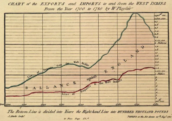
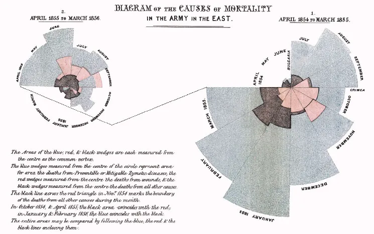
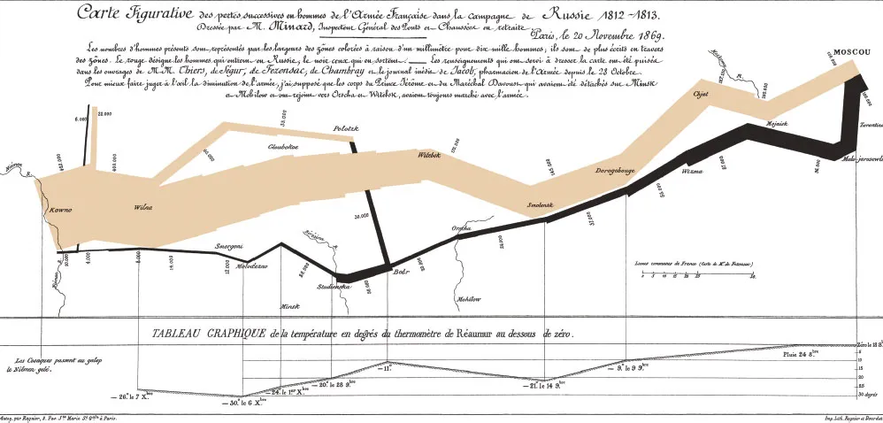
What we think of as data visualization today—charts and graphs—dates to the late 1700s and a man named William Playfair, who in 1786 published The Commercial and Political Atlas, which was full of line charts and bar charts. He later added pie charts. Histories of infographics often start with a celebrated 1861 diagram by Charles Minard that shows the decimation of Napoleon’s army during his doomed Russian campaign. Praise also goes to Florence Nightingale’s “coxcomb diagrams” of British casualties in the Crimean War, published about the same time as Minard’s famous chart. Nightingale’s work is credited with improving sanitation in hospitals because it showed how disease, above all, was what killed soldiers.
William Playfair, Florence Nightingale, and Charles Minard, the big three of early modern charting.
BRINTON TO BERTIN TO TUKEY TO TUFTE
It’s no accident that charting began to take off with the Industrial Revolution. Visualization is an abstraction, a way to reduce complexity, and industrialization brought unprecedented complexity to human life. The railroad companies were charting pioneers. They created some of the first organizational charts and plotted operational data such as “revenue-tons per train mile” (line chart) and “freight car-floats at a railroad terminal” (dual-axis timeline).2 The work of their skilled draftsmen was a prime inspiration for what can be considered the first business book about data visualization: Graphic Methods for Presenting Facts, by Willard C. Brinton, published in 1914.
Willard Brinton’s Graphic Methods for Presenting Facts provided advice to chart makers and critiques of charts in the early 20th century.
Brinton parses railroad companies’ charts (and many others) and suggests improvements. He documents some rules for presenting data and gives examples of chart types to use and types to avoid. Some of his work is delightfully archaic—he expounds, for example, on the best kind of pushpin for maps and how to prepare piano wire for use as a pin connector (“heated in a gas flame so as to remove some of the spring temper”).
Then again, many of his ideas were in the vanguard. Brinton lays out the case for using small multiples (he doesn’t call them that), currently a popular way to show a series of simple graphs with the same axes, rather than piling lines on top of one another in a single graph. He shows examples of bump charts and slope graphs, styles many people assume are more modern inventions. He looks askance at spider graphs (they should be “banished to the scrap heap”), and he questions the efficacy of pie charts a century ahead of today’s gurus.
Eventually, Brinton lays out a system for creating “curves for the executive” which can “tell the complete story [of the business] in every detail if placed in proper graphic form.”
By mid-century, the US government had become a complex and data-driven enterprise that demanded abstraction in unprecedented volume. Fortunately for the feds, they employed Mary Eleanor Spear, a charting pioneer who worked for dozens of government agencies and taught at American University. She produced two books in the spare, directive prose of someone who has a lot of work to do and not a lot of time to explain. Charting Statistics (1952) arose as a response to “problems encountered during years of analyzing and presenting data” in government. Practical Charting Techniques (1969) was an update and expansion on the previous. Spear’s books, like Brinton’s, are filled with commonsensical advice, along with some now-obsolete passages of her own (she expertly lays out how to apply various crosshatching patterns to distinguish variables on black-and-white charts). And she engaged in some ahead-of-her-time thinking—in 1952 she included tips and techniques for presenting charts on color TV.
Jacques Bertin, a cartographer, wanted to ground all this practical advice about chart making in some kind of theoretical foundation. So he formed a theory of information visualization in his watershed 1967 book, Sémiologie graphique. Rather than focus on which chart types to use and how to use them, Bertin describes an elemental system that still frames and provides the vocabulary for contemporary dataviz theory. He broadly defines seven “visual variables” with which we “encode” data: position, size, shape, color, brightness, orientation, and texture.3
Bertin also established two ideas that remain deeply influential to this day. The first is the principle of expressiveness: Say everything you want to say—no more, no less—and don’t mislead. This is a reasonably universal idea: It’s editing. Writers, composers, directors, cooks, people in any creative pursuit, strive (okay, struggle) to pare down their work to the essential.
The second is the principle of effectiveness: Use the best method available for showing your data. That is, choose the visual form that will most efficiently and most accurately convey the data’s meaning. If position is the best way to show your data, use that. If color is more effective, use that. This second principle is obviously trickier, because even today, determining the “best” or “most appropriate” method isn’t easy. Often, what’s best comes down to convention, or taste, or what’s readily available. We’re still learning, scientifically, what’s best, and the process is complicated by the fact that in a world of digital interactivity and animation, what’s best may change from page to screen, or even from screen to screen.
Bertin was followed in the 1970s by John Tukey, a statistician and scientist who was making 3-D scatter plots way back in the mainframe era. Tukey can be credited with popularizing the concepts of exploratory and confirmatory visualization—terms I’ll borrow to use later in this book.
Jock Mackinlay built on Bertin’s work in his influential 1986 PhD thesis.4 Mackinlay focused on automatically encoding data with software so that people could spend more time exploring what emerged in the visuals and less time thinking about how to create them. He also added an eighth variable to Bertin’s list: motion. Working in computer science at the dawn of the PC era, he could see animation’s powerful application for communicating data.
If Brinton is modern data visualization’s first apostle, and Spear and Bertin its early disciples, Edward Tufte is its current pope. With disciplined design principles and a persuasive voice, Tufte created an enduring theory of information design in The Visual Display of Quantitative Information (1983) and ensuing tomes. For some, Display is visualization gospel, its famous commandments oft repeated. For example: “Above all else show the data” and “Chartjunk can turn bores into disasters, but it can never rescue a thin data set.” Even though his work was rooted in scientific precision, Tufte is to the design-driven tradition what Bertin was to the scientific. A generation of designers and data-driven journalists grew up under the influence of Tufte’s minimalist approach.5
EARLY EVIDENCE
While Tufte was declaring the best ways to create beautiful, effective charts, researchers were learning how people read them. In 1984 William S. Cleveland and Robert McGill took on “graphic perception” by testing how well people could decipher simple charts.6 Pie charts have seemingly been under assault as long ...