Analytics is the science of examining raw data with the purpose of drawing conclusions about that information and using it for decision-making. Before the formal written language, there were pictures which shared ideas, plans, and history. Most of the knowledge that we have of our ancestors is from these pictures drawn on caves or monuments. In today’s world, visualizations in the form of bar charts, scatter plots, or dashboards are essential tools in business intelligence as they help managers to absorb information and take apt decisions quickly. Dashboards in particular are very helpful for managers as multiple charts and graphs giving the latest information about sales, returns, market share, etc. keep them up to date on the latest developments in the company. There are a number of visualization software in the market which are easy to learn and communicate the analyzed data in an easily understood form; the leading ones being Tableau, QlikView, etc. with each one having its positives. This chapter also looks at the pairing of visualization tools with different measurements of data.
Introduction
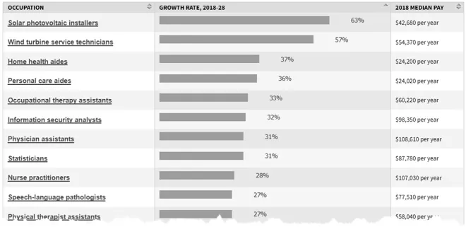
The application of Data Science has immensely benefited corporates by driving productivity, encouraging faster and better decision-making, enabling smarter hiring, and thus increasing net revenues. It has benefited customers by giving them faster access to all kinds of information, communication platforms, and services in the form of search engines like Google and Bing, flight ticket booking websites like makemytrip.com or goibibo.com, or social media apps like Facebook, twitter, etc. The widespread use of Enterprise Resource Planning systems, the internet, and various mobile applications by industry and individuals has given rise to a mind-boggling volume of data in the form of numbers, text, visuals, videos, etc. In today’s world where we are generating data continuously to the tune of 2.5 quintillions of data (2,500,000,000,000,000,000 bits) in the form of text, images, and speech, it becomes more imperative to have tools which can mine these data, analyze these data, and share it within organizations so that they profit from it. On the heels of this digital influx has been the exponential growth of the field of data science. The US Bureau of Labor Statistics (2019), in its Occupational Outlook Handbook has ranked the top jobs needed for the coming decade. The graph in Fig. 1 shows the jobs that are projected to grow the fastest for 10 years up to the year 2028 in the United States:
Fig. 1. The 10 Jobs Projected to Grow Fastest in the United States. Source: US Bureau of Labor Statistics, Occupational Outlook Handbook.
As is clear from the graph in Fig. 1, out of the professions listed, the eighth fastest growing job in the United States is for that of a statistician or a data scientist. The demand is expected to increase by a phenomenal 31% between the years 2018 and 2028 as organizations are going to want statisticians to extract and interpret the continually increasing stream of digital data that are being generated. In an interview with Dan Kopf (2018), Hal Varian, Google’s chief economist expresses concern about the huge gap in the supply of data scientists. One of the reasons that there is such a huge supply demand gap for data scientists is that while there is an immense generation of data, there are very few people who can extract the data, make them ready for analysis, analyze them, and draw insights to help business from them. The problem of drawing insights from data gets intensified when managers at senior levels do not have the time or inclination to sift through the mounds of data at their disposal or even go through the analysis conducted on it. The reason they are not being used is that they are difficult to understand, and thus, they are not used for decision-making. It is here that data visualization steps in as a savior. This stream of data science shows data, trends, relationships, and stories pictorially and through dashboards. It has been proven that the human brain can absorb information faster and better when it is shown pictorially. Researchers (Potter, Wyble, Hagmann, & Emily, 2014) have stated that we human beings react to and process visual data fastest as our brain processes visualzing 13–80 milliseconds as compared to text, where the brain takes more than 200 milliseconds to process text (Hauk, Davis, Ford, Pulvermülle, & Marslen-Wilson, 2006)! As we process visual data better than numerical or textual data, we should employ this ability to enhance organizational effectiveness by processing information through visual mediums.
A 2018 NASSCOM (National Association of Software and Services Companies) report (Zinnov, 2018) Talent Demand and Supply Report AI and Big Data Analytics says that presently there are 3,70,000 jobs in data analytics, and there will be a demand of another 2,30,000 jobs in the field of Artificial Intelligence (AI) and Business Data Analytics in the year 2020. The report interestingly points out that 70% of these jobs demand visualization skills and in particular the ability to work on popular platforms like Excel, Tableau, QlikView, Power BI, etc. This shows that while data analysis is delivering value to corporates across domains, and its use is becoming widespread within organizations there is a need for simplifying the analysis to make it more usable to a larger audience.
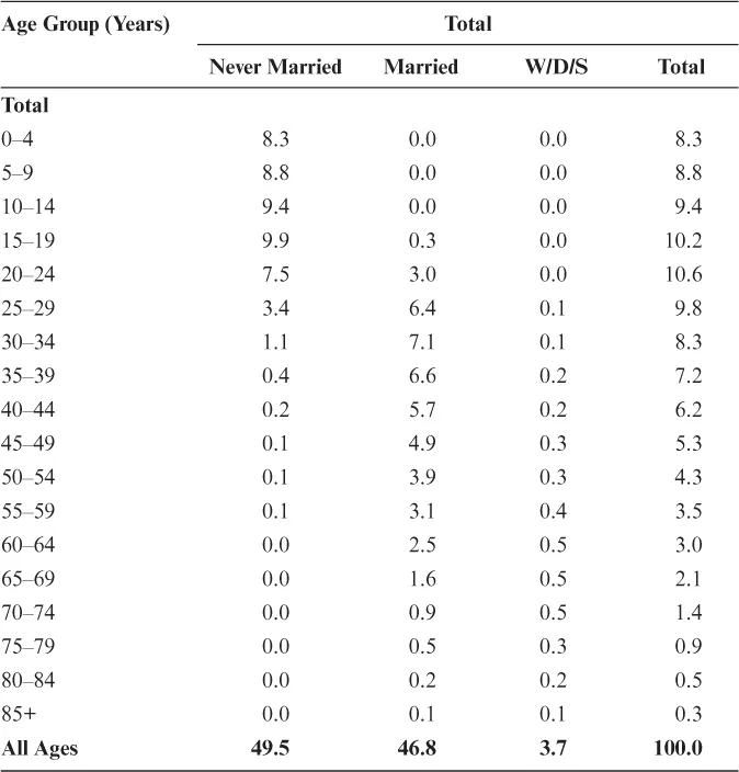
In order to understand the efficacy of visualization, the following example is considered. Recent reports cite the fact that through the years 2018–2055, India’s working-age population, i.e., people between 15 and 64 years of age, is becoming more than those dependent on them, which is children below 15 years and adults above 65 years of age. Given below are data which have been drawn from the Indiastat (https://www.indiastat.com/demographics-data/7/population/217/age-group-wise-percentage-of-population/12977/stats.aspx) database in the form of a table, and this is followed by the same data in the form of a graph (Thakur, 2019). This dataset is particularly fascinating as there has been a lot of discussion on the India’s demographic dividend (an increase in the working-age population). Over the years, the governments at the center and state have put various measures in place to abolish child marriage and have been encouraging universal education. Hence, it is an apt time to look at the age breakup in India’s population, along with the marital status. India can reap dividends from a larger working-age population only if it is healthy, and one of the ways of ensuring good health is by marriages after 18 years of age. Therefore, the data for population breakup and marital status, given in two files, are collated, and the resulting table is reproduced in Table 1.
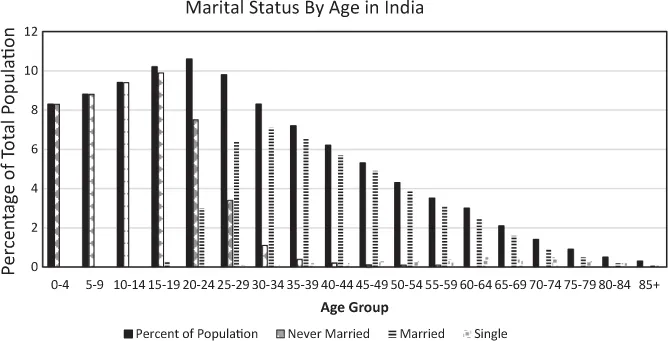
At a first look, it is easy to see that 17.1% of India’s population is below 10 years of age and 9.4% is between 10 and 14 years, it takes time to register the other age groups and their proportion in the population. While this is a compact table, it is very difficult to compare across different age groups, and it is not possible to look at the larger picture. It is easier to get a feel of India’s age breakup and marital status by examining the same data in the graph given in Fig. 2.
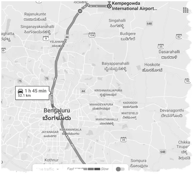
In Fig. 2, we can easily make out that the largest age category is of people in the 20–24 age group with 10.6% in that age group. As is clear from the above example, a graph or picture gives a better and faster understanding of data. Another example is that of Google Maps. Google Maps is used to give directions to drivers in two ways – one is through text and the other is through pictures. A passenger traveling from Symbiosis, Electronic City, to the airport in Bengaluru could use help by using directions in the form of text as in Fig. 3 or maps as in Fig. 4 (Yes, it takes nearly two hours!!!). No prizes for guessing which is more helpful!
Table 1. India’s Population Breakup and Corresponding Marital Status.
Source: Office of the Registrar General and Census Commissioner, India (ON1960; https://censusindia.gov.in/2011census/C-series/c-2.html).
Note: W/D/S: widowed/divorced/separated.
Recently, pop singer Rihanna (source: https://djmag.com/news/rihanna-announces-visual-autobiography) announced that she would be sharing her autobiography through a new medium which was through pictures, thereby coining a new term – visual autobiography. Such is the power of pictures that even autobiographies are going visual! Whether it is stunning portrayals on the migratory route of birds across Europe (https://twitter.com/SteveStuWill/status/1175367233180065792) on Twitter, helping school students learn geography (Holmes, 1996), successfully planning large projects like urban developments and daily hospital routine (Hahn & Zimmermann, 2011) or a description of how art collections are managed, accessed, and used (Bailey & Pregill, 2014), visualization have moved a long way from simple charts to being a potent tool in revealing patterns and uncovering narratives in a way that is easy to understand and a joy to behold.
Fig. 2. Marital Status by Age in India. Source: Census of India, Indiastat.
Fig. 3. Directions Given by Google Maps.
Fig. 4. Directions Given by Google Maps in the Form of a Picture.
Anew field is the geo visualization of consumer data, which is of particular value to corporates. In their chapter, O’Brien and Cheshire (2018) state that as the volume and variety of spatially referenced consumer data grows, there is an unrivaled need for it to be analyzed and communicated. Consumers are interested in knowing what their data say about them, retailers want to exploit data to drive sales, and researchers analyze such data to comprehend social processes. Interactive maps are a proven tool in facilitating data access across these groups. They communicate insights, in addition to providing an interface through which subsets of large and complex databases can be downloaded for further analysis.
All activities and plans are now being “datafied” as most communications are now being recorded as digital data (Cukier & Schönberger, 2013; Van Es & Schäfer, 2017). As the amount of data keeps increasing, the “open data” movement argues that data are a public good and seek to democratize the production of information and knowledge. The access and reusability of public information keeps governments and corporations on its toes as it allows for active citizen participation. The challenge facing this movement is that data must not only be made accessible but also understandable. Data visualizations are commonly used to make sense of data and to communicate that sense (Kitchin, 2014, p. 106). These publicly available visualizations are being used in diverse fields and in diverse ways – urban dashboards, for instance, render a city’s infrastructures visible and make tangible, or in some way comprehensible, various hard-to-grasp aspects of urban quality of life (Mattern, 2015). Art projects, however, experiment with the possibilities for visualizing and layering data within the physical environment to create awareness and activate citizen participation around urban challenges (Brynskov, Galsgaard, & Halskov, 2015; Vande Moere & Hill, 2012; Wiethoff & Hussmann, 2017).
Visualization is also a great technique to improve an individual’s performance. At an individual level when a person visualizes an important event to be happening before it happens – whether it is a sports activity, making a presentation, attending a meeting, etc. in the human mind the event is already happening. That process works out as a success: the person is the winner; she will shoot the ball in the goal. The same idea can be applied to organi...