Visualizing with Text uncovers the rich palette of text elements usable in visualizations from simple labels through to documents. Using a multidisciplinary research effort spanning across fields including visualization, typography, and cartography, it builds a solid foundation for the design space of text in visualization. The book illustrates many new kinds of visualizations, including microtext lines, skim formatting, and typographic sets that solve some of the shortcomings of well-known visualization techniques.
Key features:
More than 240 illustrations to aid inspiration of new visualizations
Eight new approaches to data visualization leveraging text
Quick reference guide for visualization with text
Builds a solid foundation extending current visualization theory
Bridges between visualization, typography, text analytics, and natural language processing
The author website, including teaching exercises and interactive demos and code, can be found here. Designers, developers, and academics can use this book as a reference and inspiration for new approaches to visualization in any application that uses text.
Foire aux questions
Comment puis-je résilier mon abonnement ?
Il vous suffit de vous rendre dans la section compte dans paramètres et de cliquer sur « Résilier l’abonnement ». C’est aussi simple que cela ! Une fois que vous aurez résilié votre abonnement, il restera actif pour le reste de la période pour laquelle vous avez payé. Découvrez-en plus ici.
Puis-je / comment puis-je télécharger des livres ?
Pour le moment, tous nos livres en format ePub adaptés aux mobiles peuvent être téléchargés via l’application. La plupart de nos PDF sont également disponibles en téléchargement et les autres seront téléchargeables très prochainement. Découvrez-en plus ici.
Quelle est la différence entre les formules tarifaires ?
Les deux abonnements vous donnent un accès complet à la bibliothèque et à toutes les fonctionnalités de Perlego. Les seules différences sont les tarifs ainsi que la période d’abonnement : avec l’abonnement annuel, vous économiserez environ 30 % par rapport à 12 mois d’abonnement mensuel.
Qu’est-ce que Perlego ?
Nous sommes un service d’abonnement à des ouvrages universitaires en ligne, où vous pouvez accéder à toute une bibliothèque pour un prix inférieur à celui d’un seul livre par mois. Avec plus d’un million de livres sur plus de 1 000 sujets, nous avons ce qu’il vous faut ! Découvrez-en plus ici.
Prenez-vous en charge la synthèse vocale ?
Recherchez le symbole Écouter sur votre prochain livre pour voir si vous pouvez l’écouter. L’outil Écouter lit le texte à haute voix pour vous, en surlignant le passage qui est en cours de lecture. Vous pouvez le mettre sur pause, l’accélérer ou le ralentir. Découvrez-en plus ici.
Est-ce que Visualizing with Text est un PDF/ePUB en ligne ?
Oui, vous pouvez accéder à Visualizing with Text par Richard Brath en format PDF et/ou ePUB ainsi qu’à d’autres livres populaires dans Computer Science et Computer Science General. Nous disposons de plus d’un million d’ouvrages à découvrir dans notre catalogue.
Fake news. Voice-based interfaces. Chatbots that answer the wrong questions. Automated transcription. Phishing emails. Underutilized customer feedback. Trolls posting hate speech. Incorrect translations. Algorithms that inadvertently promote extremism. Product reviews posted by bots. These are some very real text-oriented problems confronting 21st-century society. In the past 20 years, the visual display of quantitative information has significantly enhanced the analysis of measurements. There is now a pressing need to expand our visualization vocabulary and repertoire for the analysis of text using visualization techniques.
1.1 Why Text?
Data visualization transforms data into visual representations such as size and color so that we can easily see trends, patterns, and anomalies across the display. Text, however, requires focused attention, sequentially perceived a few words at a time. Visualization leverages humans’ automatic preattentive perceptual capabilities – where preattentive means that we perceive the patterns before we consciously focus on specific items in the view. Reading, by comparison, is slow. Therefore, the use of text inside a visualization seems counterintuitive.
So, why should text be used with visualization other than simple supporting roles, such as axes labels, legends, or explanations?
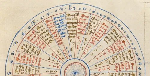
Consider some medieval visualizations. In Figure 1.1, part of a circular diagram is shown (Virgil 1405). Pie-chart-like, it is formed of wedges, with sequences of individual characters around the perimeter, sentences in each wedge, and a few character codes per wedge as well. Text color differentiates wedges and some individual characters are highlighted in yellow.
FIGURE 1.1 Portion of a text-heavy medieval circular chart from 1405 with sentences filling wedges, plus character codes and text around the perimeter.
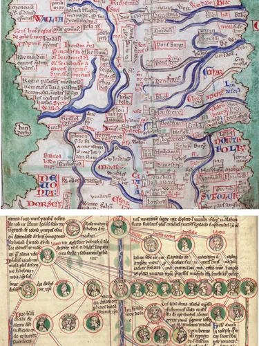
In the top image of Figure 1.2, a portion of a map of England is shown (Paris 1255). Text ranges from simple labels, to phrases to sentences. Text color varies: cities are brown, counties are red, some regions are entirely red (e.g. DORSET) or combinations of alternating red and blue letters (NORTHFOLK). Case varies: cities are lowercase, regions in uppercase. Colored boxes (brown or red) surround the text for many cities.
FIGURE 1.2 Early medieval map and graph. Text is fully integrated within the other visual elements.
At the bottom of Figure 1.2 is a genealogical diagram (Peter of Poitier 1205). Nodes are thumbnail portraits with colored names with connections sometimes labeled. The accompanying text is fluidly set out in relation to and adjacent to the nodes. This text will cross lines or squish into narrow spaces in order to be close, while not overlapping the nodes.
Clearly, medieval scribes were very flexible with regards to the textual content, graphical elements, and their composition. Text and visualization were not separate.
1.2 500 Years of Pushing Text Out of Visualizations
How did text become separated from visualization?
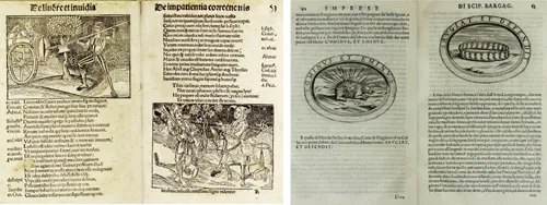
Guttenberg’s printing press of 1455 fundamentally changed the technical process of publishing. After the printing press, the text for a document is assembled from small pieces of movable type, arranged and locked together in a form. Images, on the other hand, were produced separately, such as carved wood blocks or engraved metal plates. The two technologies were not easy to mix. Blocks of text became separate from the blocks with images (with a few words carved into the image, if required). Figure 1.3 shows some early books with wood block images. In the second image, some minimal text has been carved into the blocks.
FIGURE 1.3 Early printed texts with woodblock images (Brant 1497, Bargagli 1589). Text is separate from image or otherwise minimal.
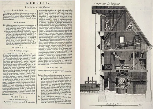
It is easier to print the text and image separately. Figure 1.4 shows an illustration of a watermill from the Encyclopédie, 1777, and the associated descriptive text (Diderot et al., Meunier, Planche II). Items in the illustration are marked with characters and numbers (A,B,C…1,2,3…), which are then cross-referenced in the descriptive text on separate pages at the beginning of the volume. Both the text and the image can be reproduced at high quality but use different technologies (cast metal type vs. copper plate engravings) and therefore printed on separate pages. However, the viewer is required to flip back and forth between the pages. The viewer needs to rely on short-term memory to keep track of references – for example, this one figure has 49 items labeled A–Z,1–23, discretely placed throughout the image.
FIGURE 1.4 Explanation and illustration of a watermill are completely separated and cross-referenced with tiny characters. From Encyclopédie (Diderot et al. 1777).
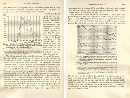
In the early 1900s, this separation between text and illustration was also applied to charts and graphs. Figure 1.5 shows some example pages from a book by Briton (1919) on charts and their uses. All text is pushed away from the chart; even the axes titles and tick labels are pushed to the perimeter of these charts. Similar to the Encyclopédie, text in the plot area is minimized; on the right chart, tiny labels in the plot (A,B,C) need to be cross-referenced with the text below.
FIGURE 1.5 Charts in a book from 1919: text is pushed outside and away from the chart.
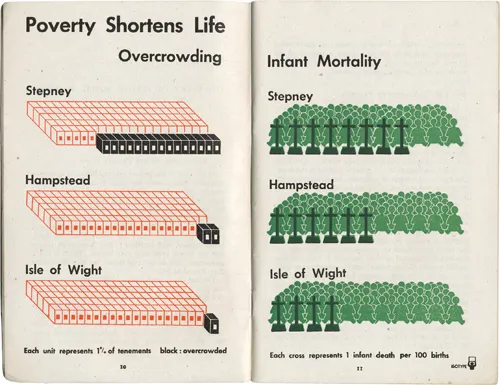
By the 1950s, the International Style was sweeping across the world, promoting design that supported international trade and communication. At the core of the International Style was modernism, which emphasized simplicity, cleanness, and readability, as well as minimizing language-specific text in favor of non-language icons and symbols. Isotype was a visualization approach typified by expressive icons (see Burke et al. 2014). Isotype was created during the early formation of modernism. The Isotype example shown in Figure 1.6 is highly different from the earlier charts: with no grid lines or axes; a strong reliance on icons (which can be easily counted thereby not needing the axis); and strong use of color. The paired charts strongly suggest a correlation between overcrowding and infant mortality.
FIGURE 1.6 An Isotype chart from 1941. Expressive icons, no grid lines, no axes, bright colors, and minimal labels.
Isotype became broadly diffused with the International Style, for example, with standardized symbols for international signage, such as airports, Olympics, and road signs. Modernists responsible for communicating data graphically would prefer simpler thematic maps and icons, short concise labels, and reduced use of grid lines.
By the 1960s, the technological shift to photo-compositing lowered costs and reduced time, but also reduced the ability to show fine details; small text was difficult to reproduce. This continued the bias for the design of visualizations to reduce the amount of text.
While the quality of phototypesetting improved, the 1980s introduced personal computers. With computers attached to monitors, visualizations could become interactive, but screens were small, and resolution was low (72–96 pixels per inch). Early graphical user interfaces used big icons and minimal labels. Text did not look good on early desktop computers. Adrian Frutiger (designer of the font Univers) said: “Coarse resolution would result in a stair-step effect on curves and diagonals that was referred to as the jaggies” (Osterer and Stamm 2014). Poor resolution required text to...
Table des matières
Cover
Half-Title
Series
Title
Copyright
Dedication
Visual Table of Contents
Contents
List of Figures and Credits
Foreword
Preface
About the Author
PART I Defining Text Elements
PART II Labels
PART III Formats
PART IV Text Layouts
INDEX
Normes de citation pour Visualizing with Text
APA 6 Citation
Brath, R. (2020). Visualizing with Text (1st ed.). CRC Press. Retrieved from https://www.perlego.com/book/1718881/visualizing-with-text-pdf (Original work published 2020)
Brath, R. (2020) Visualizing with Text. 1st edn. CRC Press. Available at: https://www.perlego.com/book/1718881/visualizing-with-text-pdf (Accessed: 14 October 2022).