eBook - ePub
Cool Infographics
Effective Communication with Data Visualization and Design
Randy Krum
This is a test
- English
- ePUB (adapté aux mobiles)
- Disponible sur iOS et Android
eBook - ePub
Cool Infographics
Effective Communication with Data Visualization and Design
Randy Krum
Détails du livre
Aperçu du livre
Table des matières
Citations
À propos de ce livre
Make information memorable with creative visual design techniques
Research shows that visual information is more quickly and easily understood, and much more likely to be remembered. This innovative book presents the design process and the best software tools for creating infographics that communicate. Including a special section on how to construct the increasingly popular infographic resume, the book offers graphic designers, marketers, and business professionals vital information on the most effective ways to present data.
- Explains why infographics and data visualizations work
- Shares the tools and techniques for creating great infographics
- Covers online infographics used for marketing, including social media and search engine optimization (SEO)
- Shows how to market your skills with a visual, infographic resume
- Explores the many internal business uses of infographics, including board meeting presentations, annual reports, consumer research statistics, marketing strategies, business plans, and visual explanations of products and services to your customers
With Cool Infographics, you'll learn to create infographics to successfully reach your target audience and tell clear stories with your data.
Foire aux questions
Comment puis-je résilier mon abonnement ?
Il vous suffit de vous rendre dans la section compte dans paramètres et de cliquer sur « Résilier l’abonnement ». C’est aussi simple que cela ! Une fois que vous aurez résilié votre abonnement, il restera actif pour le reste de la période pour laquelle vous avez payé. Découvrez-en plus ici.
Puis-je / comment puis-je télécharger des livres ?
Pour le moment, tous nos livres en format ePub adaptés aux mobiles peuvent être téléchargés via l’application. La plupart de nos PDF sont également disponibles en téléchargement et les autres seront téléchargeables très prochainement. Découvrez-en plus ici.
Quelle est la différence entre les formules tarifaires ?
Les deux abonnements vous donnent un accès complet à la bibliothèque et à toutes les fonctionnalités de Perlego. Les seules différences sont les tarifs ainsi que la période d’abonnement : avec l’abonnement annuel, vous économiserez environ 30 % par rapport à 12 mois d’abonnement mensuel.
Qu’est-ce que Perlego ?
Nous sommes un service d’abonnement à des ouvrages universitaires en ligne, où vous pouvez accéder à toute une bibliothèque pour un prix inférieur à celui d’un seul livre par mois. Avec plus d’un million de livres sur plus de 1 000 sujets, nous avons ce qu’il vous faut ! Découvrez-en plus ici.
Prenez-vous en charge la synthèse vocale ?
Recherchez le symbole Écouter sur votre prochain livre pour voir si vous pouvez l’écouter. L’outil Écouter lit le texte à haute voix pour vous, en surlignant le passage qui est en cours de lecture. Vous pouvez le mettre sur pause, l’accélérer ou le ralentir. Découvrez-en plus ici.
Est-ce que Cool Infographics est un PDF/ePUB en ligne ?
Oui, vous pouvez accéder à Cool Infographics par Randy Krum en format PDF et/ou ePUB ainsi qu’à d’autres livres populaires dans Ciencia de la computación et Visualización de datos. Nous disposons de plus d’un million d’ouvrages à découvrir dans notre catalogue.
Informations
1
The Science of Infographics
Why do people love infographics?
Humans have been drawing pictures to communicate with each other for thousands of years—from pictograms on cave walls to Egyptian hieroglyphics to ideograms on modern signs (Figure 1-1). People love using pictures to communicate and tell stories because it’s hardwired into the human brain.

FIGURE 1-1: Altamira bison cave painting, ancient Egyptian hieroglyphics, and modern signs.
Infographics and data visualizations are all around us. We are surrounded by visual representations of information—charts, maps, icons, progress bars, signs, posters, diagrams, and online visuals (Figure 1-2). These are all examples of visual communication, but these are not all infographics.
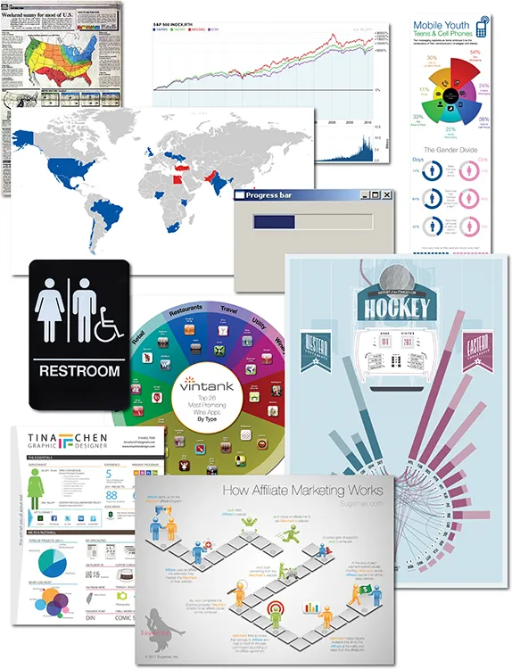
FIGURE 1-2: Collage of infographics and data visualizations
The word infographic is used by people to mean many different things. In many cases infographics and data visualizations are considered synonymous, but in the world of an infographic designer they mean different things.
Data visualizations are the visual representations of numerical values. Charts and graphs are data visualizations and create a picture from a given set of data. Figure 1-3 shows the price chart of the S&P 500, the Nasdaq, and the Dow Jones Industrial Average since 1950. The reader can easily see the overall upward trend and the comparison between the three data sets. Including the volume chart beneath the price chart, this data visualization creates a picture using at least 80,000 data points.
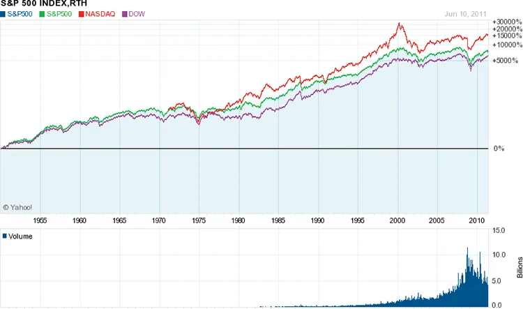
FIGURE 1-3: Stock price chart
It takes us only seconds to understand the long-term trend, to see the close relationship between the three indices, and to see the significant spikes and falls in the stock market. This visualization easily fits on one piece of paper, a computer screen without scrolling, or a presentation slide. Seeing the entire data set on one page, we can understand the data quickly and with little effort.
This is an efficient way to communicate data. Data visualizations can be very space efficient by visualizing a large set of numbers in a small space. By designing a visualization that displays all of the data within the readers’ field of view, this enables us to see the entire data set with minimal eye movement without scrolling or flipping between pages.
If we looked at a spreadsheet with 80,000 values instead, how long would it take us to get a general understanding of the market?
In 2001, Dr. Edward R. Tufte, one of the pioneers of modern data visualization and professor emeritus of political science, statistics, and computer science from Yale University, clearly explained this phenomenon when he stated, “Of all methods for analyzing and communicating statistical information, well-designed data graphics are usually the simplest and at the same time the most powerful.”[1]
This screen shot (Figure 1-4) from the StockTouch app on an iPad is another example of a good data visualization design. The top 100 largest U.S. stocks are shown from nine different market sectors. In this view, the companies from each market segment are organized in a spiral pattern from largest (in the center) to smallest. Each stock is color coded based on its stock price performance over the prior 12 months, but the time period is adjustable with the slider on the right. The shades of green show stock prices that have increased, and shades of red show prices that have decreased.
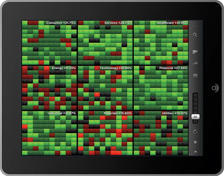
FIGURE 1-4: Heatmap visualization of stock price changes
coolinfographics.com/Figure-1-4Source: StockTouch iOS app, Visible Market, Inc.
Whether it’s a new definition or an additional definition of the term infographics, its use now implies much more than just a data visualization. Up until recently, a common definition for infographics was simply “a visual representation of data”; however, that definition is outdated and is more indicative of data visualizations. Originally derived from the phrase information graphics, infographics was a term used in the production of graphics for newspapers and magazin...