The Visualization of Spatial Social Structure
eBook - ePub

The Visualization of Spatial Social Structure

  1. English
  2. ePUB (mobile friendly)
  3. Available on iOS & Android
eBook - ePub

The Visualization of Spatial Social Structure

Book details
Book preview
Table of contents
Citations

About This Book

How do you draw a map of 100, 000 places, of more than a million flows of people, of changes over time and space, of different kinds of spaces, surfaces and volumes, from human travel time to landscapes of hopes, fears, migration, manufacturing and mortality? How do you turn the millions of numbers concerning some of the most important moments of our lives into images that allow us to appreciate the aggregate while still remembering the detail?

The visualization of spatial social structure means, literally, making visible the geographical patterns to the way our lives have come to be socially organised, seeing the geography in society. To a statistical readership visualization implies using data. More widely defined it implies freeing our imaginations.

The Visualization of Spatial Social Structure introduces the reader to new ways of thinking about how to look at social statistics, particularly those about people in places. The author presents a unique combination of statistical focus and understanding of social structures and innovations in visualization, describing the rationale for, and development of, a new way of visualizing information in geographical research. These methods are illustrated through extensive full colour graphics; revealing mistakes, techniques and discoveries which present a picture of a changing political and social geography. More complex aspects on the surface of social landscapes are revealed with sculptured symbols allowing us to see the relationships between the wood and the trees of social structure. Today's software can be so flexible that these techniques can now be emulated without coding.

This book centres on a particular place and time; 1980s Britain, and a particular set of records; routine social statistics. A great deal of information about the 80s' social geography of Britain is contained within databases such as the population censuses, surveys and administrative data. Following the release of the 2011 census, now is a good time to look back at the past to introduce many new visualization techniques that could be used by future researchers.

Frequently asked questions

Simply head over to the account section in settings and click on “Cancel Subscription” - it’s as simple as that. After you cancel, your membership will stay active for the remainder of the time you’ve paid for. Learn more here.
At the moment all of our mobile-responsive ePub books are available to download via the app. Most of our PDFs are also available to download and we're working on making the final remaining ones downloadable now. Learn more here.
Both plans give you full access to the library and all of Perlego’s features. The only differences are the price and subscription period: With the annual plan you’ll save around 30% compared to 12 months on the monthly plan.
We are an online textbook subscription service, where you can get access to an entire online library for less than the price of a single book per month. With over 1 million books across 1000+ topics, we’ve got you covered! Learn more here.
Look out for the read-aloud symbol on your next book to see if you can listen to it. The read-aloud tool reads text aloud for you, highlighting the text as it is being read. You can pause it, speed it up and slow it down. Learn more here.
Yes, you can access The Visualization of Spatial Social Structure by Danny Dorling in PDF and/or ePUB format, as well as other popular books in Matemáticas & Probabilidad y estadística. We have over one million books available in our catalogue for you to explore.

Information

Publisher
Wiley
Year
2012
ISBN
9781118353998
Chapter 1
Envisioning information
We must create a new language, consider a transitory state of new illusions and layers of validity and accept the possibility that there may be no language to describe ultimate reality, beyond the language of visions.
(Denes, 1979, p. 3)

1.1 Visual thinking

Envisioning means bringing into the condition of vision for the purposes of contemplation, making visible, to enable visualization. It is what this book practises. For at least a century we have known that envisioning is about giving information to people in a form that is better suited to all our minds.
This work does not concentrate on the mechanics of getting information into and out of the machine, but instead with how you get it out to people (Figures 1.1 and 1.2). To communicate spatial structure is hard without involving the sense of sight.1 Language, along with music, the most sophisticated use of hearing, is an excellent means of conveying ideas and thoughts, but cannot present a large amount of information in a structured form at speed.2 Neither can touch or our other senses.
Figure 1.1 Software by Ace Computing was used to produce these still illustrations from a conventional video animation of the Acorn Archimedes computer. Polygon shading colours the entire surface of each facet a constant shade, which is determined by its colour and the light and shadow falling on it. The scenes produced are therefore crisp, but somewhat unrealistic. Note: this very early race tracing software produced images at even a low resolution very slowly and so parts of these 18 frames can appear jagged.
1.1
Figure 1.2 Ray-tracing involves estimating the colour of every pixel in the image plane by calculating the trajectory of a ray of light on to the surface of a hypothetical object, where it can be reflected, diffracted or absorbed, and then through the screen to the eye of the viewer. During the late 1980s the algorithms were still in development. Later the advantages of this technique became more apparent. Note: the jagged nature of some of these images is accentuated when the virtual camera was very close to objects and it was then easy to over-expose the virtual ‘film’.
1.2
When you look out of the window you can see a great deal in an instant.3 The mind has an extremely powerful system for processing imagery that can instantly analyse a pattern of colours, of light and shade, and know that these are trees, houses or people. How long would it take to describe all that you can see in words?
Pictures alone are insufficient. This little book is only held together by its text. We have travelled a long way with our little symbols, the letters of the alphabet, which exist only because they were easy to scratch with a stick or form quickly with lips and tongue. Did our ancestors develop the most efficient means of communication or did they make do with what was possible?
The spatial structure of 1980s British society, which is envisaged in these pages, was made up of far more than a few large regions that can be named and divisions that could be measured. Social structure has a texture to it, a fine pattern, an elaborate organization, not unlike the fractal patterns to what were thought to be chaos, which were first revealed in the 1980s (Figure 1.3).
Figure 1.3 Height of the surface shows the rate of divergence of each point on the complex plane, to infinity. The Mandelbrot and Julia sets essentially trace out one-dimensional lines in two-dimensional space. These are of such complexity, however, that a three-dimensional projection can be illuminating. These pictures are derived from simple equations. Note: the resolution reflects the original pixel sizes of the six screen shots are shown here.
1.3
We depend on vision, we think visually, we talk in visual idioms and we dream in pictures, but we cannot easily turn a picture in our mind into something other people can see (and not everyone can see). An artist will take days to paint a single portrait. My parents' generation were the first to have easy access to the camera and mine were the first to receive the computer, which can turn a huge amount of data into pictures—snapshots of our society. In the future we may be able to speak visually and may be able to summon up an image to explain what we are trying to say. For now we still have to learn how.

1.2 Pictures over time
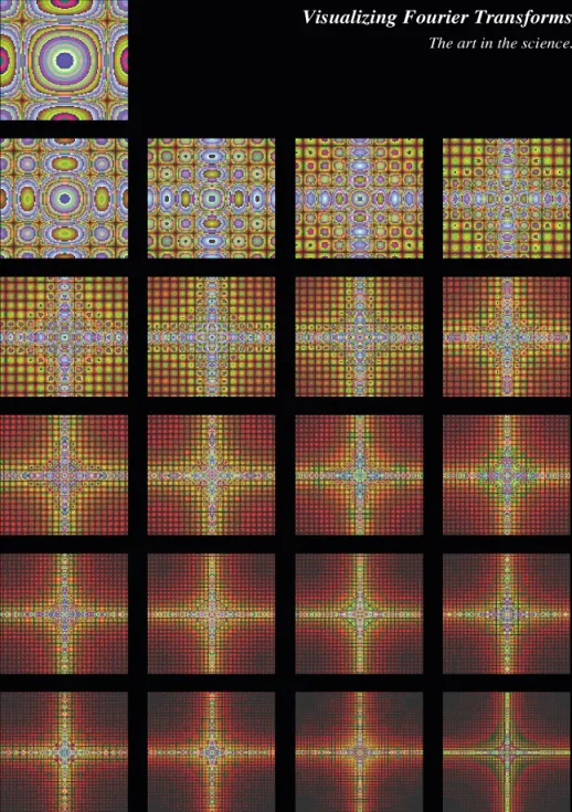
One of the great potentials of computer graphics is to provide a vision of what we might not otherwise be able to see in a photograph or real life.
(Dooley and Cohen, 1990, p. 307)
Our first permanent communications were cave paintings and our first textual scripts were made of pictures. Today the liquid-crystal display screen, which abounds with icons, is the modern cave wall (Figure 1.4); we have rushed forward to the beginnings of visual communication.4
Figure 1.4 These images show the distribution of patterns of differing frequencies on the complex plane. The patterns show how science and art can merge. This is understandable when their objectives become less dissimilar. Different people might notice different patterns in the same pictures—there is some subjectivity in visualization because we have different experiences and expectations.
1.4
The first detailed maps were drawn on clay. They were invaluable objects for the control of territory or the projection of religious truth about the world. Maps were accumulations of innumerable stories, reams of parchment and hordes of figures, but they were also about power.
As map-making developed into the art of cartography, rules were formalized and conventions defined. Cartography is no longer a major discipline or even an important aspect of geography. Its modern tools can be used by children (Figure 1.5) and its conventions have been challenged as stale. It may currently be merging into a new, as yet unlabelled, discipline. This could be the discipline needed to collate knowledge on the graphical design of all that which now appears within touch-sensitive liquid-crystal displays, now that the displays interact. Disciplines change.
Figure 1.5 The maze is created by repeatedly choosing a starting position and colour at random, and then reversing direction, again at random, avoiding any obstacles. Great detail can be seen in this image, which consists of only 320 by 250 pixels. Some of the most detailed pictures shown in this book are made up of just over one million pixels. Often, though, only eight colours are used.
1.5
The nineteenth century saw the growth of an aversion, in science, to pictures. The graphs, which instruments traced on to paper, were immediately turned into supposedly more accurate and readable tables. Even in the early 1960s diagrams were said to be for people without mathematical imagination.5 Nevertheless, statistical graphics did germinate in these surroundings.
The graph, bar chart and scatter diagram were invented and formalized. Rules for their construction were produced, while their supposed subservience to more advanced methods was made clear. By 1990 the cycle had come round again and a new breed of statistician appeared who saw visualization as paramount.
Computer graphics in the 1960s changed the picture. Swirling images were produced from simple formulae. It was immediately obvious that reading an equation told you little about what secrets it held. Before computer graphics, people were blind to the behaviour of relationships they thought they could easily understand (Figure 1.6). The programmers then turned their efforts to the possibilities of rendering abstract worlds.
Figure 1.6 The same point in the plane is being repeatedly magnified in this visual series. By the end of the series the image is a million times larger in resolution. At this point the arithmetic accuracy of the computer used begins to fail. We can naturally appreciate complex images. There is no need to smooth out the beauty and diversity of reality either.
1.6
Graphics have come in and out of favour in cycles through time. Their resurgences usually have more to do with taking advantage of new printing technologies and the availability of more abundant information than a basic understanding of their value.
Box 1.1 shows how computer graphics are constructed. At the time it was first drawn, being able to combine all these separate elements in a single ‘graphics file’ was novel. Creating such files required knowing that to place an island in a river within a ...

Table of contents

  1. Cover
  2. Series Page
  3. Title Page
  4. Copyright
  5. Dedication
  6. List of figures
  7. List of text boxes
  8. Preface
  9. Introduction: Human cartography
  10. Chapter 1: Envisioning information
  11. Chapter 2: People, spaces and places
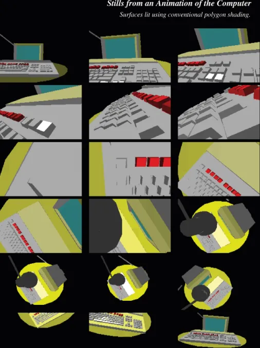
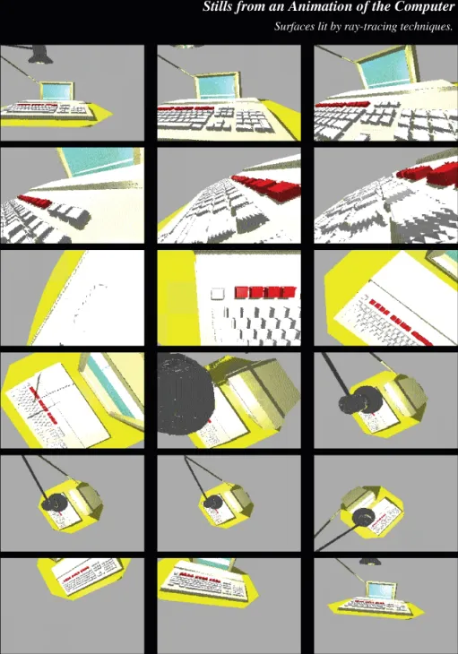
  12. Chapter 3: Artificial reality
  13. Chapter 4: Honeycomb structure
  14. Chapter 5: Transforming the mosaic
  15. Chapter 6: Cobweb of flows
  16. Chapter 7: On the surface
  17. Chapter 8: The wood and the trees
  18. Chapter 9: Volume visualization
  19. Chapter 10: Conclusion: Another geography
  20. Endnote
  21. Acknowledgements
  22. Appendix: Drawing faces
  23. References
  24. Author Index
  25. Subject Index