![]()
Part I
Foundations
Chapter 1
Methodological Tools
Ethan P. White, Xiao Xiao, Nick J. B. Isaac, and Richard M. Sibly
SUMMARY
1 In this chapter we discuss the best methodological tools for visually and statistically comparing predictions of the metabolic theory of ecology to data.
2 Visualizing empirical data to determine whether it is of roughly the correct general form is accomplished by log-transforming both axes for size-related patterns, and log-transforming the y-axis and plotting it against the inverse of temperature for temperature-based patterns. Visualizing these relationships while controlling for the influence of other variables can be accomplished by plotting the partial residuals of multiple regressions.
3 Fitting relationships of the same general form as the theory is generally best accomplished using ordinary least-squares-based regression on log-transformed data while accounting for phylogenetic non-independence of species using phylogenetic general linear models. When multiple factors are included this should be done using multiple regression, not by fitting relationships to residuals. Maximum likelihood methods should be used for fitting frequency distributions.
4 Fitted parameters can be compared to theoretical predictions using confidence intervals or likelihood-based comparisons.
5 Whether or not empirical data are consistent with the general functional form of the model can be assessed using goodness-of-fit tests and comparisons to the fit of alternative models with different functional forms.
6 Care should be taken when interpreting statistical analyses of general theories to remember that the goal of science is to develop models of reality that can both capture the general underlying patterns or processes and also incorporate the important biological details. Excessive emphasis on rejecting existing models without providing alternatives is of limited use.
1.1 INTRODUCTION
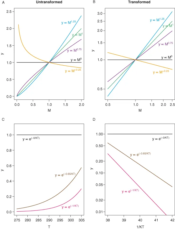
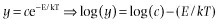
Two major functional relationships characterize the current form of the metabolic theory of ecology (MTE). Power-law relationships, of the form y = cMα (Fig. 1.1A,B), describe the relationship between body size and morphological, physiological, and ecological traits of individuals and species (West et al. 1997; Brown et al. 2004). The Arrhenius equation, of the general form, y = ce−E/kT (Fig. 1.1C,D), characterizes the relationships between temperature and physiological and ecological rates (Gillooly et al. 2001; Brown et al. 2004). In addition to being central to metabolic theory, these empirical relationships are utilized broadly to characterize patterns and understand processes in areas of study as diverse as animal movement (Viswanathan et al. 1996), plant function (Wright et al. 2004), and biogeography (Arrhenius 1920; Martin and Goldenfeld 2006).
Methodological approaches for comparing metabolic theory predictions to empirical data fall into two general categories: (1) determining whether the general functional form of a relationship predicted by the theory is valid; and (2) determining whether the observed values of the parameters match the specific quantitative predictions made by the theory. Both of these categories of analysis rely on being able to accurately determine the best fitting form of a model with the same general functional form as that of MTE, so we will begin by discussing how this has typically been done using ordinary least-squares (OLS) regression on appropriately transformed data. Potential improvements to these approaches that account for statistical complexities of the data will then be considered. We will discuss methods for comparing the fitted parameters to theoretical values and how to determine whether the general functional form predicted by the theory is supported by data. This will require some discussion of the philosophy of how to test theoretical models. So we will end with a general discussion of the technical and philosophical challenges of testing and developing general ecological theories.
1.2 VISUALIZING MTE RELATIONSHIPS
Before conducting any formal statistical analysis it is always best to visualize the data to determine whether the model is reasonable for the data and to identify any potential problems or complexities with the data.
1.2.1 Visualizing functional relationships
The primary model of metabolic theory describes the relationship between size, temperature, and metabolic rate; combining a power function scaling of mass and metabolic rate with the Arrhenius relationship describing the exponential influence of temperature on biochemical kinetics.
See Brown and Sibly (Chapter 2) or Brown et al. (2004) for details.
Most analyses of this central equation focus on either size or temperature in isolation, or attempt to remove the influence of the other variable before proceeding. As such, the most common analyses focus on either power-law relationships, y = cMb, or exponential relationships, y = ce−E/kT, both of which can be log-transformed to yield linear relationships (Fig. 1.1).
The linear forms of these relationships form the basis for the most common approaches to plotting these data and graphically assessing the validity of the general form of the equations. Plots of these linearized forms are obtained either by log-transforming the appropriate variables or by logarithmically scaling the axes so that the linear values remain on the axes, but the distance between values is adjusted to be equivalent to log-transformed data. In this book all linearized plots will used log-scaled, rather than log-transformed, axes. Relationships between size and morphological, physiological, and ecological factors are typically plotted on log-log axes and relationships between temperature and these factors are displayed using Arrhenius plots with the log-scaled y variable plotted against the inverse of temperature (Fig. 1.2A,B). If the relationships displayed on plots of these forms are approximately linear then they are at least roughly consistent with the general form predicted by metabolic theory.
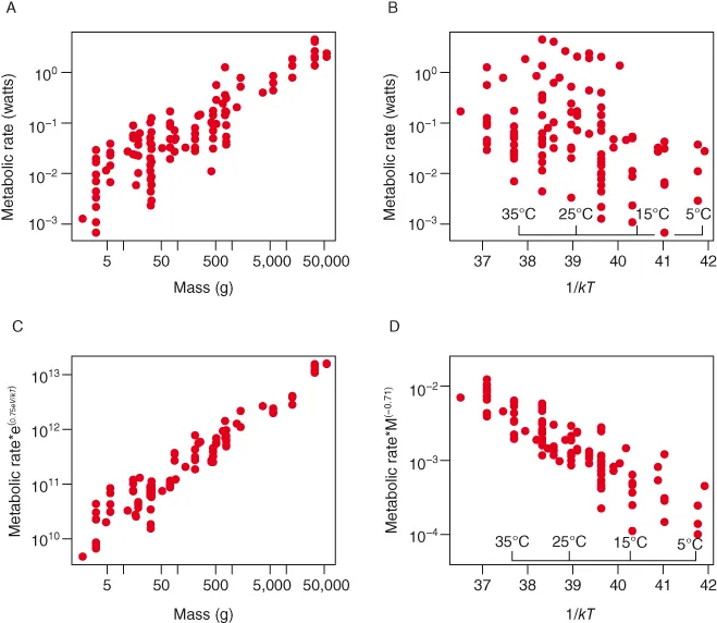
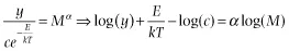
When information on both size and temperature are included in an analysis to understand their combined impacts on a biological factor, this has been displayed graphically by removing the effect of one factor and then plotting the relationship for the other factor (Fig. 1.2C,D). The basic idea is to rewrite the combined size–temperature equation so that only one of the two variables of interest appears on the right-hand side.
The value for the dependent variable (i.e., the value plotted for each point on the vertical axis) is then determined by dividing the observed value of y by the appropriate transformation of temperature or mass for the observation and log-transforming the resulting value. This is equivalent to the standard approach of plotting the partial residuals to visualize the relationship with a single predictor variable in multiple regression. Often in the MTE literature the theoretical forms of the relationships (α = 0.75, E = −0.65) have been used rather than the fitted forms based on multiple regression. For reasons discussed below we recommend using the fitted values of the parameters, or simply using the partial residuals functions in most statistical packages, to provide the best visualization of the relationship with the variable of interest.
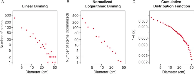
1.2.2 Frequency distributions
In addition to making predictions for the relationships between pairs of variables – e.g., size, temperature, and metabolic rate – metabolic ecology models have been used to make predictions for the form of frequency distributions (i.e., histograms) of biological properties such as the number of trees of different sizes in a stand (Fig. 1.3; West et al. 2009). The predicted forms of these distributions are typically power laws and have often been plotted by making histograms of the variable of interest, log-transforming both the counts and the bin centers and then plotting the counts on the y-axis and the bin centers on the x-axis (Fig. 1.3A; e.g., Enquist and Niklas 2001; Enquist et al. 2009). This is a reasonable way to visualize these data, but it suffers from the fact that bins with zero individuals must be excluded from the analysis due to the log-transformation. These bins will occur commonly in low probability regions of the distribution (e.g., at large diameters), thus impacting the visual perception of the form of the distribution. To address this problem we recommend using normalized logarithmic binning (sensu White et al. 2008), the method typically used for visualizing this type of distribution in the aquatic literature (e.g., Kerr and Dickie 2001). This approach involves binning the data into equal logarithmic width bins (either by log-transforming the data prior to constructing the histogram or by choosing the bin edges to be equal logarithmic distances apart) and then dividing the counts in each bin by the linear width of the bin prior to graphing (Fig. 1.3B). The logarithmic scaling of the bin sizes decreases the number of bins with zero counts (often to zero) and the division by the linear width of the bin preserves the underlying shape of the relationship. Another, equally valid approach is to visualize the relationship using appropriate transformations of the cumulative distribution function (Fig. 1.3C; see White et al. 2008 for details), but we have found that it is often more difficult to intuit the underlying form of the distribution from this type of visualization and therefore recommend normalized logarithmic binning in most cases.
1.3 FITTING MTE MODELS TO DATA
1.3.1 Basic fitting
Since the two basic functional relationships of metabolic theory can be readily written as linear relationships by log-transforming one or both axes, most analyses use linear regression of these transformed variables to estimate exponents, compare the fitted values to those predicted by the theory, and characterize the overall quality of fit of the metabolic models to the data. Given the most basic set of statistical assumptions, this is the correct approach.
Specifically, if the data points are independent, the error about the relationship is normally distributed when the relationship is properly transformed (i.e., it is multiplicative log-normal error on the untransformed data):
and there is error (i.e., stochasticity) only in the y-variable, then the correct approach to analyzing the component relationships is ordinary least-squares regression.
Given the same basic statistical assumptions, analyzing the full relationship including both size and temperature should be conducted using multiple regression with the logarithm of mass and the inverse of temperature as the ...