Join noted watercolorist Ted Kautzky as he shares his wisdom on painting the infinitely wonderful details of trees and landscapes. Beginning with the fundamentals of good composition, value arrangement, balance, rhythm, and basic brushstrokes, the book explores ways of painting such important landscape components as trees, roads, puddles, rain, plant life, and fog. Individual chapters are devoted to painting forests, and different types of trees are amply illustrated, from the lush willow to the stately Lombardy poplar. Beautifully presented and filled with valuable insight, this book will be warmly welcomed by art students, landscape architects, commercial artists, and anyone familiar with the author's other popular books.
- 112 pages
- English
- ePUB (mobile friendly)
- Available on iOS & Android
eBook - ePub
Painting Trees and Landscapes in Watercolor
About this book
Trusted by 375,005 students
Access to over 1.5 million titles for a fair monthly price.
Study more efficiently using our study tools.
Information
Topic
ArtSubtopic
Art TechniquesCOMPOSITION
Perhaps the most important consideration in the painting of successful pictures in any medium is the design or composition. Nature provides the artist with inspiration, motifs, color and arresting forms, but the business of arranging any and all elements into a pleasing design is the vital problem of organization.
When going out to paint a landscape, the first thing to do is to arrange all of your materials and equipment in good order.
Next, do not make the mistake of traveling in circles hoping to find the perfect subject ready-made for you. Make it a practice to stop at the first subject that attracts you and get to work. But this does not mean you should start painting immediately. Walk around the subject and try to select a point of view that lends itself to the best position with full consideration for the light direction and the most attractive deposition of the major masses.
Having selected your position, take time to make one or more preliminary drawings in small scale, placing the accent on the simplest pattern.
Painting a picture is like building a house. First comes the plan, next the construction of the framework, and finally, the refining details of ornamentation, color and textures.
As an aid in making my initial remarks concerning composition clearer, I have prepared the group of examples, opposite. In each of these three sets, I have used the same general subject matter. In the examples on the left, the design indicates a less than satisfactory composition; those on the right of each present a re-arrangement with additional elements, providing better pictures.
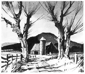
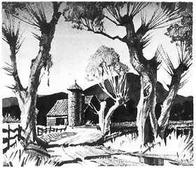
Starting at the top, example number 1 shows a monotonous arrangement. The barn and silo are centered, left to right; the flanking trees and mountain background are too evenly spaced.
In number 2, variety of pattern and informal balance have been achieved by the placement of the barn off center to the left; the curvature of the road has been accentuated in the foreground; and a willow has been added in the middle distance. The large tree to the right, reflected in the mud puddle, has also added interest.
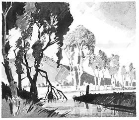
Number 3 has considerable line movement but fails to contain itself within the picture plane, as the perspective lines of sky, trees, and distant mountain all lead out of the picture, from the upper left to the lower right. As a counterbalance for this fault, in number 4, I have introduced a clump of dark tree forms on the right bank, and changed the slant of the mountain outline. Notice too, that the trees to the right being barren of foliage, provide a marked contrast to the fullness of the other tree masses.
In example number 5, we find the picture optically overweighted on the left side. Only by cropping it about one-third on the right, could proper balance be effected−which would make an upright shape instead of a horizontal one. By adding the two trees on the right side, and increasing the dark mass of trees in the middle distance farther to the right, number 6 becomes a well-balanced and more interesting composition. The changes that have been discussed and graphically shown here are in effect the kind of preliminary sketches I have recommended in the beginning of this chapter. It is not necessary to make them as complete as I have to serve the important purpose. Pencil may be substituted for the Sepia wash. The significant thing about it is that by making two or more studies prior to plotting the composition on your watercolor paper, much of the trial and error will be eliminated.
1
2
3
4
5
6
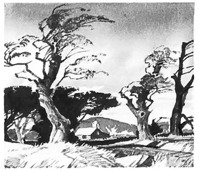
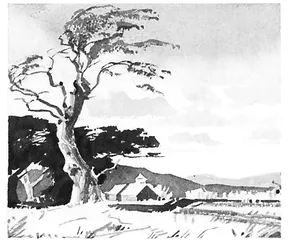
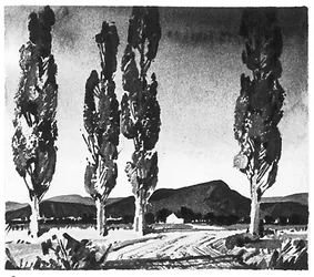
A very dramatic effect may be produced by a low eye level, intercepted by tall verticals. This is displayed in example 7, but it has the same monotony as example 1, on page 3. The even spacing of the trees with each one rising to the top produces a static effect that acts as a barrier to the eye. Now examine the picture opposite (number 8). I have eliminated one tree, and in re-spacing the others, opened up a passage for the road. The simple device of placing the white house foiled against the dark of the mountain carries the eye into the background. Also note that the second tree from the left side does not carry to the top and thereby helps to stop the vertical movement, returning the interest to the horizontal plane.
Now we come to four separate pictures that demonstrate particular features which need special explanation.
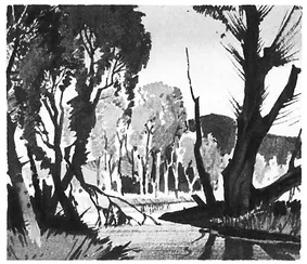
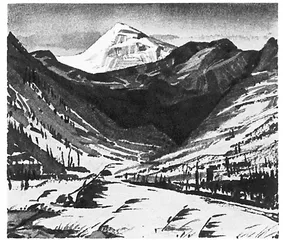
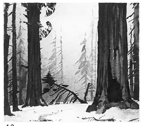
In painting mountains, and in fact all angular forms, there is a natural tendency to create monotony through the paralleling lines. I have tried to avoid this situation in number 9 of the mountain picture, by supporting the pyramidal snow-capped peak by a series of contrasting obliques. The eye, entering the composition on the flat foreground plane, is carried in a series of zigzag movements to the topmost peak. The larger masses are broken up with textural indications and varied in pattern by contrasting values. Distances are further enhanced by the receding scale of the trees, from those in the foreground to those suggested on the slopes. The giant Sequoias in picture number 10 would not impress us with their great scale were it not for the presence of the pines introduced alongside of them in the middle distance. This device of providing a unit of familiar measure−like a figure or animal−immediately creates the illusion of contrasting scale.
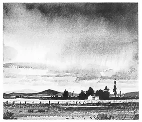
If you select a subject to paint that does not have perspective lines which lead into the picture (such as we find in examples 7 and 12), the illusion of depth may be obtained by varying the spacing of the parallel forms−shadows on the ground, a horizon line, or in the sky area, the cloud forms.
I have put this principle to work in picture number 11. The horizontal spacing diminishes from foreground to horizon on the ground plane, and also in the cloud forms, from the top to the horizon. The depth is further enhanced by the value arrangement which will be taken up in the next chapter.
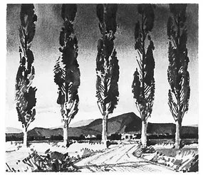
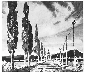
Picture number 12 presents one of the most powerful devices in composition, wherein all of the perspective lines− of the roadway, trees and telephone lines−lead the eye to a point of convergence at the horizon. In painting this kind of picture, it is important to avoid placing the point where all the perspective lines converge in the dead center. I have avoided this by (1) using a low eye level and (2) by forcing the end of the road off center, to the right.
7
8
9
10
11
12
VALUE ARRANGEM...
Table of contents
- Title Page
- Dedication
- Copyright Page
- Table of Contents
- INTRODUCTION
- MATERIALS
- COMPOSITION
- VALUE ARRANGEMENT
- FOG AND RAIN
- ROAD PUDDLES
- ON PAINTING ROADS
- USEFUL STROKES FOR PAINTING TREES
- PAINTING TRUNKS AND FOLIAGE
- THE FOREST
- TEN VARIETIES OF TREES
- THE WILLOWS
- EVERGREENS
- THE MAPLE TREE
- THE BIRCHES
- THE SYCAMORE
- THE PALMS
- THE ELM TREE
- THE OAKS
- LOMBARDY POPLAR AND ASPEN
- MONTEREY CYPRESS
- PRACTICE SUBJECTS
Frequently asked questions
Yes, you can cancel anytime from the Subscription tab in your account settings on the Perlego website. Your subscription will stay active until the end of your current billing period. Learn how to cancel your subscription
No, books cannot be downloaded as external files, such as PDFs, for use outside of Perlego. However, you can download books within the Perlego app for offline reading on mobile or tablet. Learn how to download books offline
Perlego offers two plans: Essential and Complete
- Essential is ideal for learners and professionals who enjoy exploring a wide range of subjects. Access the Essential Library with 800,000+ trusted titles and best-sellers across business, personal growth, and the humanities. Includes unlimited reading time and Standard Read Aloud voice.
- Complete: Perfect for advanced learners and researchers needing full, unrestricted access. Unlock 1.5M+ books across hundreds of subjects, including academic and specialized titles. The Complete Plan also includes advanced features like Premium Read Aloud and Research Assistant.
We are an online textbook subscription service, where you can get access to an entire online library for less than the price of a single book per month. With over 1.5 million books across 990+ topics, we’ve got you covered! Learn about our mission
Look out for the read-aloud symbol on your next book to see if you can listen to it. The read-aloud tool reads text aloud for you, highlighting the text as it is being read. You can pause it, speed it up and slow it down. Learn more about Read Aloud
Yes! You can use the Perlego app on both iOS and Android devices to read anytime, anywhere — even offline. Perfect for commutes or when you’re on the go.
Please note we cannot support devices running on iOS 13 and Android 7 or earlier. Learn more about using the app
Please note we cannot support devices running on iOS 13 and Android 7 or earlier. Learn more about using the app
Yes, you can access Painting Trees and Landscapes in Watercolor by Ted Kautzky in PDF and/or ePUB format, as well as other popular books in Art & Art Techniques. We have over 1.5 million books available in our catalogue for you to explore.