- 280 pages
- English
- ePUB (mobile friendly)
- Available on iOS & Android
eBook - ePub
About this book
Mobile user experience is a new frontier. Untethered from a keyboard and mouse, this rich design space is lush with opportunity to invent new and more human ways for people to interact with information. Invention requires casting off many anchors and conventions inherited from the last 50 years of computer science and traditional design and jumping head first into a new and unfamiliar design space.
Tools to learn more effectively

Saving Books

Keyword Search

Annotating Text

Listen to it instead
Information
CHAPTER 1
Casting Off Anchors
Preparing to Explore the Mobile Frontier
The Golden Age of Mobile | 4 |
Casting Off Anchors from the Past | 6 |
Section One: What Makes Mobile Different? | 8 |
Section Two: Emergent Mobile Patterns | 8 |
Section Three: Crafting Mobile Experiences | 8 |
Section Four: The Future of Mobile UX | 9 |
Excerpt: The Mobile Sinners | 10 |
Whenever I think of mobile user experience, I think of frontiers rather than the latest mobile app, the hottest mobile operating system, or debates over mobile apps versus mobile Web. Instead, for me, images of astronauts exploring lunar landscapes or the brave pioneers who settled the Wild West come to mind. Much like outer space or the western half of the U.S., I picture the mobile design space as a frontier that people can explore and invent new and more human ways for people to interact with information.
By definition, a frontier is simply the term used to describe the land that lies beyond a settled geographic region. Unlike similar words such as wilderness, sticks, or outback, the term frontier is subtly but significantly different in that it conjures up romantic notions that have long held the human imagination. A frontier represents more than a piece of land—it’s a word that symbolizes optimism, unlimited opportunity, and the shedding of current restraints. Frontiers inspire in us the sense that anything is possible.
In reality, thinking of the mobile user experience as an unsettled frontier is a romantic notion that at times can be difficult to sustain. Instead of an idyllic landscape of unfettered land, today the mobile industry looks a lot more like Figure 1.1.

FIGURE 1.1 Iconic image of the Oklahoma Land Rush of 1889.
On April 22 of 1889, an estimated 50,000 people lined up on the edge of an unsettled frontier in the United States to participate in a land run, later known as the Oklahoma Land Rush. On that day, the two million-acre restricted frontier known as the Unassigned Lands was opened for settlement by the U.S. government. In essence, the government gave away the land for free; all that settlers had to do was grab it. So picture 50,000 men and women mounted on their horses waiting for hours for a symbolic gunshot to be fired. Once that shot was fired, the race was on. They were free to claim their land. I’ve long loved this image because it captures what I imagine those settlers felt on that day—the frenetic energy of unbounded optimism.
Right now, the mobile industry feels a lot like this picture. Just like the Unassigned Lands, the mobile industry is a frontier that people want to talk about, hear about, speculate about, and grab a piece of for their very own. Mobile feels like an unsettled landscape that is there for the grabbing.
The design and user experience community is not immune to this sense of boundless opportunity. Everyone wants to get in on the action! Designers and user experience (UX) professionals are clamoring to get up to speed on designing for the latest mobile operating systems, while technologists fight holy wars over which mobile OS is superior. Philosophical debates rage over which design approach is superior: mobile Web sites or native applications. When it comes to mobile user experience, the design and UX community feels a lot like that picture: Mobile is where the action is.
Maybe you’ve been swept up in that energy already. Perhaps you picked up this book because you’re simply chomping at the bit to build a mobile application. Or maybe you hope this book will tell you how to tailor your existing Web site to a mobile device. Yes, this book will offer some insight into how to do those things, but there are other things I think you need to know first. It’s easy to get caught up in the mobile land rush and reduce the mobile experience to a new method or tool you need to learn or a technical platform you need to get up to speed on. Allowing the hype to reduce the mobile experience to just one of these areas puts you at risk for losing sight of quite possibly the most important and exciting part of what’s currently happening.
Those simple mobile devices you hold in the palm of your hand are offering a new way to think about computing. Unfettered from the keyboard and mouse, mobile devices give you the opportunity to invent new and more human ways for people to interact with information, and with each other.
You may wonder, “Why now? Mobile phones have been around for a long time. Why has mobile become this frontier of opportunity now?”
For what felt like the longest time, mobile UX was considered to be a small and obscure design space that most designers felt obliged to learn more about but loathed participating in because of all the inherent design constraints. Widespread adoption of new and more intuitive mobile devices has changed all that. Now, as increasingly more people are experiencing what it’s like to access and interact with information from nearly anywhere, mobile is no longer a niche topic. There’s never been a better time to design mobile experiences.
The Golden Age of Mobile
When I began working in the mobile industry seven years ago, mobile experiences truly stunk (as evidenced by Figure 1.2). At that time, a common industry credo was the more features, the better. Subsequently, mobile user experiences were abysmal. They were bloated with features, their user interfaces were confusing and unintuitive, and most users struggled to figure out how to make a simple voice call. There was no joy of use for mobile phones in those days. It was the age of the “Frankenphone.” Device experiences were truly miserable
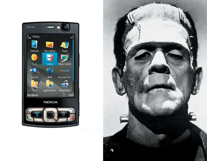
FIGURE 1.2 Before the iPhone was the age of the Frankenphone. Mobile phones were so bloated with features that users struggled to figure how to make a simple voice call.
But one little product changed all that. That product was the iPhone.
Steve Jobs, then CEO of Apple, Inc., unveiled the iPhone, as seen in Figure 1.3, to the public on January 9, 2007. The phone was not available in the United States until June of that same year. Throughout the United States, thousands of customers lined up outside Apple stores waiting to purchase the device, as shown in Figure 1.4. It was something the mobile industry had never seen before.
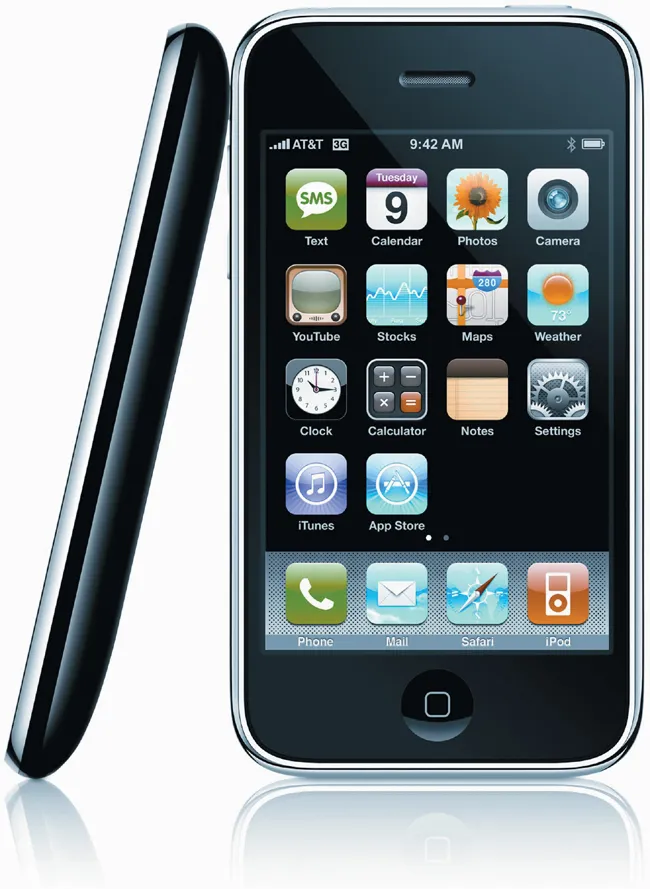
FIGURE 1.3 The passionate reaction to the launch of the iPhone resulted in sections of the media christening it the “Jesus phone.”

FIGURE 1.4 People in New York City waiting in line for the first iPhone in 2007.
Unlike its predecessors with bloated feature sets, the iPhone was a mobile device with a simplified bundle of truly useful applications. Instead of confusing hard keys and buttons, the iPhone had a seductive touchscreen paired with a visually elegant and intuitive interface. Not only was the iPhone a gorgeous product, but it also had something previous mobile devices did not have: The iPhone had a great user experience. The iPhone demonstrated to the mobile industry and the world what was possible when innovative mobile technology was paired with a stellar user experience. The iPhone was more than an innovative product; it was the first mobile device that got people—regular, everyday people (not just the geeks)—excited about using a mobile phone. The iPhone grew to symbolize the shedding of current restraints, newfound innovation, and a sense of unlimited opportunity in the mobile industry.
Much has happened since the iPhone’s release in 2007. Unlike other industries that are shrinking or flat, the mobile industry has experienced explosive growth and interest. There are now a plethora of tools and resources available that make it relatively easy for people from almost any walk of life to develop mobile applications. From tiny devices worn on the body to tablet-sized devices such as the iPad, people are pushing the boundaries of scale and form, constantly challenging what constitutes a mobile device. Since the iPhone was released, touchscreens on smartphones have become standard, clearing the path for designers to direct their creative energies toward developing new and emergent interface paradigms.
Unlike the Frankenphone days when little to no attention was paid to user experience, people now care and even talk about mobile user experience and its importance. Basically, the iPhone ushered in the golden age of mobile, when almost anything seems possible. The mobile space has entered into a new era of fast-moving innovation, investment, and creativity. There has never been a better time to begin exploring this new and exciting design space.
The iPhone is the product that opened up the mobile frontier for the rest of us.
Casting Off Anchors from the Past
Humans have two legs, making us inherently mobile beings. Yet for the past 50 years we’ve settled into a computing landscape that assumes a static context of use. While the wildly successful desktop paradigm enabled more people to interact with computers than its predecessors, it came with its own set of limitations. For example, countless design details—from input mechanisms and device form factors to assumptions about user engagement and interface design—have been made with a common and unfortunate assumption: That users have their butts in chairs and their eyes glued to computer screens. For all its success, the desktop paradigm was never designed to accommodate our pesky human desire to move and roam around the world. Mobility, which involves the ability to compute in mobile contexts, is an inherent human need that has been largely unaddressed for a very long time.
Mobility is an exciting concept, but busting out of this current desktop computing landscape isn’t as easy as it may sound. Like any frontier pioneered and settled before, the land of desktop computing has some advantages that are difficult to leave behind. Widespread acceptance and understanding of the p...
Table of contents
- Cover Page
- Title Page
- Copyright Page
- DEDICATION
- HOW TO USE THIS BOOK
- FREQUENTLY ASKED QUESTIONS
- CONTENTS
- FOREWORD
- CHAPTER 1 Casting Off Anchors: Preparing to Explore the Mobile Frontier
- CHAPTER 2 The Emergent Mobile NUI Paradigm: Traversing the GUI/NUI Chasm
- CHAPTER 3 Peanut Butter in Denver: Demystifying the Elusive Mobile Context
- CHAPTER 4 Shapeshifting: Convergence and Multidevice Experiences
- CHAPTER 5 Mobile UX Patterns: Designing for Mobility
- CHAPTER 6 Mobile Prototyping: Tools and Methods for Designing Mobile Experiences
- CHAPTER 7 Motion and Animation: A New Mobile UX Design Material
- CHAPTER 8 Awakening the Senses: Touch, Gesture, Voice, and Sound
- CHAPTER 9 New Mobile Forms: Pioneering the Mobile Frontier
- Index
- FIGURE CREDITS
- ACKNOWLEDGMENTS
- ABOUT THE AUTHOR
- Footnotes
Frequently asked questions
Yes, you can cancel anytime from the Subscription tab in your account settings on the Perlego website. Your subscription will stay active until the end of your current billing period. Learn how to cancel your subscription
No, books cannot be downloaded as external files, such as PDFs, for use outside of Perlego. However, you can download books within the Perlego app for offline reading on mobile or tablet. Learn how to download books offline
Perlego offers two plans: Essential and Complete
- Essential is ideal for learners and professionals who enjoy exploring a wide range of subjects. Access the Essential Library with 800,000+ trusted titles and best-sellers across business, personal growth, and the humanities. Includes unlimited reading time and Standard Read Aloud voice.
- Complete: Perfect for advanced learners and researchers needing full, unrestricted access. Unlock 1.4M+ books across hundreds of subjects, including academic and specialized titles. The Complete Plan also includes advanced features like Premium Read Aloud and Research Assistant.
We are an online textbook subscription service, where you can get access to an entire online library for less than the price of a single book per month. With over 1 million books across 990+ topics, we’ve got you covered! Learn about our mission
Look out for the read-aloud symbol on your next book to see if you can listen to it. The read-aloud tool reads text aloud for you, highlighting the text as it is being read. You can pause it, speed it up and slow it down. Learn more about Read Aloud
Yes! You can use the Perlego app on both iOS and Android devices to read anytime, anywhere — even offline. Perfect for commutes or when you’re on the go.
Please note we cannot support devices running on iOS 13 and Android 7 or earlier. Learn more about using the app
Please note we cannot support devices running on iOS 13 and Android 7 or earlier. Learn more about using the app
Yes, you can access The Mobile Frontier by Rachel Hinman in PDF and/or ePUB format, as well as other popular books in Computer Science & Entreprise Applications. We have over one million books available in our catalogue for you to explore.