![]()
III
Specific tasks
![]()
CHAPTER 7
Visual perception and the brain
IT HELPS TO KNOW A LITTLE about how the human brain processes visual information. It’s very popular to explain this in terms of evolution, even though it is largely speculative. Nevertheless, the great majority of our million years or so on earth involved finding things to eat and spotting predators before they spotted us. Sitting down and looking at data is a new preoccupation, but uses the same old hunter-gatherer apparatus (eyes and brain). We tend to notice only the very broadest outlines of our surroundings except for one or two things that stand out in some way and draw our attention.
As a first principle, any visualization should convey its information quickly and easily, and with minimal scope for misunderstanding. Unnecessary visual clutter makes more work for the reader’s brain to do, slows down the understanding (at which point they may give up) and may even allow some incorrect interpretations to creep in. You might hear this called chartjunk. The designer Edward Tufte encourages us to think about the data:ink ratio, which you should try to keep high at all times. Statistician William Cleveland was more specific: the plot region is the part of any visualization that has to be clutter-free. That is the space between axes where the data appear. Annotations, examples, and even just eye candy outside the plot region impacts less on understanding. Sometimes a key, showing what different colors stand for, can be placed in the plot region without intruding much on the reader’s attention.
Figure 7.1 A version of Figure 4.6 with a better data-to-ink ratio.
Although simplicity helps to avoid distraction, and some designers claim that a good visualization will require no explanation, not even axis labels, a legend or key, most experienced data analysts recognize that some explanation and guidance is essential. Complicated visualizations can make use of a “How to read this chart” paragraph, and talking the reader through how to identify and interpret one of the aspects of the data can be helpful.
Getting the reader to understanding the visualization at the time is a different task than getting them to remember the image or its message. Some research has found that including relevant and witty chartjunk can actually help recall, but it has to be done carefully.
7.1 ATTENTION AND CLARITY
Often, a visualization tells a story or conveys one specific message out of a larger analysis. Scientific training discourages analysts from telling the reader what to think, but in dataviz it may be important. Such points of interest can be highlighted: a steady increase in a line chart or one out of a cloud of markers in a scatter plot, for example.
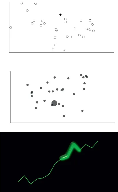
This can be done effectively without cluttering by using pre-attentive cues. These are features that our brains seem to be hardwired to detect. We can add unobtrusive features to our visualizations just to help tell the story like this. In Figure 7.2, one marker is highlighted by color, another by size, then part of a line chart by shading around it. Very little is needed to draw the eye. I challenge you not to look at those points!
Figure 7.2 Examples of pre-attentive features.
Crucially, these highlights have to be used sparingly. If there are too many of them, the reader will feel overloaded with information and they will no longer work. If you are making visualizations, be careful not to fall into a trap where you are very familiar with the data, so everything you create makes perfect sense to you. Experimentation and user testing will help you out. In Chapter 17, I am going to revisit some of these highlights and link them to everything else that surrounds the visualization.
We can also influence how the reader sees objects as being connected in some way. Good data visualization builds on the long-established Gestalt principles. The most obvious is that objects (like markers or lines) that are close together in a cluster and distinct from others farther away will be seen as connected. If we encode some of our variables as location or length then this follows naturally. But there are others that are not used so often:
• Draw subtle lines connecting the objects of interest together.
• Identify a group by a very distinct color and shape (for markers) or pattern and thickness (for lines).
• Enclose them in a shaded area, or surrounding oval or rectangle (more complex shapes will lose this effect).
Of course, it’s not always possible to connect objects in the visualization without clutter, but it is worth considering. As with the pre-attentive cues, don’t overload the reader. There should only be one group that gets connected per visualization for maximum impact, and going beyond this can backfire. If you have multiple messages, maybe you need multiple visualizations (or an interactive one).
Jittering takes objects that confusingly coincide on the visualization and moves them by small random amounts. Scatter plots with markers piled on top of one another now have a cloud of closely packed markers around a common point, and line charts with the same problem now have a bundle of lines moving closely together from one common end to another.
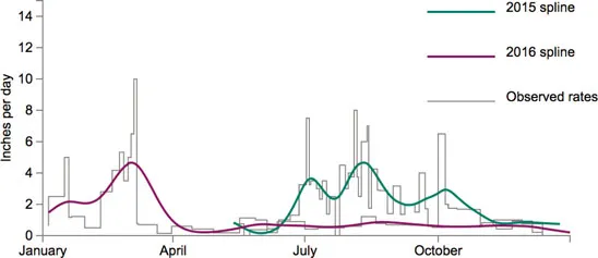
Figure 7.3 Observed rates of bird seed consumption in my garden, and smoothed lines through the data using splines. robertgrantstats.co.uk/dataviz/birdfeeders
Smoothing is perhaps the opposite of jittering, in that a lot of information gets summarized into one simple impression. A curve wiggles through a scatter plot, tracking the markers, or through a chart with multiple lines, showing a summary of the patterns (Figure 7.3).
The important feature of smoothed curves is that the smoothness is not part of the data. In the bird feeder data of Figure 7.3, the consumption often changes, and the resulting lines are very rough series of steps up and down (the gray lines). Most readers would find it hard to see the overall pattern, but the smoothed lines make it easier: more seeds consumed in summer 2015 and spring 2016, less so in the winter and through the rest of 2016. We are compromising by bending the natural line of the data, with the intention of improving understanding.
In Chapter 10, we’ll explore different techniques for smoothing in the context of models that predict one variable based on others. If your aim is not as formal as all that, and you just want to give a simplified impression, you could try a trick suggested by John Tukey that didn’t catch on: instead of small markers like circles, draw a vertical line for each data point. The overall shape will be apparent to readers but the central locations on the line will not be obvious (Figure 7.4).
Sometimes, there is a good reason for breaking a sequence of data into more than one smoothed line. For example, if you have economic data before and after the credit crunch of 2008, then you know from the context, even before you draw the data, that it could be represented as one smooth curve before and another smooth curve after the crunch.
Another simplifying trick which we will encounter in Chapter 11 is edge bundling, where lines connecting points together are artificially pulled together to reduce the spaghetti effect.
Semi-transparency is a great all-round tool for busy visualizations, also known as opacity. This allows lines, markers and such that coincide to be seen. Those in the background show through slightly. When markers are piled on top of one another, they look extra dark compared to others on their own. Because semi-transparency is more like the real world, we get an impression of lines moving continuously over and under one another and are able to take in more information immediately. There are several images in this book with semi-transparency, such as Figure 8.2; even though there are many markers or lines, you can see where they pile up in greater numbers.
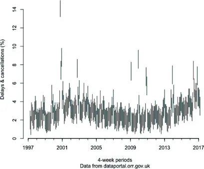
Figure 7.4 Tukey’s smoothing by drawing vertical lines instead of points, applied to the train delay data from Chapter 2.
Colors, lengths, and areas are some of the attributes to which we have been encoding data. These are stimuli that get perceived by the brain. Not all stimuli have the same effect; the psychologist Stanley Smith Stevens showed that, if you double a length, it will be perceived accurately as twice the size of the original, but doubling an area is underestimated as 1.6 times bigger, while doubling the redness of a color is overestimated as 3.2 times bigger. This is why serious data visualization experts don’t like encoding things to area or color unless they are just ordinal (or you are happy for them to be understood as such).
7.2 CULTURAL ASSUMPTIONS
In many of the visualizations we’ve seen so far, time has been encoded to the horizontal location, with old data on the left and new data on the right. Why? This is an artifact of reading from left to right, and is so universal in dataviz that it is preferred even by writers of right-to-left alphabets like Arabic. Colors, too, do not have a universal meaning. Red is dangerous in some places and auspicious in others. It is a good idea not to assume your reader understands this sort of culture-specific encoding.
Some visualization formats are themselves cues to interpret the data in a specific way. For example, connections between data points have been visualized in the style of a subway map, and lists of items in the style of a periodic table of chemical elements. The trouble here is that, unless these are aimed wholly at city dwellers or chemists, not everyone will know what you are implying by the format. Although they are creative and fun, creators of these sorts of visualizations have sometimes been mocked for not having understood the thing they imitated. Do the distances between the subway stops represent anything? Is there actually periodicity in what looks like a periodic table, or is it just a glorified list?
7.3 LEARNING FROM OPTICAL ILLUSIONS
In data visualization, optical illusions are not just fun but actually give us some clues as to ways that people might misinterpret our work.
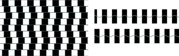
The café wall illusion (Figure 7.5, left) is one that may well affect data visualizations with blocks of color, causing lines to appear sloped when they are actually not. Lines entering and leaving shaded regions can also appear to bend (Figure 7.7), and wavy lines appear flatter or taller than they really are (Figure 7.5, right). Any visualization with high-contrast blocks of background color might be at risk from these effects.
Figure 7.5 The café wall illusion (left), where all lines are actually straight and either vertical or horizontal. A related illusion by Akiyoshi Kitaoka (right), where the two gray waves are identical in height. Left image by Wikipedia user “Fibonacci” - Own work, CC BY-SA 3.0, https://commons.wikimedia.org/w/index.php?curid=1788689. Right image by Akiyoshi Kitaoka, used with permission.
Figure 7.6 The Ebbingh...