- 105 pages
- English
- ePUB (mobile friendly)
- Available on iOS & Android
eBook - ePub
Baseline Assessment and Monitoring in Primary Schools
About this book
First Published in 1999. This book offers the reader a detailed picture of attitudes and self-concepts of pupils and their growing achievements as they move through primary education. Acknowledging the complexity of schools and schooling, Peter Tymms shows with many charts, diagrams and data displays how reliable measures can be used to track pupils' development. Systematic data collection and interpretation are based on the well-established Performance Indicators in Primary School (PIPS) project. Important policy and practical questions are addressed, and some surprising conclusions are reached. Gaps in knowledge are also identified and way to full them are outlines. Teachers, headteachers, middle managers, policy makers, INSET providers in primary schools and student teachers will welcome this text.
Trusted by 375,005 students
Access to over 1.5 million titles for a fair monthly price.
Study more efficiently using our study tools.
Information
Topic
EducationSubtopic
Education GeneralChapter 1
Introduction
How do we know what we know about primary pupils and the progress that they make? The answers to such an apparently simple question are quite diverse. Clearly everyone involved with education in the primary years has first-hand knowledge of pupils and the way that they develop. This is important information, but it is held in the minds of many thousands of individual professionals and cannot readily be accessed by others. One could try to distil and pass on this information. Processes such as mentoring and teacher training do this, at least in part. Such information is also passed on informally from one teacher to another and in its totality forms a rich vein of professional working knowledge.
Other information comes from more formal attempts to learn about pupils and they come under the heading of educational research. But this general heading has a variety of sub-headings. Research into education is unique in being conducted by specialists in a bewildering variety of academic disciplines. There are historians, scientists, mathematicians, philosophers, sociologists, psychologists and others. Each makes a contribution to educational research, bringing their own techniques (and baggage) to the process. This book attempts to provide a picture of pupils using an approach that is uniquely suitable to providing an overview of the progress that they make in primary schools. It draws strength from information collected from thousands of pupils as part of the PIPS project. This information is collected through surveys, assessments and tests involving pupils throughout the primary age range.
A lot of material is presented and much of it is numerical. It is described in the text but it is also presented in a variety of charts some types of which will be familiar to the reader whilst others may be new. The first chapter describes four different forms of presentation and the metric ‘Effect Size’ which is used throughout. The next chapter takes a careful look at assessments in general and at baseline assessment in particular. Chapter 3 considers the differences between pupils and the way in which they develop during the primary years. Chapter 4 explores the concept of Value-added and how the results of assessments can be used to look at the progress that pupils make. This is followed by a consideration of their attitudes, including self-concepts.
The last two chapters are devoted to considering how change can be handled within education and how research can be organised to help find things out and assist in the planning of policy.
1.1 Bar charts and histograms
One of the simplest ways to show information is to use a bar chart. It can show how many people belong to particular categories. By way of example we will look at the responses of Year 6 pupils to one of the questions asked about their feelings towards school in the PIPS project. The pupils were asked to say how much they agreed with the statement: People are nice to me at school. They chose their responses from five options: False. Mostly false. Sometimes true/sometimes false. Mostly true. True. The responses1 from 1998 are shown in Figure 1.1, which compares the results of girls and boys.
The most common response from both girls and boys is to choose ‘True’ with over 40 per cent of both sexes opting for this reply. To see this is very gratifying and it is also nice to note that less than 10 per cent of boys and of girls choose the ‘False’ option. Overall, the girls are slightly more positive than the boys in their responses. About 5 per cent more girls than boys pick the most positive response and more boys than girls pick the negative responses.
Whilst bar charts are used to show categories, histograms can be used to show information that is continuous. Examples of continuous data include age, scores on an arithmetic assessment, salaries, attitudes and self-concept. Although the last chart showed one aspect of the feelings of pupils about school it was organised into categories simply because that was how the information was collected. The pupils’ feelings are not really in boxes, we created the categories artificially. Feelings are on a continuum. The example below shows a histogram of the scores of Year 6 pupils on a continuous measure called ‘Attitude to School’. It was formed by averaging the pupils’ responses to a series of statements about school. One of those items was discussed when looking at bar charts above and further examples follow:
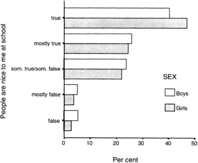
Figure 1.1 Bar chart
• I look forward to school.
• I like my teachers.
• I like the lessons.
There were seven statements in all and for each one the pupils picked one of the five responses. These responses were given numbers from one to five with five being the most positive. The average response was then calculated to give an overall measure of Attitude to School. These responses are shown in the histogram in Figure 1.2.
The horizontal scale is given in numbers of pupils whereas in Figure 1.1 the horizontal scale is based on the percentage of pupils. It can be useful to see how many subjects are involved but proportions can also be informative and both are used in this book. The vertical scale runs from one to five and each bar represents the number of pupils within a particular range of scores from their responses to the seven questions. The distribution shows a marked tendency for pupils to pick the more positive responses. This tendency towards higher scores gives an asymmetrical spread of results that is known as a skewed distribution.
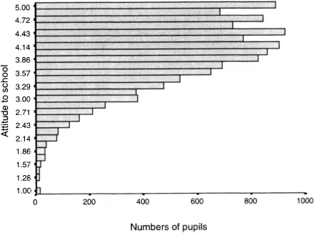
Figure 1.2 Histogram
1.2 Box-and-whisker plots
One nice way to summarise the kinds of data shown in the last diagram is to use box-and-whisker plots. They were invented by the statistician Tukey and are useful when dealing with continuous measures. Tukey’s innovative diagrams are becoming quite common and are a useful way in which to look at information. They are used extensively in this book.
Box-and-whisker plots of the Attitude to School data, which was shown in the histogram earlier, are shown in Figure 1.3 for boys and girls separately.
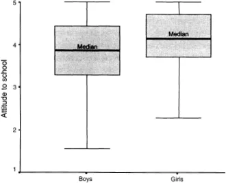
Figure 1.3 Box-and-whisker plots
The plots show how the Attitude to School scores are distributed. The two horizontal lines in the boxes show the middles of the two distributions. They are the medians and they divide the girls and boys into two equally sized groups. The two boxes each hold half of the boys and girls. A quarter of the boys and a quarter of the girls come above the boxes and a quarter below. The lowest lines of the boxes are the 25th percentiles - also know as the lower quartiles. The tops of the boxes are the 75th percentiles - also known as the upper quartiles. (A percentile indicates the percentage of pupils that obtain scores below the chosen one. The median, for example, is the 50th percentile since half of the pupils have scores below the median.)
The whiskers extend upwards to the highest score and downward to the lowest score. Unusual scores, known as outliers, may exist beyond the whiskers but for the sake of simplicity they are not shown in this book.
Figure 1.3 shows that scores are generally grouped towards the high end and the asymmetrical whiskers emphasise the skewness which is seen in Figure 1.2. The girls generally have higher scores on the Attitude to School scale than the boys. This is particularly noticeable at the more negative end of the scale where the boys dominate the chart. This is of educational significance. The chart shows that the majority of pupils at the top end of our primary schools and about to go to secondary school are very positive towards school. But there is a minority that do not like or enjoy school. Boys dominate this negative minority.
The average difference between girls and boys is clearly visible on the chart. The average score for boys was 3.81 and for girls it was 4.12. The next section shows how these averages can be presented together with estimates of how accurately they were measured. This is followed by a section that discusses how these averages can be used to find Effect Sizes - a crucial concept in educational research.
1.3 Confidence Intervals
We all know that measurements have uncertainties associated with them. Sometimes these uncertainties are regarded as so small that we tend not to be concerned with them in everyday life. However, even something as commonplace as measuring the length of an object with a ruler involves uncertainties. Indeed there are uncertainties with all measurements and it is important to recognise this whenever we use scores.
Assessments of knowledge and feelings are inherently less accurate than measures of length and it is particularly important to acknowledge the uncertainties surrounding those assessments. It is all too easy to assume that an assessment has pinned things down. To hear that Abigail has an IQ of 140 creates an inevitable impression but to know that the assessment had a stated uncertainty of plus or minus 20 puts a different complexion on the information.
The chart below (Figure 1.4) shows the average Attitude to School score for girls and boys together with the uncertainties surrounding those averages. The degrees of uncertainty, or certainty, are shown as the 95 per cent Confidence Intervals.
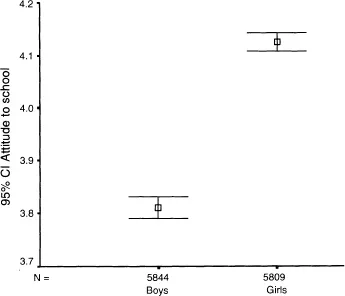
Figure 1.4 Means with Confidence Intervals
The little squares mark the average scores and the vertical bars above and below the squares mark the ends of the Confidence Intervals. The averages are estimates of the ‘true’ averages for Year 6 pupils but we cannot be sure that they are precise. We can, however, be fairly confident that the ‘true’ results lie somewhere within the horizontal lines which come at the ends at the vertical lines. Sometimes, but rarely, the ‘true’ result will be outside the vertical bars. In other words the Confidence Intervals are guides that help us gauge how accurately we have estimated the average for the boys and the girls. It is as though we look at measures through glasses that always make the results blurred and the confidence intervals give us a feel of how blurred the results are....
Table of contents
- Cover
- Title Page
- Copyright Page
- Contents
- Preface
- Acknowledgements
- 1 Introduction
- 2 Baseline and other assessments
- 3 Achievements and the differences between pupils
- 4 Value-added
- 5 Attitudes
- 6 How to live in a fog
- 7 What we do and do not know and how we can find things out
- References
- Index
Frequently asked questions
Yes, you can cancel anytime from the Subscription tab in your account settings on the Perlego website. Your subscription will stay active until the end of your current billing period. Learn how to cancel your subscription
No, books cannot be downloaded as external files, such as PDFs, for use outside of Perlego. However, you can download books within the Perlego app for offline reading on mobile or tablet. Learn how to download books offline
Perlego offers two plans: Essential and Complete
- Essential is ideal for learners and professionals who enjoy exploring a wide range of subjects. Access the Essential Library with 800,000+ trusted titles and best-sellers across business, personal growth, and the humanities. Includes unlimited reading time and Standard Read Aloud voice.
- Complete: Perfect for advanced learners and researchers needing full, unrestricted access. Unlock 1.5M+ books across hundreds of subjects, including academic and specialized titles. The Complete Plan also includes advanced features like Premium Read Aloud and Research Assistant.
We are an online textbook subscription service, where you can get access to an entire online library for less than the price of a single book per month. With over 1.5 million books across 990+ topics, we’ve got you covered! Learn about our mission
Look out for the read-aloud symbol on your next book to see if you can listen to it. The read-aloud tool reads text aloud for you, highlighting the text as it is being read. You can pause it, speed it up and slow it down. Learn more about Read Aloud
Yes! You can use the Perlego app on both iOS and Android devices to read anytime, anywhere — even offline. Perfect for commutes or when you’re on the go.
Please note we cannot support devices running on iOS 13 and Android 7 or earlier. Learn more about using the app
Please note we cannot support devices running on iOS 13 and Android 7 or earlier. Learn more about using the app
Yes, you can access Baseline Assessment and Monitoring in Primary Schools by Peter Tymms in PDF and/or ePUB format, as well as other popular books in Education & Education General. We have over 1.5 million books available in our catalogue for you to explore.