The Global North-South Atlas
eBook - ePub

The Global North-South Atlas

Mapping Global Change

  1. 168 pages
  2. English
  3. ePUB (mobile friendly)
  4. Available on iOS & Android
eBook - ePub

The Global North-South Atlas

Mapping Global Change

Book details
Book preview
Table of contents
Citations

About This Book

This innovative atlas deconstructs the contemporary image of the North–South divide between developed and underdeveloped countries which was established by the 1980 Brandt Line, and advocates the need for the international community to redraw the global map to be fit for the 21st century.

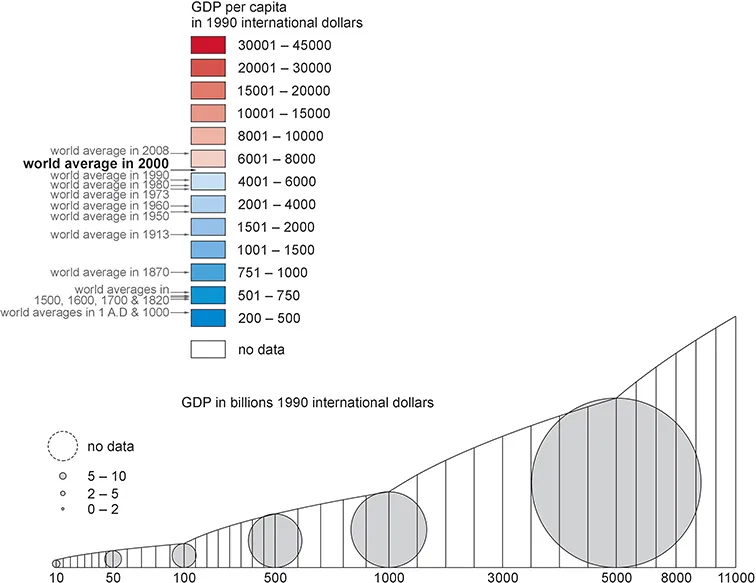
Throughout the book a range of colorful maps and charts graphically demonstrate the ways in which the world has changed over the last 2, 000 years. The atlas first analyzes the genesis and characteristics of the Brandt Line's North–South divide, before going on to discuss its validity through the centuries, especially before and after 1980, and demonstrating the many definitions and philosophies of development that exist or may exist, which make it difficult to define a single notion of a Global North and South. The book concludes by proposing new schemes of categorization between developed and developing countries which might better fit our contemporary global society.

This book will serve as a perfect textbook for students studying global divisions within geography, politics, economics, international relations, and development departments, as well as being a useful guide for researchers, and for those working in NGOs and government institutions.

Frequently asked questions

Simply head over to the account section in settings and click on “Cancel Subscription” - it’s as simple as that. After you cancel, your membership will stay active for the remainder of the time you’ve paid for. Learn more here.
At the moment all of our mobile-responsive ePub books are available to download via the app. Most of our PDFs are also available to download and we're working on making the final remaining ones downloadable now. Learn more here.
Both plans give you full access to the library and all of Perlego’s features. The only differences are the price and subscription period: With the annual plan you’ll save around 30% compared to 12 months on the monthly plan.
We are an online textbook subscription service, where you can get access to an entire online library for less than the price of a single book per month. With over 1 million books across 1000+ topics, we’ve got you covered! Learn more here.
Look out for the read-aloud symbol on your next book to see if you can listen to it. The read-aloud tool reads text aloud for you, highlighting the text as it is being read. You can pause it, speed it up and slow it down. Learn more here.
Yes, you can access The Global North-South Atlas by Marcin Wojciech Solarz in PDF and/or ePUB format, as well as other popular books in Economics & Economic Theory. We have over one million books available in our catalogue for you to explore.

Information

Publisher
Routledge
Year
2019
ISBN
9780429959684
Edition
1

1

MAPPING GLOBAL CHANGE

Differences in development and wealth from the 1st to the 21st century

Developmental inequalities exist at every level of human political organization, but the crucial role of the nation state in the modern world makes the inequalities between these entities the most important. A country’s status, autonomy, and international political options all depend on its level of development. Differences in development levels between countries are also important at the “molecular” level, as they are reflected in the lives of individuals. Having here maps based on the contemporary political map is also a result of the way(s) in which the source data on which these maps have been compiled were aggregated. It seems that Maddison’s general assumption was to give GDP and GDP per capita estimations based on the boundaries of modern states, although he made some exceptions, that were sometimes ignored for practical or other reasons here on maps (Maddison 2006). This chapter contains five series of maps; four trace the evolution of GDP and GDP per capita, and one shows the changes in human development.
The series of maps for GDP and GDP per capita vary in both detail and time scale. Time and precision are inversely correlated here. The longer the timeframe, the greater the area(s) to which the data pertain, and, by virtue of the manner with which Angus Maddison aggregated the data, their geographical boundaries are sometimes quite special. In the case of GDP and GDP per capita, the detailed series of maps cover respectively 13 territorial entities (16 maps for the years 1–2008), 22 entities (14 maps for 1500–2008), 69 entities (ten maps for 1870–2008), and all the countries in the world (eight maps for 1950–2017). The series related to the evolution of human development level encompasses all the countries in the world in the period 1980–2017 (five maps). HDI levels are marked with color and areas of circles correspond to the population(s) of the given country(ies) (in the case of previous series, GDP per capita and GDP respectively). This additionally allows quality of life to be examined not only through the prism of states but also in societies. This series is the shortest, as the history of HDI only dates back to 1990, and historical analyses of human development have only been conducted over a limited time period. It should be emphasized that an accurate reading of the maps in this chapter requires a thorough reading of both the legend (the four series of maps for GDP and GDP per capita have a common legend (Figure 1.1), as do the maps in the HDI series (Figure 1.57); the exception being maps for 2017, which have their own legends (Figures 1.54 and 1.62), and a separate introductory map that has been inserted into each series (with the exception of human development maps showing data for all the countries of the world) to illustrate the way(s) in which the data were geographically aggregated, i.e. to depict the regions described by the data (Figures 1.3, 1.20, 1.35, 1.46).
FIGURE 1.1 A common legend for all series of maps showing GDP and GDP per capita (1ad–2008)
Source: Own elaboration
Any attempt to show world development over the past 2000 years is fraught with risk. During this time, a great many polities have risen and fallen and political boundaries have changed radically. Moreover, the essence and understanding of development have changed. The more distant the past, the fewer the hard figures, and the more uncertain, questionable, and debatable the estimates and hypotheses. As noted above, the maps below for 1–2000 (GDP and GDP per capita) are based on estimates by Angus Maddison (2006), subsequently extended to 2008 with his data available on a website managed by a team that has been continuing his work at the Groningen Growth and Development Center since his death (Maddison 2010). Maddison’s final estimates published on this website have been partially revi...

Table of contents

  1. Cover
  2. Half Title
  3. Title Page
  4. Copyright Page
  5. Table of Contents
  6. List of figures
  7. Editorial page
  8. Acknowledgments
  9. Introduction: The Brandt Line: political or developmental boundary
  10. 1. Mapping global change: differences in development and wealth from the 1st to the 21st century
  11. 2. Different philosophies of development: different development boundary lines
  12. 3. Towards a new global line?
  13. 4. Conclusions
  14. Bibliography
  15. Index