![]()
Chapter 1
Composition and Lighting
Before exploring visual effects we need to lay down some of the fundamentals of image making. Cinematography tells a silent story through the framing and lighting of the subject. A visual effects cameraperson must first understand and practice the techniques of standard cinematography before engaging in more exotic methods. The best visual effect is one that invisibly enhances an image that has been painstakingly created by the Director of Photography and his or her crew, so it is important to understand cinematography from its inception. What follows is an elementary examination of two key elements that are used to create the image.
Most of us are inherently good at composition. It is only when we think about it too much that we stumble over the rules. If you give a child a camera and ask him or her to take a picture of the ocean, you will usually get a well-composed shot that tells a story of the ocean or the sky (there are only two elements), depending upon what strikes the child at the moment. If the horizon is placed in the center, it is a rather uninteresting shot that doesn't have a point of view (ocean or sky). If the horizon is placed too high, so that the sky is almost out of the frame, the composition becomes uncomfortable because people have a sense of psychological closure and will want the sky out of the frame altogether. Seeing just a sliver of something creates tension.
Steven Spielberg used this compositional tension in the first scene of the movie Jaws, where the shark kills the first victim. In the shots of the ocean, the compositions are purposely off-balance to create an unsettling premonition of what is to come. If the horizon is brought down to a point that is comfortable, it will usually land around what is known as the “golden section.”
Figure 1.1 This composition slices the frame in two and doesn't favor one subject over the other. It becomes neutral in terms of point of view.
Figure 1.2 This composition is unsettling because there is only a tiny sliver of sky. The outside of the frame seems to pull on it to try to close it up and get rid of it. This kind of composition can be used to create tension; you can see the technique used in the opening scene of Jaws.
Figure 1.3 A pleasing, balanced composition that tells a story about the sky.
Figure 1.4 A pleasing composition that tells a story about the ocean. The horizon line bisects the frame at the“golden section.”
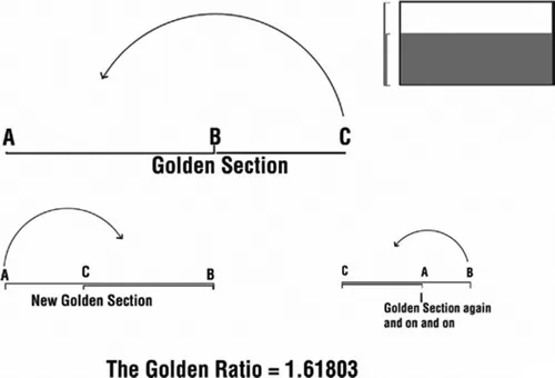
The golden section or golden mean is a mathematical formula for proportion that was worked out by the Greek mathematician Pythagoras as early as 530 BCE and promoted by Leonardo da Vinci (1452–1519), the great Renaissance painter and inventor. This golden section or ratio is 1.61803, and when it is used to divide a line, the resulting proportion will continue itself forever. Figure 1.5 shows a line from A to C that has been divided at the golden section at B. If the line is folded over at B to move C toward A, another golden section will be created where the paper meets. You can keep folding the paper at this division and it will always repeat. This is what makes the ratio so special—it mimics the natural repeating proportions in nature. Artists have used it for years for the composition of paintings and the proportions in sculpture.
Figure 1.5 The golden section is a magical ratio that not only creates pleasing compositions but also repeats itself endlessly when folded upon itself. The box in the upper right corner is a 1.85 frame divided by a golden section.
In 1927 a famous Swiss-French architect, Le Corbusier (Charles E. Jeanneret, 1887–1965), created a system called the Modulor. The Modulor used the golden section to determine the proportions in a human figure. For example, the navel marks the golden section of the human body from the top of the head to the feet. It again repeats itself from the naval to the knees to the feet. The golden section is also found from shoulder to elbow to forearm. The section is roughly three units to five units.
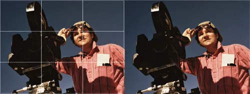
Some camerapeople use the idea of the golden ratio by dividing up the frame into nine quadrants with two horizontal and two vertical. The idea behind this “rule of thirds” is that if you place the point of interest at an intersection of these lines, you will generally wind up with a good composition. The picture in Figure 1.6 uses this technique. The cameraman's eye is placed on the upper right-hand intersection, and the picture becomes a story about the cameraman. Also note the use of the low camera angle (the camera looking up). This technique emphasizes the subject and makes him appear larger than life. This works because in our early years we were always looking up to our parents, who held great importance to us. The opposite effect occurs in high-angle shots, in which the subject is diminished in importance.
Our eyes only have one focal length. In 35 mm motion pictures, this is roughly the equivalent of a 50 mm lens. Our eyes never “zoom in”; only our mind does, when we concentrate on a particular subject in our field of view. The camera gives us the ability to have many different lens focal lengths that can simulate what goes on in our mind. The most important phenomenon to remember about using different lenses is that wide lenses not only give you a wider field of view but also tend to keep everything in focus. A longer focal length lens (which is what you look through when you zoom in) sees less of the scene and tends to have shallower focus or depth of field. This means that the subject will be in focus but the background will go soft. Many cinematographers use this phenomenon to help separate the subject from the background.
Figure 1.6 The use of the rule of thirds in a 1.33 composition.
The other attribute of lenses with longer focal lengths is that they compress the pictorial elements in depth and make elements of the scene look like they are right next to each other when in fact they are quite far apart. Once again, Spielberg used these principles to great effect in Jaws, in the scene where the sheriff is on the beach and sees the shark in the water. Spielberg used what is called a dolly zoom: the camera starts out close on the sheriff with a wide lens, and then pulls back while zooming in to keep the sheriff's face the same size in the frame. The image that results is the sheriff's static face with a background that seems to compress and pile up behind him. It is a clever use of lens technique to achieve a startlingly dramatic result.
In my early days, we had few avenues for learning how to light. The usual training exercise was to light a person's face using a hard key light angling down to create a slight offset shadow to the nose for pleasant modeling. Next, a large soft light was used from the camera position to “fill in” the shadows so that they would not be crushingly dark. To obtain a lighting ratio for pleasing contrast, a light meter reading was taken of both key and fill light combined, and then the key light was blocked off and a reading was taken of the fill light alone. If key and fill read f/8 and the fill alone read f/5.6, then the key plus fill would be twice as bright as the fill alone and result in a fairly flat 2:1 ratio. Some authors at that time who were more concerned with tone reproduction than art would habitually recommend no more than a 3:1 lighting ratio. The last light to kiss in on the subject was a “kicker” or back light that was used for isolating the figure from the background. Finally, a background light was used to illuminate the back wall, usually through a card with a random pattern of cutouts called a cookaloris. This “broke up” the light on the background, creating a bit of interest, and if rendered soft would draw more focused attention to the subject.
If the lighting instruction covered color, the general rule given was that a cooler tone (such as blue) lighting the background would make it recede and bring up the prominence of the subject. Using colored gels or a different color temperature on the foreground was frowned upon, as flesh tones would not be reproduced accurately. These light placements were a great way to light a newscaster and put forth basic ideas. To tell stories with pictures, however, we need to build upon these basic principles and break the rules once in a while when we start to paint with light. The rules I speak of involve the direction, quality, and ratio of the light.
The key light is the primary source of light that provides definition in the form of the figure. The hard key light I spoke of previously is based on conventional stage lighting that is designed to emulate the kind of lighting on a face that we see during a pleasing time of day, such as 10:00 a.m. There is nice modeling to the face because the shadow direction doesn't overpower other features of the face, as would happened with high noon lighting directly overhead. Top lighting from directly above is generally avoided because the eyes disappear, falling into deep shadow from the overhanging brow, and the nose casts a long shadow over the mouth. Is it wrong to have the key light overhead? Not at all if the scene demands it. In the opening scene of The Godfather, for example, all the characters in the Don's office are lit this way. The gangster characters look like skulls skulking within dark confines. The quality of the key light does not have to be hard light either. In our standard example in Figure 1.7, the key light was hard because it was “mimicking” sunlight, but it is not wrong to have a soft key or a soft fill structure. In fact, many cinematographers follow this method to achieve a pleasing look.
The main purpose of the key light is not only to define and reveal the main subject but also to tell a story about the character. Key lighting is a difficult subject to teach because of the tremendous variety of situations and stories. The important thing to remember is that you can place the key light anywhere as long as it does its job of contributing to the story.
As I mentioned before, the general recommendation used to be for photographers to avoid going beyond a 3:1 lighting ratio. Gosh! What if you didn't use a fill light? Would the video police come after you? Once again, the fill light is needed when it's needed; any ratio from no fill at all on up to 1:1 can be perfectly valid. Different colors of light can be used as well. Many cinematographers will add yellow or blue gels to warm up or cool down different areas of the frame to add depth and meaning to shots. It is rare, however, that this coloration exceeds the correct color temperature to the point at which the scene can't be corrected for a re...