- 346 pages
- English
- ePUB (mobile friendly)
- Available on iOS & Android
eBook - ePub
About this book
In recent years, there has been considerable interest in the problems that public spaces face because of the design of commercial signs. The negative consequences that commercial signs can have on the visual quality of urban areas and further more, on people's quality of life, has been studied from both architectural, planning and psychological perspectives. While the issue of visual pollution, as this phenomenon is commonly described, has been widely debated, there is as yet no clear conclusion as to how best to control commercial signage and whether different urban contexts and people from different backgrounds and cultures have universal or distinct preferences. Several different commenrcial signage approaches are currently applied to different historic cities, but these initiatives are not based on principles derived from the perception and evaluation of users. Drawing on a range of comparative and contrasting empirical studies of historic city centres in the UK and Brazil, this book examines questions of commercial signage control management, the preservation of historic heritage and user preference and satisfaction. The author takes an environment behaviour approach to this research, involving theories, concepts and methodologies related to environmental psychology, architecture, planning and urban design. In doing so, it argues that there are in fact visual preferences common to the majority of people, independent of their urban context and that these common views can be useful to the development of a general theory of how to control commercial signage. In conclusion, the book suggests that the best way of controlling signage is not only to recommend general guidelines related to the operation of commercial signage, but also to recommend design principles that can create commercial streetscapes evaluated positively by different users.
Trusted by 375,005 students
Access to over 1.5 million titles for a fair monthly price.
Study more efficiently using our study tools.
Information
PART I
The Theoretical Debate: Visual Quality of Public Spaces versus Commercial Signage
Figure I.1 Avenue des Champs-Élysées in Paris. The signage becomes the architecture itself as already predicted by Jean Baudrillard. (Source: author)
Chapter 1
User’s Perception and Cognition of the Built Environment
This first chapter discusses concepts related to the Environment-Behaviour approach, which explores the relationships between human perception, evaluation and behaviour and the built and natural environment. This approach is distinguished from other studies by the explicit consideration it gives to the needs and preferences of people who are destined to use a determined setting. In this regard, this chapter introduces concepts, which are applied later in this book to analyse user perception and evaluation of commercial signage controls and appearance of historic city centres. First, the concept and importance of visual quality in the built environment are discussed. Next, the attributes of legibility and imageability, the processes of perception and cognition, the concepts of user preference and user satisfaction, and the dimensions of aesthetic evaluation applied to analyse the appearance of streetscapes are presented. The use of vague and ambiguous expressions in aesthetic evaluations and the influence of user background on perception and evaluation of the built environment are also discussed.
Formal and symbolic factors that can influence aesthetic judgements are also investigated. In the discussion, formal factors are related to physical characteristics of commercial signs and buildings. The concept of complexity is also taken into account in order to identify what level of variation (high, moderate or low) of commercial signs and buildings is perceived as positive by users from different cultures. Symbolic factors are explored with particular focus on the importance given to historic buildings and places by users when they evaluate commercial streetscapes. At the end, the conclusion summarizes the preliminary principles adopted for the theoretical and conceptual framework of the empirical investigation discussed later in this book.
Visual Quality of the Built Environment
The concept of visual quality is related to the level of order among the physical elements of built space such as the features of buildings and commercial signs. As affirmed by the architect researcher Ralf Weber (1995, p.113) in his book ‘On the Aesthetics of Architecture’: ‘the more orderly a configuration, the higher its aesthetic value’. According to Gestalt psychology principles, the high visual quality of a public place consists in the ‘good form’ or ‘pragnanz’ of the city. ‘Good’ in this case concerns how elements in an aesthetic composition are related to each other such as regularity, orderliness, simplicity, symmetry and so on, which then refer to specific Gestalt laws. In this book, places where there is no aesthetic conflict between physical elements of buildings and commercial signs are recognized as having high visual quality or high order. On the other hand, low visual quality is linked to disordered places as already said by the German psychologist Rudolf Arnheim (1977) three decades ago. According to Jon Lang (1987, p.189) in his well-known book ‘Creating Architectural Theory’: ‘a disordered environment is one where the relationship of components to each other is purely haphazard and not governed by some overall principle’.
Weber (1995) agrees with Arnheim (1977) who said that order is an indispensable aspect in all kinds of configuration (physical and mental). According to both authors, ordered compositions cause positive reactions on user perception and evaluation. Although user evaluation can be influenced by particular experiences, preferences and feelings, the perception of order is evaluated as positive by almost all people. A study developed by Jack Nasar in 1998 also suggested that ordered streetscapes are evaluated positively by people who live in different cultures environments as he compared perceptions of people who lives in Japan and the United States. On the other hand, disordered public spaces are evaluated negatively because observers are exposed to a series of disconnected aesthetic elements (such as commercial signs, buildings and urban furniture) which provoke user saturation. This saturation experience means that people lose the enjoyment of variety, and their perceptions become insensitive to the succession of visual stimulus without order presented by signage and buildings.
The importance of high visual quality in public space is analysed in several studies and it has been a common sense in the literature since the second half of the 20th century (e.g. Stamps, 2000; Weber, 1995; Herzog, 1992, Nasar, 1988; Russell and Ward, 1981; Oostendorp and Berlyne, 1978; Wohlwill, 1976; Harrison and Sarre, 1975; Hershberger and Cass, 1974; Lowenthal and Riel, 1972; Canter, 1969). The literature support the argument that the visual quality of public spaces influences human behaviour, and it also identifies aesthetic compositions of buildings evaluated positively and negatively by users. The importance of high visual quality is also emphasized because it promotes safe, better behaviour from users and can create interaction between people and local authorities in order to get a better sense of community. Lang (2005) says that the visual quality of open spaces is essential to experiencing cities and the perceptions of their quality; the high visual quality of places built by street morphology, squares, parks and buildings that face public areas forms the international images of cities such as London, Paris and Singapore. In addition, the Danish city planner Jan Gehl in his famous book ‘Life Between Buildings’, first published in English in 1987, argues that the extent and character of outdoor life can be influenced by physical planning. He affirms that there is a relationship between outdoor visual quality and outdoor activity. In this way, the visual quality of commercial city centres may influence user evaluation of the functions of these places (such as places of leisure, work or for passing through). It is believed that the visual quality may affect how people use the city centres, how long individual activities last, and which activity types may develop.
Urban design principles can help to increase the visual quality of urban areas. Harley Sherlock in his work ‘Cities are Good for Us’ (1991) says that city centres need to have ‘decent environments’, without which people and their activities will eventually melt away. According to him, the expression ‘decent environment’ does not mean simply pleasant buildings. This term has to mean that users feel pleased and interested with the appearance of streetscapes. Sherlock demonstrates that people like shopping in ordered areas, and treatment of public spaces helps to determine pleasurable and interesting shopping experiences. A report undertaken by ‘Building Design Partnership’ in UK, called ‘Urban Design for Retail Environments’ and published in 2002, discussed how retail-led regeneration (a mechanism to revitalise communities by providing jobs, promoting economic growth and creating attractive places to draw people into an area) can deliver sustainable urban renewal. This publication supports that consumers prefer commercial city centres with qualities that make them stand out from other city centres in terms of the level of order. In the same way, shopping in ordered retail environments can improve user mood according to a study published in the ‘Journal of Retailing’ (Mano, 1999).
In light of this context, the empirical study presented in the second part of this book analyses the level of order in historic city centres located in different urban contexts, and explores user perception and evaluation in terms of the appearance of these places. Following the criterion applied by Portella’s earlier study (2003), the level of order of commercial street facades is defined by the percentage of a street facade related to buildings harmed by commercial signs. Harmed buildings are considered to be the ones where commercial signs cover and/or damage elements related to facade silhouette, facade details, and/or facade articulation.
Legibility and Imageability
The concepts of legibility and imageability concern an exploration of how people use and visualize the built and natural environment. They were firstly investigated by Kevin Lynch (1960), who provided a theoretical framework for studying cognitive maps, urban form and the spatial relationships of three American cities (Los Angeles, Boston and Jersey City). His study reveals what elements in the built structure of those cities were important in the popular perception.
Legibility can be related to the term ‘wayfinding’, very well studied by Paul Arthur and Romedi Passini in their book ‘Wayfinding: People, Signs, and Architecture’ (1992). Wayfinding can be understood in the architectural context as the user experience of orientation and choosing a path within a place, with regard to a set of architectural and design elements that may influence orientation. In other words, this term concerns the user’s capacity to form cognitive maps and involves two abilities – cognitive and behavioural – applied to get to a destination. In this case, legibility embraces character and sense of place with clarity and helps wayfinding (Butina and Bentley, 2007; Urban Design for Retail Environments, 2002). In this regard, legibility is related to the ease with which people understand the layout of places. For example, to understand the layout of a city centre, people create a mental map. This representation includes points of reference (such as buildings, signs, trees and so on) which stand out first in people’s minds when the streetscape is observed. These references may help people navigate through city centres, and, as defined by Lynch (1960), they can be classified as networks of paths, edges, districts, nodes and landmarks. On the other hand, imageability is the quality in a physical object which gives it a high probability of evoking a strong image in any given observer. Physical characteristics of public spaces, such as shapes of buildings and colours, are elements that compose mental images of the built environment, and help people remember a place as unique (Lynch, 1960). As described by Nasar (1998), a highly imageable city would be well formed, contain very distinct parts, and be instantly recognizable by people.
Passini, in his first book ‘Wayfinding in Architecture’ (1984), supports that post Kevin Lynch studies have confirmed that the importance of legibility and imageability in public spaces is valid in other cities outside the United States. In many cases, there are minor differences in the relative importance of different elements over different cultures. Consequently, Lynch’s findings (1960) have been implemented in city planning operations in several places in recent years. As a result, people may be benefiting from the use of more legible and imaginable city elements and clearer forms. Strategies applied by local authorities to improve legibility and imageability of public areas can be seen, for example, in Bristol and Bath, in England. One of the aims of the City Design Group in Bristol is to create a comprehensible image of the city by means of signs, routes, street furniture design, public art, publicity and marketing; this group of action is named ‘Legible City’ (Kelly and Kelly, 2003). Similarly, practices in development controls in Bath emphasize the importance of legibility in terms of landmarks and the relationship to existing and past urban form (Bath and North East Somerset City Council, 2007) (see Figure 1.1).
Legibility and imageability increase user perception of personal safety and make people become more familiar with their surroundings. Shop owners might desire legible and imaginable commercial city centres because shoppers may be able to find their stores more easily. Mental references make it easier for people to find their way around; anchor stores often act as references within the townscape, as do shopfronts and window displays. Commercial city centres which are too uniform do not help to build the legibility and imageability of places. In terms of commercial signage controls adopted in historic sites, in some places these can fail to provide sufficient variety to attract the public as a destination. According to the report ‘Urban Design for Retail Environments’ (2002), this can happen because of lack of diversity with particular focus on commercial signs. For these reasons, good legibility and imageability are about creating a memorable experience that involves the variety of commercial signs and buildings in an ordered relationship together.
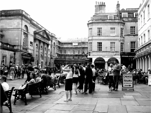
Figure 1.1 The city centre of Bath, in England, has improved its visual quality in terms of landmarks and its relationship to existing and past urban form. (Source: author)
The conceptual framework of the empirical investigation presented later in this book assumes that: (i) legibility and imageability can create or reinforce the character of commercial city centres, (ii) order creates legible and imaginable city centres, and (iii) legible and imaginable city centres help people to orientate themselves better spatially, to navigate through the centre and to find their way, and to experience a sense of place. This framework recognizes that the more legible and imaginable commercial city centres are, the more successful they are likely to be in attracting people. The concepts of legibility and imageability are applied here to analyse the mental image that people have of commercial city centres with respect to the following: (i) how users recognize historic city centres (as historic, commercial, tourist or cosmopolitan centres), (ii) whether commercial signs are identified as points of reference, and (iii) whether these media are evaluated as positive or negative elements of city centre image.
The Process of User’s Perception and Cognition
The process of user evaluation of the visual quality of public spaces involves two principles: perception and cognition. The first one is related to the process by which users get visual information of places through stimuli. In city centres, these stimuli are physical elements of public spaces, such as commercial signs, shapes, colours of buildings, street furniture and so on. The latter principle does not need to be related directly to visual stimuli linked to physical characteristics of places. The cognition process involves symbolic meanings associated with places, and can be influenced by user urban context, values, culture and individual experiences. This last definition agrees with what Nicholas Meader, David Uzzell and Birgitta Gatersleben say in their paper ‘Cultural Theory and Quality of Life’ (2006, p.61): ‘people do not perceive the environment through clear eyes, but through perceptual lenses coloured by their world view’.
An approach suggested by Lang (1987) indicates that the process of perception and cognition involves three interlinked factors: a multi-sensorial perception, symbolic meanings, and the relationship between these symbolic meanings and the physical characteristics of the built environment. In this approach, user perception involves more than a mere intellectual association related to an observed object; this is also linked with the cognitive process from the first stage. Consequently, the result of the processes of perception and cognition constitutes the mental representation of the public space that is what people evaluate as positive or negative when the streetscape is analysed (see Figure 1.2). In this regard, this mental representation is the focus of the empirical investigation presented in this book as this study analyses how commercial historic city centres are perceived and evaluated by people from different urban contexts. The following issues are taken into account in the theoretical framework of this analysis: (i) perceptions of users from different backgrounds can be similar according to the phenomenon of perceptual constancy already identified by David Canter more than three decades ago (1974), and (ii) evaluations of users from different backgrounds can vary due to their interpretations of the built environment, which might be influenced by their personal experiences.
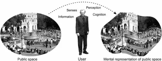
Figure 1.2 The final result of the process of user perception and cognition of a public space is the mental representation of this space. (Source: author)
Preference and Satisfaction
The concepts of preference and satisfaction are applied to evaluate the visual quality of the built and natural environment. Preference judgement concerns something that will be experienced by users, and is always related to users’ choice for one or more objects compared to others. On the other hand, satisfaction involves something that has been experienced by users, and does not need to involve comparison among things. According to Avery Guest and Barrett Lee (1983, p.234), satisfaction is ‘the utilitarian value [of a place] to meet certain basic needs’, which can range from social activities to physical characteristics. Preference and satisfaction are involved in aesthetic judgements, which may correspond to scales of evaluation such as beautiful–ugly, pleasant–unpleasant, likeable–dislikeable, and good–bad. Arthur Stamps, in his notorious book ‘Psychology and the Aesthetics of the Built Environment’ (2000), establishes that this kind of judgements allows comparison between different user groups in terms of evaluation of streetscapes, and between physical characteristics of the public space and user evaluation of its visual quality.
Analysis of user preference and satisfaction in terms of the appearance of commercial streetscapes can help in the identification of the physical elements of buildings and commercial signs perceived and evaluated negatively and positively by people from different urban contexts. To identify these elements, the empirical investigation presented in this book analyses the physical characteristics of buildings and commercial signs indicated as positive and negative by users from different urban contexts, and the intensity of influence of these characteristics on user preference and satisfaction. For instance, if a positive correlation is found between user satisfaction with a city centre and the importance attributed...
Table of contents
- Cover Page
- Half Title Page
- Title Page
- Copyright Page
- Dedication
- Contents
- List of Plates
- List of Figures
- List of Tables
- Acknowledgements
- Preface
- Introduction
- Part I The Theoretical Debate: Visual Quality of Public Spaces versus Commercial Signage
- Part II The Empirical Investigation: The Effects of Commercial Signage on People's Quality of Life
- Appendix A Architectural Styles of Buildings
- Appendix B General Physical Characteristics of the Commercial Streets in Oxford, Gramado and Pelotas
- Appendix C Geographic Location of the Streets in Oxford, Gramado and Pelotas
- Appendix D Method Applied to Calculate Complexity — the Complexity Method
- Appendix E Questionnaires Answered On-site and Off-site
- Appendix F Interview applied to planning city council officers in Oxford, Gramado and Pelotas
- References
- Index
Frequently asked questions
Yes, you can cancel anytime from the Subscription tab in your account settings on the Perlego website. Your subscription will stay active until the end of your current billing period. Learn how to cancel your subscription
No, books cannot be downloaded as external files, such as PDFs, for use outside of Perlego. However, you can download books within the Perlego app for offline reading on mobile or tablet. Learn how to download books offline
Perlego offers two plans: Essential and Complete
- Essential is ideal for learners and professionals who enjoy exploring a wide range of subjects. Access the Essential Library with 800,000+ trusted titles and best-sellers across business, personal growth, and the humanities. Includes unlimited reading time and Standard Read Aloud voice.
- Complete: Perfect for advanced learners and researchers needing full, unrestricted access. Unlock 1.5M+ books across hundreds of subjects, including academic and specialized titles. The Complete Plan also includes advanced features like Premium Read Aloud and Research Assistant.
We are an online textbook subscription service, where you can get access to an entire online library for less than the price of a single book per month. With over 1.5 million books across 990+ topics, we’ve got you covered! Learn about our mission
Look out for the read-aloud symbol on your next book to see if you can listen to it. The read-aloud tool reads text aloud for you, highlighting the text as it is being read. You can pause it, speed it up and slow it down. Learn more about Read Aloud
Yes! You can use the Perlego app on both iOS and Android devices to read anytime, anywhere — even offline. Perfect for commutes or when you’re on the go.
Please note we cannot support devices running on iOS 13 and Android 7 or earlier. Learn more about using the app
Please note we cannot support devices running on iOS 13 and Android 7 or earlier. Learn more about using the app
Yes, you can access Visual Pollution by Adriana Portella in PDF and/or ePUB format, as well as other popular books in Politics & International Relations & City Planning & Urban Development. We have over 1.5 million books available in our catalogue for you to explore.