Note: One terabyte is 1,000,000,000,000 bytes. There are many more byte sizes, large and small, to derive insights from, as well.
This chapter presents key concepts about how data visualizations can help a growing range of people gain insights from data. In addition, it raises several considerations and questions about the larger context of data visualization. Along with the tools themselves, it’s important to keep in mind the strengths and weaknesses of the people who might use them. Humans have extraordinary abilities to detect patterns and derive useful explanatory narratives. Although our capacity to capture, store, analyze, and display data is increasing, there is still uncertainty. Ambiguity and subjective judgments will continue to be an important factor in the process. The chapter also includes interviews with a journalist, a statistician, and the CIO of a data mining company to provide different perspectives on working with data. In addition, there are brief discussions that cover fundamental terms such as “data,” “metadata,” and “statistical significance” as well as descriptions of the essential elements of the data lifecycle.
Introduction: A Grander View
Where the telescope ends, the microscope begins. Which of the two has the grander view?
– VICTOR HUGO
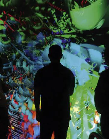
From our latest purchase decisions to global population trends, data of all kinds are increasingly swept up and carried along into ever-expanding streams. These surging flows are often so fast, and the volume so massive, they can overwhelm people’s capacities to distill the essential elements, derive meanings, and gain insights. We invent tools to solve problems, accomplish tasks, and augment our abilities. We’ve devised instruments to see distant stars and view subatomic particles; now, people are creating new ways to peer at1 multiple layers of data that otherwise would be invisible to us. Visualizations offer a way to extend and enhance our innate powers of perception and cognition and get a “grander view” of the world around us.
However, no matter how necessary these visual representations might be or how reliant we’ve become on them, they don’t tell the complete story. The processes that go into making the visualization, the parts you don’t typically see, are still key components of the picture. The more you know about what goes into making a visualization, as well as its relative strengths and weaknesses, the more effective a tool it can be. Technology enables us to interact with data on more levels to accomplish objectives ranging from completing simple day-to-day tasks to solving long-term, seemingly intractable problems. Visualizations help us transcend the jumbles of data, allowing us to see more of the stories life has to tell.
Things That Make Us Smarter: How Thoughtful Visualizations can make our Lives Better
How have we increased memory, thought and reasoning? By the invention of external aids: it is things that make us smart.
– DONALD NORMAN
For all of the things you care about most, do you ever wonder whether your decisions are well informed, uninformed, or even misinformed? Digital data of all kinds has the potential to provide us with deeper, more useful insights into many aspects of life. However, the elements we may need or want are typically not delivered to us in convenient little packages; they are heaped before us, strewn around, or stored away in vast repositories. The people who regularly work with data hold some of the keys and codes to unlocking the value held in countless databases. But the tools of access, the things that help make us smarter, don’t all have to belong to the relative few. With the help of well-designed visualizations, and an awareness of their strengths and limitations, the doors can be thrown open to far greater numbers of people. Doors can be opened in different ways—from a blunt implement like a battering ram to the precision instruments used by a locksmith. Each approach requires a different level of skill and applies in a different range of instances.
If all the data being collected, distilled, and disseminated about our lives were physical, it would create vast heaps that we would have to step over, sift through, trip on, or walk around. Imagine your computer as a vast storage locker, filling with ever-increasing stuff. There may be crucial items in there, but if you can barely remember, or keep track of, what you have, what good are they to you? Take the analogy a step further, and think of all the boxes in this locker as representing categories of your life: health, finance, work, family, social life, and so on. How do you find, filter, and fact-check all the information to have a clearer understanding and make good choices? Complicating the picture further, we live in a world of flux; depending on the timing and context, we may have a greater or lesser ability to make good decisions. And for some, the ability to rapidly and effectively make decisions from fast-flowing streams of data is an integral part of their work. From emergency rooms to operational command centers, a clear understanding, rapid assessment, and decisive actions based on data can make the difference between life and death.
An amazing quantity and variety of data is theoretically available at our fingertips through smart phones, tablets, and various other devices. It’s a veritable “Neurvana” for inquisitive minds. However, the true value is often totally out of reach. We could all be better informed about what matters to us, but the catch is that all the data2 is useless, or misleading, if we don’t know what it means.
The remainder of this section examines some of the ways that data visualization and other emerging approaches can help fill this gap.
Your “peripheral brain”
For many of us, it’s not natural to think in purely numerical and mathematical terms. Because of this, it can be difficult to make assessments and decisions as quickly and confidently as we might need to in the moment. However, if we can distribute some of the mental workload required to perform tasks, such as making comparisons between data elements, to various areas of our brains, we can redeploy our overall effort to solve higher order problems. For example, we can engage our visual systems’ capacity for sensing difference rather than relying solely on contemplating abstract numbers.
Expanded vision
Different types of visualizations can reveal distinct aspects of the world that otherwise would be invisible to us. Although the terminology is not always entirely clear-cut, here’s one way to think about two broad categories of technology-enhanced vision: data visualizations provide concrete visual representations of the nonphysical and the abstract such as a statistical trend; scientific visualizations allow people to see hidden physical forms and processes, such as a positron emission tomography (PET) scan that shows the level of metabolic activity in various regions of the brain when performing certain tasks.
Filtering out the noise
It doesn’t take much time or effort to open floodgates of information, only to soon need to stem the flow and start dumping the excess—sometimes throwing out the essential along with the marginal in the process. That said, what we consider to be essential and marginal can vary depending on the context and circumstances. It can be a challenge to make easy distinctions and reorder priorities on the fly. Well-executed interfaces and visualizations can help by presenting simple, clear cues that allow us to easily identify and differentiate different kinds of data and information and rearrange them rapidly.
Many kinds of data only matter when they matter. For example, when I drive on the highway, I barely look at my gas gauge, but I’ll keep an eye on the speedometer to ensure my speed is in a good range. However, I want my gas gauge in my peripheral vision, and only want it to call attention to itself when I’m low on fuel and need to address it. Even if I’m deep in thought about other things, my little yellow warning light has something important to communicate, and I pay attention when it comes on. For various kinds of purposes, visualizations can apply these basic concepts of threshold detection and peripheral vision to let us know to at...


