This is a test
- 250 pages
- English
- ePUB (mobile friendly)
- Available on iOS & Android
eBook - ePub
Book details
Book preview
Table of contents
Citations
About This Book
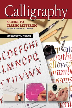
If you've ever wanted to learn the techniques of hand lettering, Calligraphy gives practical advice and guidance on materials, tools, and methods. Containing four alphabets and 12 step-by-step projects, you'll be able to create stunning cards, calendars, letterheads, and wall hangings.
Frequently asked questions
At the moment all of our mobile-responsive ePub books are available to download via the app. Most of our PDFs are also available to download and we're working on making the final remaining ones downloadable now. Learn more here.
Both plans give you full access to the library and all of Perlego’s features. The only differences are the price and subscription period: With the annual plan you’ll save around 30% compared to 12 months on the monthly plan.
We are an online textbook subscription service, where you can get access to an entire online library for less than the price of a single book per month. With over 1 million books across 1000+ topics, we’ve got you covered! Learn more here.
Look out for the read-aloud symbol on your next book to see if you can listen to it. The read-aloud tool reads text aloud for you, highlighting the text as it is being read. You can pause it, speed it up and slow it down. Learn more here.
Yes, you can access Calligraphy, Second Revised Edition by Margaret Morgan in PDF and/or ePUB format, as well as other popular books in Arte & Tecniche artistiche. We have over one million books available in our catalogue for you to explore.
Information
Topic
ArteSubtopic
Tecniche artisticheIntroduction
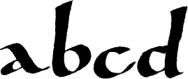
Lettering is fun! This book is aimed at beginners as well as those with some experience of wielding a broad-edged pen. It gives you the information and examples needed to help you write several different scripts well, and then goes on to introduce the use of design in simple calligraphic projects. Once you have mastered the basic skills of good letterforms, there are many exciting techniques to explore, both traditional and modern, within these pages.
Since the widespread use of computers and handheld devices have taken over so much of our written communications, it does no harm at all to reexamine the historical origins of the letters we see and use every day. Look carefully at how those familiar 26 letters are made, following four specific traditional styles, then take courage and go forward with experiments of your own. Open your eyes to other cultures too; other, less familiar influences, with their different ways of using color and design than your own, can open up new horizons and spark off ideas to explore.
My involvement with calligraphy started early. Learning italic handwriting at the age of eight and a Christmas gift of a set of broad-edged Mitchell nibs are what got me hooked. I studied graphic design and typography at art college (letters again!), which formed the major part of my professional work for more than twenty years. However, those edged pens were never far from my hand, and calligraphic work eventually took over my time completely towards the end of the 1990s, which gives me great satisfaction. That art training, backed up by continuing regular study with well-regarded international lettering artists, has been invaluable for extending the creative possibilities for the many gifts and cards using letters that I have made over the years.
Calligraphy: A Guide to Classic Lettering gives you a glimpse of what is possible with pen, paper, inks, and paints, with a little time, patience, and enthusiasm. You may find, as I have, that your interest goes beyond the hobby stage and will stay with you forever.
Margaret Morgan

A Brief History of Western Calligraphy
The history of calligraphy, like many other histories, is cyclical: a new writing style is born, developed, and eventually dies or goes out of fashion; this is followed by rediscovery, reappraisal, and further improvement. What follows is just a general outline of how our current letterforms came into being.
roman capitals
Our familiar Western letterforms mostly stem from the Roman capitals (or majuscules) of the early centuries AD. These capitals were used for important and formal inscriptions. It is generally believed that the letters were first painted with a square-edged brush, then cut into a V-section in stone. The pattern of thick and thin strokes shows the calligraphic influence of the tools used to make them and the angle at which the tools were held. They weren’t “everyday” letterforms, though, as they required care and precision in the making. Square and rustic capitals fall into the same category. These early book hands were used for writing out classical texts. They were slow to write and required much pen manipulation to achieve the shapes—not natural pen-written forms at all.
Scribes gradually modified the capitals to economize on effort for the sake of speed; they took notes with their metal styli onto wax tablets, and, gradually, a cursive or running hand evolved. These tablets could be smoothed over and reused after the text had been transferred to a more permanent form, such as with reeds or quills on papyrus.
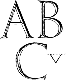
ROMAN CAPITALS

RUSTIC CAPITALS
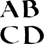
SQUARE CAPITALS
uncials and half uncials
Between the 4th and 8th centuries AD, uncials developed out of the old Roman cursive hand, for writing out Christian texts. The forms were rounded, written with a slanted pen at a shallow angle, and showed the first real suggestion of ascenders and descenders. These are the first true pen-made letters, the shapes being created by the nature of the tool, not by trying to imitate anything else. They are clear, simple, and legible, and continue to provide inspiration to modern calligraphers. Later forms were written with a flat pen angle.
The spread of Christianity had much to do with the next development of written forms. The Roman Empire began to decline into chaos, incessant wars caused further difficulties, and much “pagan” classical literature was lost during the period we call the Dark Ages (550–750 AD). Cultural life in Europe more or less ceased as barbarians invaded and care of books and teaching passed to the care of the church. Half uncials developed independently during this time in Ireland and England from early examples of Roman uncials; they show clear ascenders and descenders. The most famous examples of the different types of “insular” half uncials can be seen in the Irish Book of Kells and the English Lindisfarne Gospels.

UNCIALS

UNCIALS WRITTEN WITH A FLAT PEN ANGLE
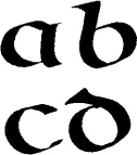
HALF UNCIALS
carolingian minuscules
The Age of Charlemagne was another important milestone. The Emperor Charlemagne was passionate about books and learning. His ambition was the revival of cultural life, for which books were essential. In 789 AD he decreed that all liturgical books should be revised. The Carolingian hand is characterized by a clear fluency and legibility that was ideal for these book texts. It was combined with the majuscules (built-up Roman letters, rustic capitals, and unicals) of antiquity, which were used for chapter headings, sub-headings, and the beginnings of verses—the hierarchy of scripts scribes still use today.
An English version of this hand was developed as an almost perfect model for formal writing—strong forms, logically made, with a consistent pen angle and easily read.
CAROLINGIAN MINUSCULES

CAROLINGIAN ENGLISH
gothic
By the 12th century, letterforms were becoming more and more compressed, and the soft flow of Carolingian gradually gave way to the heavy, angular, black letters of northern Europe known as Gothic. Materials became more expensive as demand for books increased, so the need to economize was greatly helped by the narrow Gothic letters that took up a lot less space but which were harder to read.
There were regional variations of the style across the European continent: the northern European quadrata had diamond feet and was very angular; rotunda, used in Spain and Italy, was much rounder in form; and the precissus Gothic of English manuscripts was characterized by its flat feet.

GOTHIC HAND

PRECISSUS

ROTUNDA

QUADRATA
the renaissance

SQUARE CAPITALS
During the Renaissance period in Italy (c. 1300–1500), there was a resurgence of interest in classical literature, and Italian scribes rediscovered the Carolingian minuscule. They also studied the Roman inscriptional letters and Bartolommeo San Vit...
Table of contents
- Cover
- Title
- Copyright
- About the Author
- Acknowledgments
- Contents
- Getting Started
- Basic Alphabets
- Practice Projects
- Developing Projects
- Additional Techniques and Projects
- Glossary
- Suppliers and Resources