A Working Costume Designer's Guide to Color provides readers with the skills and knowledge to create coherent color schemes for costumes.
Drawing on decades of experience in the costume shop, the author guides readers through every step of the process, from finding inspiration for a color scheme and successfully working with the design team to understanding how lighting design can affect costume color choices. Filled with step-by-step illustrations of how to add colors to a set of renderings and color-block samples to illustrate color theory, terminology, and usage of colors, the book covers a wide range of topics, including:
How to add colors to a set of renderings to clarify characters and character relationships.
How color interacts with surface pattern and fabric textures.
Color theory and terminology.
How to combine colors to make a coherent color scheme using different methods, including using dominant, supporting, and accent colors.
How to flatter actors while staying within an overall color scheme.
Color meanings in different cultures and for different time periods.
How to manage costume changes to preserve or extend a color scheme.
A valuable resource for students of costume design courses and professional costume designers, A Working Costume Designer's Guide to Color provides readers with the tools to create harmonious color schemes that will enhance the look of a production as whole.
Trusted by 375,005 students
Access to over 1.5 million titles for a fair monthly price.
Color is one of the most exciting tools for designing costumes. Color can shape the way that an audience perceives characters, their relationships, and the style of a production. Color can be used to organize and direct the attention of the audience toward an important character or moment, to underline relationships between characters and groups, and to help clarify when and where the production is being set. Color is a wonderful element that can enhance the look of the production as a whole, apart from the shape or style of the costumes.
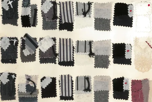
Because color is such a strong aspect of design, it can also become a source of anxiety for many designers. At the start of my career, I found a color scheme that had worked for one production – Grey, Black, White, and Mauve – and repeated it in most of my design work for the next several years. This was due to fear of making a mistake and in being acclimated to the grey, misty weather in the region where I grew up.
FIGURE 1.1 Black, Grey, and White color range
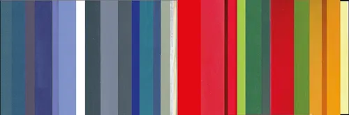
It was only when I relocated to a new city with clear light, bright sun, and a culture that used color with joy that I realized that I needed to be bolder and freer in my own use of color. I saw how colors were combined in local fashions, gardens, and architecture and I began to allow myself to expand and experiment with color. Eventually Red, Gold, Green, bright Blue, Purple, other rich hues, and bold contrasts became part of the palette that I could increasingly balance in a design. The more I saw color around me, the more comfortable I felt in using it with confidence in my work.
Given all the colors in the world, how does a designer begin to choose? Inspirations for costume color directions can be everywhere if you choose to look for them. Color ideas can be gleaned from specific images in the script, the typical colors used in the fashion and décor of a time period, the director’s sense of the production, a piece of fine or decorative art that a designer responds to and that seems to reflect the play, nature, architecture, cars, or through a serendipitous combination of influences that create a starting point that can be explored. Consider all the sources of inspiration for assembling color schemes and allow yourself to play.
Let’s examine some sources of color inspirations.
Script References
As with all costume design choices, start with color images in the script.
Some plays contain specific references to color, such as Hamlet’s dark mourning clothes. Other plays may elicit such a strong mood that certain colors will support the mood much better than others. For example, Greek tragedies such as Oedipus Rex or Medea are not generally costumed in bright Pastels or Neon colors, no matter the period in which they are set, but are usually designed with deep, earthy, and restrained colors to match the stately mood of these plays.
FIGURE 1.2 Oedipus Rex, set in late 1940s Europe
It is helpful to be aware of color traditions for certain plays, so that the tradition may be consciously used or subverted. Romeo and Juliet is often costumed to help organize the two warring families, with clearly different color schemes for the Montagues versus the Capulets. This tradition is even carried over into the modern retelling of the story in West Side Story. However, the contrasting color groupings are not actually contained in the script.
FIGURE 1.3 Romeo and Juliet colors with a clear difference between the colors used for the two families
Although expected, the contrasting colors may not be appropriate for a particular production of Romeo and Juliet. If the concept of your production focuses more on the overall society in which the lovers exist, rather than on the strife between the families, the concept might be better expressed through using similar colors but in very different intensities and textures between the families. Knowing the color expectations and traditions for a play can be helpful, but they are not laws that must always be followed. More specifics on choosing colors to reflect character relationships will be discussed in Chapters 3–7 and Chapter 11.
Period Setting
Color schemes can be drawn from the time period suggested by the script, whether that is the time in which the action is placed, the period in which the play was written, or an entirely different period choice that will illuminate the play for a particular production. For example, Moliere’s The Misanthrope, written during the reign of Louis XIV in France, may suggest the sky Blue, Gold, and White color scheme typical of this period, or use sepia-toned colors. However, David Ives’s School for Lies, which uses modern rhymes to retell The Misanthrope’s story, might be better served by using bold, bright, modern colors along with accurate period costume shapes.
FIGURE 1.4 The Misanthrope
FIGURE 1.5 School for Lies
However, a single period color scheme does not necessarily always apply to all the costumes in a production. In The Waiting Room, three women of different time periods (one of which is from the 1990s) meet in a modern doctor’s office waiting room. Each woman’s costume might logically reflect the time period and culture that she represents, rather than all of them being united by a common color scheme. Two of the women’s husbands are also seen and coordinate with their wife’s individual period-inspired colors. The surrounding modern characters, however, could be part of a color scheme that is outside those of the three main women.
FIGURE 1.6 The Waiting Room
Following this same idea, for a production of Shakespeare’s Twelfth Night in which the characters are dressed in costumes from various time periods, based on their individual personalities, each might be costumed in a different color scheme based on their individual time period, and they would need to be balanced with one another to create an overall composition.
FIGURE 1.7 Twelfth Night. Bottom register: Orsino in the 1830s Romantic period, Olivia in the 1870s Victorian period, Viola as Cesario in the 1920s. Middle register: Malvolio as a Puritan, Maria as an 1890s beachgoer, Sir Toby as a Cavalier, Sir Andrew as a 1780s fop. Top register: Feste as a modern street person, and Fabian as an early 19th-century waiter
Typical color choices for a variety of cultures and time periods are contained in Appendix 2. The colors listed there include fashionable garment colors as well as decorative and architectural colors. Good sources for period colors include artwork and advertising images of different time periods, as well as Owen Jones’s The Grammar of Ornament, which is a good secondary source of decorative colors up to the late 19th century.
Director’s Concept
Directors will often have their own sense of the colors that will be appropriate for a production. This may be shared through artwork that the director presents to the design team, through key words for the tone of the production such as “war-torn” or “silly” or “nostalgic,” or through the proposed style of the production such as “abstract” or “comic” or “realistic.” During the initial discussions with the director, bring samples of your take on the colors suggested both by the script – whether from specific script references or the overall mood of the play – and by the time period of the script. As key words or script references may conjure different color images for different people, it is valuable to bring some color chips or samples with you to look at together and discuss early in the design process.
For example, “war-torn” may suggest an overall subdued color as the base, with slashes of dirtied, darker colors or areas of Red. This may be contrasted with cleaner areas of military-derived colors, for the army and/or supporters of the ruling regime.
FIGURE 1.8 Macbeth with a war-torn color scheme
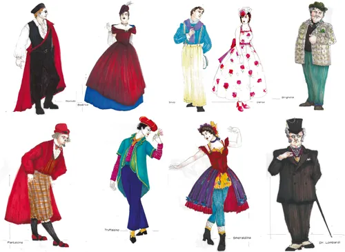
“Silly” color schemes may contain bold contrasts with larger areas of bright color. Added bands of edging, graphic patterns, or color break-ups can add more visual movement.
FIGURE 1.9 Servant of Two Masters with a bright color scheme for a silly effect
FIGURE 1.10 Into the Woods
Finally, “nostalgic” productions may use warm colors, with a range of tones to indicate a range of character ages. Light colors around faces (such as collars) and dark colors for shoes, belts, neckties, jackets, coats, and accessories will add interest by expanding the color scheme to include light tints and dark shades. Add some cool colors to create variety in what can otherwise become an undefined mass of beige.
FIGURE 1.11 The Trestle at Pope Lick Creek with a nostalgic color scheme
In all cases, if you or the director are using descriptive words to describe the color mood, it is helpful to have color sources with you to consult in early meetings in order to define what is meant by any key words. I have several books of color samples that I bring to the first production ...
Table of contents
Cover
Half-Title
Title
Copyright
Contents
Acknowledgments
Introduction
1 Color Inspirations
2 Working with the Design Team to Develop the Color Scheme
3 Color Theory and Color Mixing
4 Color Harmony
5 Other Methods of Creating a Color Scheme
6 Color Temperature
7 Color Contrasts
8 Color with Pattern and Texture
9 Color from an Inspiration Source
10 Color Schemes from What Is Available
11 Color and Characters
12 Flattering the Actors
13 Costume Changes
14 Distributing Color
Appendix 1: Color Meanings
Appendix 2: Period Color Schemes
Appendix 3: Lighting Design for Costume Designers
Recommended Books
Index
Frequently asked questions
Yes, you can cancel anytime from the Subscription tab in your account settings on the Perlego website. Your subscription will stay active until the end of your current billing period. Learn how to cancel your subscription
No, books cannot be downloaded as external files, such as PDFs, for use outside of Perlego. However, you can download books within the Perlego app for offline reading on mobile or tablet. Learn how to download books offline
Perlego offers two plans: Essential and Complete
Essential is ideal for learners and professionals who enjoy exploring a wide range of subjects. Access the Essential Library with 800,000+ trusted titles and best-sellers across business, personal growth, and the humanities. Includes unlimited reading time and Standard Read Aloud voice.
Complete: Perfect for advanced learners and researchers needing full, unrestricted access. Unlock 1.5M+ books across hundreds of subjects, including academic and specialized titles. The Complete Plan also includes advanced features like Premium Read Aloud and Research Assistant.
Both plans are available with monthly, semester, or annual billing cycles.
We are an online textbook subscription service, where you can get access to an entire online library for less than the price of a single book per month. With over 1.5 million books across 990+ topics, we’ve got you covered! Learn about our mission
Look out for the read-aloud symbol on your next book to see if you can listen to it. The read-aloud tool reads text aloud for you, highlighting the text as it is being read. You can pause it, speed it up and slow it down. Learn more about Read Aloud
Yes! You can use the Perlego app on both iOS and Android devices to read anytime, anywhere — even offline. Perfect for commutes or when you’re on the go. Please note we cannot support devices running on iOS 13 and Android 7 or earlier. Learn more about using the app
Yes, you can access A Working Costume Designer's Guide to Color by Jeanette deJong in PDF and/or ePUB format, as well as other popular books in Design & Theatre. We have over 1.5 million books available in our catalogue for you to explore.