
eBook - ePub
Stock Trading Made Simple: How to Trade on the Stock Market
The Beginner's Guide
- English
- ePUB (mobile friendly)
- Available on iOS & Android
eBook - ePub
CHAPTER 3
STRATEGIES
Deciding precisely, when to enter and when to exit the stock market is extremely hard. Technical analysis is an effective way to analyze the markets or stocks. It will provide you with a road map, which can be used to chalk out future price trends or movements. Prices are represented in the form of charts. Like airfares going up when the demand is high, the price of a stock moves up when the demand is high. This is represented by an increase in buying volume. Now, let me put this in the investing context. The movement of price is called price action. The point where demand starts to increase, and price stops falling and starts to rise, is called ‘support’ or ‘floor’ (Fig 3.1 Resistance or Support). At the point where the price is too high, the demand starts to dry out. The price stops going up, and starts to stall and fall. This is called ‘resistance’ or ‘ceiling’. When you plot price as a dot, and volume as a bar for each day on the y-axis against time (date) on the x-axis, you will get a price chart. When you start connecting these price points, you will get a line chart. Histograms below the price are volume histograms. If sellers are dominant then volume of sellers is shown in darker shade.
Now, if you replace price dots with a vertical line, the top end of the line represents the highest price that it reached that day (price high) and the bottom end represents the lowest it recorded that day (price low). You now have a high-low price bar.
If you take each day’s vertical line and try to add in a bit more detail, by means of adding a horizontal tip to the vertical line to signify the price at which the day started - open price and a right horizontal tip to show the price at which the day ended. You now have 4 price points on each of the lines. Each line represents the open price, close price, high price and low price. Now this is a bar chart. Fig 3.2.a
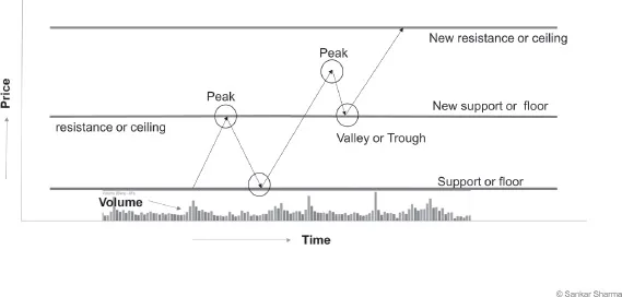
Fig 3.1 Resistance or Support
If you connect the open and close prices with a rectangle and leave the rest of the line on either side, you have a candle. The rectangle connecting open and close is called the body, and the extensions either side that represent high and low are called the wick. If you draw the up price candles as empty candles, and down candles filled, you now have a candlestick chart.
Fig 3.2.a gives a clear visual representation of two chart types - Bar Chart and candlestick chart. Charts used in this book are either bar chart or candlestick chart. Candles with a white body or hallow going up like balloons represent raising price, and are often referred to as bullish candles. Candles shown in the figure below filled are like iron rods falling and are often referred to as bearish candles.
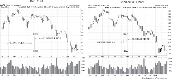
Fig 3.2.a. Bar Chart and Candlestick Chart
Imagine that a day’s price movement was plotted both as a bar as well as a candle and Close price is above the Open, then we say the price for the Day is ‘Up’ (Refer to Fig. 3.2.b that shows how a raising price represented as a bar and the same represented in a candlestick format)
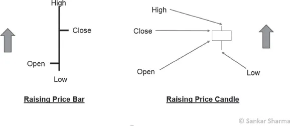
Fig 3.2.b. Raising Price Bar vs Raising Price Candle
Again imagine that one single day’s price movement is plotted both as a bar and as a candle. If Close price for the day is less than the Open price for the day we say we had a ‘Down’ Day (Refer to Fig. 3.2.c that shows how a falling price represented as a bar and the same represented in a candlestick format)
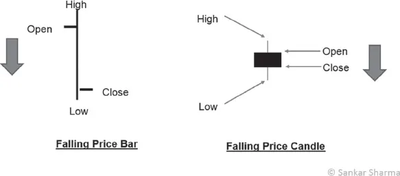
Fig 3.2.c. Falling Price Bar vs Falling Price Candle
Where is support and where is resistance? How do you identify them so that you can buy at the lowest price where price stops falling and starts to raise? How do you identify the point to sell where price is perceived high? To identify this support area or support zone, and resistance area or resistance zone, you need to identify peaks and troughs.
Peak and troughs are often referred to as reaction high or reaction low respectively. The peaks that create major swings are called swing highs and the same applies to swing lows.
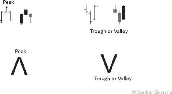
Fig 3.3.a. Peak and Trough
A peak is a bar or candle that has a higher high than the bar before it and the bar after it. A trough has a lower low compared to the bar that preceded it and the bar that succeeds it.
When you connect at least two troughs or one peak and one trough using a horizontal line, you get the support zone.
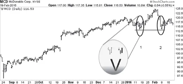
Fig 3.3.b. Support Zone – Joining Two Troughs
You can mark the support zone with a green line (Refer Fig 3.3.b for Support Zone).
Joining at least two peaks via a horizontal line will give a resistance line, and you can color this red for easy identification. (Refer Fig 3.3.c for Resistance Zone)
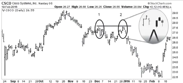
Fig 3.3.c. Resistance Zone – Join Two Peaks
The distance that price travels from trough to peak is called ‘Up swing’, and from peak to trough, is called ‘Down Swing’. (Refer Fig. 3.3.d Kellogg’s price char). This is because price swings from trough to peak and vice versa. In order to draw support and resistance lines, you need to focus on the peak or trough that had maximum swing lengths. In other words, you need to look for swing pivots that are generating maximum reaction.
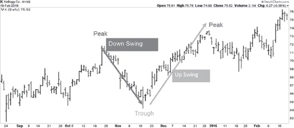
Fig 3.3.d Up Swing and Down Swing
If you refer to the Amazon chart in Fig 3.3.e, you will notice the peak and the trough (valley) circled. Note the volume, the buying volume is right below the arrow that says conservative entry. When price breaks the resistance line at $580, the resistance (identified by red line) becomes support (line color changed to Green to indicate it has now become support). The same support again becomes resistance as the price goes down, at the price point $580 on the extreme right of the chart.
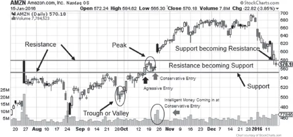
Fig 3.3.e. Peak and Trough, Resistance and Support
When the price breaks through its nearest resistance zone, it comes back to create a trough in the same zone, before stopping and continuing its original course. The resistance zone then becomes its new support zone and vice versa. You need to remember to change the color on your chart to capture this. Support Zones are drawn in Green color and Resistance in red. When Support becomes resistance then change the color from green to red and vice versa.
Even though you draw support and resistance by joining two points, they are actually zones, so do not restrict yourself to the line you need to treat it as a zone. When price is starting to approach the resistance zone or support zone, two things can happen. Either the price will continue its trend, or it will stop and reverse. This is represented in Fig 3.4.
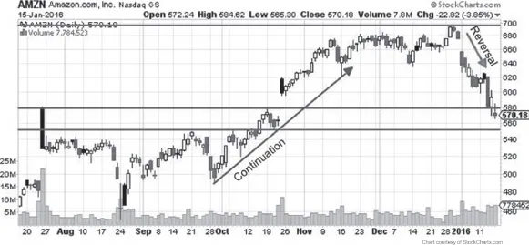
Fig 3.4 Price Continuation and Price Reversal
Price continuation
Consider the case of a Resistance zone, price sometimes pierces through the resistance and continues its trend upwards (Fig 3.4). If this happens, you have what is called a ‘break out’. You then have two places to enter the trade (or buy the stock). One comes immediately as soon as the price pierces the resistance zone. This will be an aggressive entry point (aggressive entry because it has higher profit potential but also it is high risk because this could be a false breakout meaning it could reverse and make loss). The second is when the price pierces through the resistance zone, and then comes back to test it. This time the zone becomes a support zone, and the price starts to react and continue its journey upwards. This point will be a conservative entry (Ref Fig 3.3.e for Aggressive and conservative entry points), and you will be entering on the bounce. This point risk is low because you can place your stop below the point where it bounced recently. There is also a third entry possible; this happens when the price breaks the nearest peak or swings high.
Price reversal
Price gets rejected at the resistance zone and bounces in the opposite direction to its original course, like a tennis ball returning from the ceiling when thrown upwards (Fig 3.4). In this case, you should wait f...
Table of contents
- Cover Page
- Title Page
- Copyright
- Dedication
- Table of Contents
- Chapter 01: Stock Market Overview
- Chapter 02: Keys to Stock Market Success
- Chapter 03: Strategies
- Chapter 04: Shortlisting Stocks
- Chapter 05: Pre-Trade Analysis
- Chapter 06: Managing Money
- Chapter 07: Managing Risk
- Chapter 08: Managing the Trade
- Chapter 09: Mindset
- Chapter 10: Plan, Track and Improve
- Chapter 11: Achieve Stock Market Success
- Chapter 12: Afterword
- Chapter 13: Bibliography and References
- Back Cover
Frequently asked questions
Yes, you can cancel anytime from the Subscription tab in your account settings on the Perlego website. Your subscription will stay active until the end of your current billing period. Learn how to cancel your subscription
No, books cannot be downloaded as external files, such as PDFs, for use outside of Perlego. However, you can download books within the Perlego app for offline reading on mobile or tablet. Learn how to download books offline
Perlego offers two plans: Essential and Complete
- Essential is ideal for learners and professionals who enjoy exploring a wide range of subjects. Access the Essential Library with 800,000+ trusted titles and best-sellers across business, personal growth, and the humanities. Includes unlimited reading time and Standard Read Aloud voice.
- Complete: Perfect for advanced learners and researchers needing full, unrestricted access. Unlock 1.5M+ books across hundreds of subjects, including academic and specialized titles. The Complete Plan also includes advanced features like Premium Read Aloud and Research Assistant.
We are an online textbook subscription service, where you can get access to an entire online library for less than the price of a single book per month. With over 1.5 million books across 990+ topics, we’ve got you covered! Learn about our mission
Look out for the read-aloud symbol on your next book to see if you can listen to it. The read-aloud tool reads text aloud for you, highlighting the text as it is being read. You can pause it, speed it up and slow it down. Learn more about Read Aloud
Yes! You can use the Perlego app on both iOS and Android devices to read anytime, anywhere — even offline. Perfect for commutes or when you’re on the go.
Please note we cannot support devices running on iOS 13 and Android 7 or earlier. Learn more about using the app
Please note we cannot support devices running on iOS 13 and Android 7 or earlier. Learn more about using the app
Yes, you can access Stock Trading Made Simple: How to Trade on the Stock Market by Sankar Sharma in PDF and/or ePUB format, as well as other popular books in Business & Stocks. We have over 1.5 million books available in our catalogue for you to explore.