This book presents an overview of the convergence of traditional letterpress with contemporary digital design and fabrication practices.
Reflecting on the role of letterpress within the emergent hybrid post-digital design process, contributors present historical and contemporary analysis, grounded in case studies and current practice. The main themes covered include the research on letterpress as a technology and medium; a reflection on the contribution of letterpress to arts and design education; and current artistic and communication design practice merging past, present and future digital fabrication processes.
This will be of interest to scholars working in graphic design, communication design, book design, typography, typeface design, design history, printing, and production technologies.
Trusted by 375,005 students
Access to over 1.5 million titles for a fair monthly price.
This part highlights a reflection on the contribution made by letterpress to the arts and design research field. It is seen through the lens of four case studies that explore the cultural legacy of letterpress communication artifacts within commercial and artistic production contexts.
It acknowledges that letterpress plays a relevant role within cultural and aesthetic expectations—ranging from the fields of archival collections, printing and design history to practice-based artistic research—that often include considerations of social, aesthetic, and human factors.
This first contribution highlights the evolution of a typeface design over a century. Amelia Hugill-Fontanel traces the various permutations of Cloister Initials: from its beginning as a metal typeface, through digital versions, and back into physical forms, demonstrating that letterforms currently transcend digital and material formats.
The following chapter considers the work of those who appropriated printing from the external expanding possibilities. Caroline Archer considers how these typographic outsiders equipped themselves with the knowledge and skills to become printers, what they produced, and what lessons they can offer today’s artists and designers entering the field of letterpress.
The second chapter explores the relationship between the creative process and letterpress printing methods, focusing on the life and work of a Portuguese designer from the mid-twentieth century. Nuno Coelho starts by analyzing the designer’s influences and creative process and then focuses on his packaging designs. More than technological constraints, the chapter emphasizes the influence of cultural heritage on the graphic design of consumer products.
The third chapter presents a recent practice-based research project in hybrid letterpress printing. Ane Thon Knutsen, a female self-taught printer, explains how crucial the material conditions for artistic practice are to artistic autonomy. Analyzing Virginia Woolf’s The Mark on The Wall, she reshapes the original experience acknowledging the role played by the printing press as her road to freedom.
Part I Research Highlight
The Seven Lives of a Typeface: Material and Immaterial Convergences
Amelia Hugill-Fontanel1
DOI: 10.4324/9781003173113-2
Understanding excellent designs from the past in such analytical terms, rather than simply regarding them as graphic images to fetishize, is the challenge—when we do it, we can learn from the past.
(Luna, 2019, p. 129)2
As printing historians, we explore motives, materials, and technologies that have contributed to the primary technology of mass communication for five centuries: printing. It is thrilling to share in-depth research, especially when tangible typographic objects are the results of the effort. The cycle of research, ideation, and production repeats, where the past feeds present and future practice. This is an account that documents how a typeface design enjoyed at least seven reincarnations during a 100-year period of technological innovation, culminating in contemporary creative graphic work.
The American type designer Frederic W. Goudy (1865–1947), designed over 120 letterpress typefaces in his long career. Cary Graphic Arts Collection at Rochester Institute of Technology holds significant archival material by Goudy, including correspondence and typeface drawings, photographs, books, and even types that he cast and the printing presses that he owned. Goudy’s work is ubiquitous in the digital landscape due to the fact that the revival of Goudy Old Style is commonly bundled as a system font on international operating systems.
In 1917 Frederic Goudy drew a floriated Capital A in the style of medieval manuscript historiated initial letters for his book, The Alphabet.3 The director of American Type Founders (ATF) convinced Goudy to draw the full alphabet for commercial release as a hot metal letterpress ‘typeface.’ This became his 33rd design, entitled Cloister Initials. It was cast in display sizes from 48- to 144-point. Enjoying prominent use through the 1940s, ATF kept it in production for years as a foundry type.
Writing a few decades after their creation, Goudy noted that the Cloister Initials ‘have had a long and useful life and are still extensively used and copied.’4 He was alluding to their popularity and inclination to be pirated by competing typefounders. He permitted translations of this design himself. For example, in the 1930s they were rebranded as Goudy Initials, no. 296 for the automated typecasting system from Lanston Monotype Machine Company. Hence the first and second ‘lives’ of Cloister Initials were personally monitored by their creator.
The mid-twentieth-century evolution of myriad type production modes incited many older designs to be adapted to new technologies. From the 1960s to the 1980s Cloister Initials were translated into phototype as well as dry-transfer letters. With the introduction of digital typefaces, they became one of the early candidates for revival. The alphabet’s designs were digitized as individual EPS files by Gerald Giampa when he purchased the remnants of the Lanston Company in the late 1980s.5Cloister Initials’ third, fourth, and fifth lives were mediocre surrogates for the elegant letterpress-printed originals. Phototypesetting’s ability to optically resize and compress characters, as well as early digital jagged type vectors, contributed to this inferior quality.
Lanston’s intellectual property was acquired in 2004 by P22 Type Foundry of Buffalo, New York. They redrew the Cloister Initials in 2005 and reformatted the EPS files to digital font formats, renaming them as LTC Goudy Initials. In 2014, P22 decided to rework the typeface from the most accurate source material.6 This involved a fortuitous discovery of the original 120-point ATF brass matrices at the RIT Cary Graphic Arts Collection.7 An RIT curator had rescued the mats from the salvage auction when ATF was in bankruptcy liquidation in 1993.8 This sixth digital incarnation of the typeface was poised to rejoin the analogue world.
RIT loaned the Cloister Initials 120-point matrices to Richard Kegler of P22 for the purposes of casting a new metal type. Only one machine in North America could handle the work, due to the fact that the matrices are such a large point size. This was the last extant Giant Pivotal caster, which was coincidentally sold to a fellow buyer at the 1993 ATF auction: printer and typecaster, Gregory Walters in Ohio.9 Casting with this machine was not an automated process, since each mould needed to be manually disconnected from its housing to eject the type.10 After several days of involved labour, Walters and Kegler were able to cast a few dozen complete alphabets of Goudy’s almost century-old typeface. Each character weighed 0.75 pounds (0.34 kg).
Since 2014, Cloister Initials has enjoyed its seventh life as an analogue/digital hybrid. The 120-point metal recasting sold out quickly to print shops in the United States and Europe. P22’s enhanced digital type revival added the functionality of chromatic accents to Goudy’s original design, with separate fonts that isolated inline character fills and the floriated backgrounds.11 These font files were recently used in 2020 to fabricate analogue letterpress plates through computer-aided design applications.12
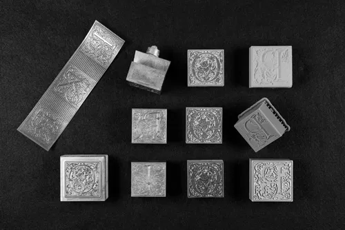
Digital processes have influenced letterpress plate production since the early 1990s,13 with the use of flexographic relief photopolymer and photo-etched magnesium or zinc plates. These standardised processes join a fertile ground for experimentation in contemporary digital laser-engraved and 3D-printed plates. Using Cloister Initials designs, several comparative characters were made with all of these technologies in a collaboration between P22 Type Foundry and RIT Cary Graphic Arts Collection. They were printed using a Vandercook cylinder printing press at P22 (Figure P1.1).
Figure P1.1 Letterpress Type. From Right Column, Top to Bottom: Goudy Cloister Initials Relief Type in Photopolymer; Photo-Etched Magnesium; Modern Lead-Alloy Cast from Original Brass Matrices; Laser-Engraved Maple Wood; Stereolithographic Plastic; Fused Deposition Model 3D Print. Photograph by Jiageng Lin.
The printed comparisons from digitally fabricated plates were promising. Photopolymer plates are known for the ability to render accurate detail in letterpress prints at small sizes. Fine tolerances in plate production at a service bureau and the careful machining of their aluminium printing base make photopolymer plates predictable printing matrices.14 This was true for the Cloister Initials test, with no surprise. The etched magnesium plate also printed well but had more variance in the type height of its plywood-mounted base which had to be corrected in proofing.15 In this way, the photopolymer and magnesium plates joined the P22-cast metal sort in a control group of acceptable prints.
The laser-engraved Cloister Initials character yielded high-quality detail in the floral tendril shapes that replicated the control group’s results. However, this fineness was a direct result of the quality of the wood from which it was cut. This was end-grain maple hardwood that had been carefully milled to letterpress height and face-sanded and shellacked before engraving. All of this work depended greatly on the skill of the worker who prepared the wood—a resource that is not accessible to all. Laser-engraving also requires a lot of testing to refine the laser’s kerf or cutting width, so that the relief block may approximate a piece of cast type.16
Encouraging results were derived from the stereolithographic 3D printing process. This makes 3D objects by successively ‘printing’ or depositing thin layers using a liquid plastic medium that is curable by ultraviolet light. The Formlabs’ Form 3 SLA printer built a Cloister Initials character with a resolution of 50 microns per layer starting from the bottom foot to the type’s face. The letterform curves were acceptably maintained, but a faint striated pattern was apparent in the positive or solid black portions of the 3D-printed type. This would be considered a defect in a cast piece of metal type.
A failed experiment in additive printing used Fused Deposition Modelling (FDM). Here a filament of a thermoplastic material was fed from a coil through a moving, heated extruder head and deposited on the growing work. The FDM 3D printer could not produce a filament that was thin enough to replicate Cloister Initials’ intricate scrollwork.17
It is important to underscore that the Cloister Initials’ seventh life in the current post-digital environment is non-binary, in terms of being material (analogue) versus immaterial (digital).18 It embraces a hybrid existence where one mode of creation blurs seamlessly into another. While Goudy drew his inspiration from media that predates movable type printing, his designs have complexity that tests the limits of contemporary technologies. If one were to forecast into the future at the end of the post-digital period, perhaps in 2035—when type moves unguided on the screen or is converted to 3D effortlessly in several media—Goudy’s Cloister Initials will have perhaps twice as many lives to be documented with a timelessness that transcends any given format.
Notes
This work was first presented with Richard Kegler of P22 Type Foundry at the 2020 Post-Digital Letterpress Conference in Porto, Portugal. The author wishes to acknowledge his continued collaboration, especially in editing this article.
Paul Luna, Typography, A Very Short ...
Table of contents
Cover
Half-Title
Series
Title
Copyright
Contents
List of Figures
Contributors
Acknowledgements
Foreword: Johanna Drucker
Introduction
PART I Introduction: Research
Part Research Highlight: The Seven Lives of a Typeface: Material and Immaterial Convergences
PART II Introduction: Education
Part Education Highlight: Poiesis and Purpose: Lessons in Making
PART III Introduction: Practice
Part Practice Highlight: The Rising Letters – Seven Criteria for the Typographic Design of a Letterpress ArchiveProposing a dual, visual and sound analysis, in the extensive survey and registration of the movable type characters in two countries (observed and considered after twenty-five years have passed)
Conclusion
Index
Frequently asked questions
Yes, you can cancel anytime from the Subscription tab in your account settings on the Perlego website. Your subscription will stay active until the end of your current billing period. Learn how to cancel your subscription
No, books cannot be downloaded as external files, such as PDFs, for use outside of Perlego. However, you can download books within the Perlego app for offline reading on mobile or tablet. Learn how to download books offline
Perlego offers two plans: Essential and Complete
Essential is ideal for learners and professionals who enjoy exploring a wide range of subjects. Access the Essential Library with 800,000+ trusted titles and best-sellers across business, personal growth, and the humanities. Includes unlimited reading time and Standard Read Aloud voice.
Complete: Perfect for advanced learners and researchers needing full, unrestricted access. Unlock 1.5M+ books across hundreds of subjects, including academic and specialized titles. The Complete Plan also includes advanced features like Premium Read Aloud and Research Assistant.
Both plans are available with monthly, semester, or annual billing cycles.
We are an online textbook subscription service, where you can get access to an entire online library for less than the price of a single book per month. With over 1.5 million books across 990+ topics, we’ve got you covered! Learn about our mission
Look out for the read-aloud symbol on your next book to see if you can listen to it. The read-aloud tool reads text aloud for you, highlighting the text as it is being read. You can pause it, speed it up and slow it down. Learn more about Read Aloud
Yes! You can use the Perlego app on both iOS and Android devices to read anytime, anywhere — even offline. Perfect for commutes or when you’re on the go. Please note we cannot support devices running on iOS 13 and Android 7 or earlier. Learn more about using the app
Yes, you can access Post-Digital Letterpress Printing by Pedro Amado, Ana Catarina Silva, Vítor Quelhas, Pedro Amado,Ana Catarina Silva,Vítor Quelhas in PDF and/or ePUB format, as well as other popular books in Design & Art Techniques. We have over 1.5 million books available in our catalogue for you to explore.