![]()
Chapter 1
Depicting Data in Telling Ways
Data flow from the pulse of business: your operations, your business, your market, your industry. Managers and analysts routinely collect and examine key performance measures to better understand their operations and make good decisions. Statistics is the study of principles and methods for exploring data and making correct conclusions.
Developing a full and articulated understanding of key performance measures often begins with a descriptive summary. Descriptive summaries can be developed graphically, which we address here, or numerically, which we develop in the next chapter.
Descriptive Narration
Graphic summaries provide a picture of key data that can be used to elicit important questions, fuel understanding, and facilitate communication. Important data tell stories worth listening to and worthy of retelling. Good graphics capture the detail in the data as well as the overview of their story. They arise in complex environments, so their summaries should depict their complexity. Good graphics present the actual data and show causality, multiple comparisons, multiple perspectives, the effects of the processes that lead to their creation, or the effects of subsequent changes made to those processes. They should visually reinforce the reason the data are of significance and integrate number, word, and illustration.
Complexity is difficult to display, for obvious reasons. Still, complexity can be thoughtfully captured in sequenced layers that allow the content to unfold, inviting interpretation and developing their meaning in the process. A rich and insightful discussion of graphic excellence can be found in any of the works by Edward Tufte (http://www.edwardtufte.com).
Data are generated either by counts or by measurements. Count data arise in settings where sampled elements are classified by a key attribute and assigned to categories, such as defective versus acceptable products, commodities whose prices rose as opposed to remained the same or even fell, or the number of sales made using credit rather than debit card, check, or cash. These are qualitative, or categorical, variables and their summaries are handled differently from quantitative variables. Quantitative variables capture data arising from measurements that include the dimensions of time, distance, length, volume, rates, percent, and monetary value. Some qualitative sample data can, under certain circumstances, be converted to rates or percents and can then be treated as quantitative sample data. Also, quantitative data can be assigned to intervals of measurement values that serve as categories and can be treated using methods appropriate to qualitative data.
Summarizing Qualitative Variables
Qualitative variables can answer the question: how many or how frequently? Qualitative sample data are discrete counts of elements in separate categories. Some qualitative variables may have only two categories (for example, defective or acceptable) or have multiple categories (for example, numbers of sales by geographic region within the service area).
Summarizing sample data for qualitative variables by category can be achieved in a column chart, where the horizontal axis marks each category and a column rises over the category to a level marked on the vertical axis by the count of elements in each category. Columns in the graph do not touch across the categories to convey the fact that there is not an implied continuum or even necessarily an order in which the categories are listed across the horizontal axis. See Figure 1.1 for an example of a column chart for the number of nonfatal occupational injuries and illnesses involving day(s) away from work in 2008 as reported by the U.S. Bureau of Labor Statistics.
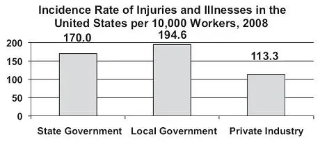
While the data reported in Figure 1.1 are accurate, they are one dimensional. They do not invite insight, comparison, or perspective. The data would be more telling if presented as an incidence rate on a common basis. See Figure 1.2.
Even though the data reported in Figure 1.2 are also one dimensional, they are reported as a rate applied to a common basis of 10,000 workers, which invites comparison and some insight.
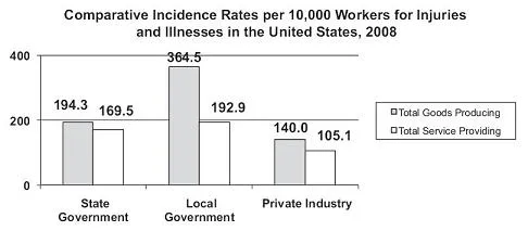
Sometimes data can be split on an additional dimension and summarized in a stacked or side-by-side column chart, as shown in Figures 1.3 and 1.4.
The introduction of an additional dimension leads us to recognize the low numbers of injuries and illnesses reported among workers producing goods in the state and local government sectors. Given state and local government workers are largely in the services sector, however, these results are not terribly surprising.
With the conversion of data to a comparable basis per 10,000 workers shown in Figure 1.4, the introduction of the second dimension of occupation generates an interesting insight—that workers in the goods producing occupations within local governments registered an injury/illness incidence rate
- 88% higher than workers in comparable occupations within state governments:
Rate of injury/illness, goods producing, local versus state government = = 1.876 or approximately 88% higher in local government than state government, and - 160% higher than workers in comparable occupations within private industry:
Rate of injury/illness, goods producing, local government versus private industry = = 2.604 or approximately 160% higher in local government than private industry.
We can also see that workers in service-providing occupations within private industry were significantly less injury/illness prone than in either governmental sectors. The magnitudes of differences reported in the graphic give readers pause to consider a number of questions: possible differences in the nature of jobs among the different sectors, the possibility of different training for worker safety and health, the impact of potentially differing benefit packages, among others. Underscored here is an important principle of data summary: When surprises occur, say so, and present the surprising results as clearly as possible. If the magnitudes of results are unexpected, as they are in this case, say so, and present the surprising magnitudes as clearly as possible. If no data occur in an expected category, say so, and discuss what the results might mean.
A special note of caution is due in working with the data shown in Figure 1.4. Because there are comparatively fewer workers in goods producing within governmental sectors, the incidence rates across service providing and goods producing occupations are not additive within sectors. We would have to convert the rates to an average weighted by the number of workers in each occupation within each sector to achieve additive rates. The caution echoes a broader principle in graphical integrity to avoid distortion of the data.
Summarizing Quantitative Variables
Where qualitative variables respond to the question of how many, quantitative variables can answer the question of how much. Sample data generated by measurements can take on any value along a number line and are considered continuous, in comparison to count data, which are discrete because they take on only the whole number counts of sampled elements.
Comparable to using the column chart for categorical data, summary of continuous variables can be accomplished with the creation of classes into which the various sample values can be sorted and counted. The resulting frequency distribution looks very much like a column chart, where the height of each column represents the counts of data in each class. In contrast to the column chart, however, columns in a frequency distribution are contiguous to convey the fact that there is a continuous scale on the horizontal axis. See Figure 1.5 for an example of a frequency distribution for the miles per gallon (MPG) ratings for city driving for subcompact cars, model year 2011, available for new car sales in the United States.
Information contained in the frequency distribution can also be displayed in a line graph, where the data point for the frequency is located at the center of each class interval. This is also referred to as a frequency polygon. See Figure 1.6.