- 368 pages
- English
- ePUB (mobile friendly)
- Available on iOS & Android
eBook - ePub
Typography 34
Tools to learn more effectively

Saving Books

Keyword Search

Annotating Text

Listen to it instead
Information
TDC59
WINNERS
WINNERS
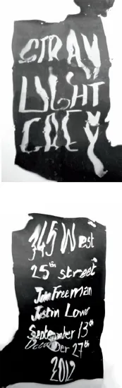
STUDENT PROJECT Design Myriam Amsalem, New York Instructors Brett Kilroe and Nic Taylor School School of Visual Arts, New York Principal Type Hand-drawn
Dimensions 29 x 42 in. (73.7 x 106.7 cm)
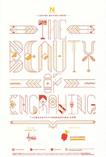
INVITATION Design Armin Vit, Austin Design Firm UnderConsideration Client Neenah Paper Principal Type ZWEI (modified)
Dimensions 5.5 x 8.5 in. (14 x 21.6 cm)
The brief was simple: Showcase the beauty of engraving (and spell it out). Because engraving holds thin lines so well, I wanted to do something that showcased that capability. I had stumbled onto Jacopo Severitano’s font many months before and thought it would be perfect once I got the assignment. I did additions and modifications to some of the characters to have more or fewer lines and changed the thickness as needed so that no matter the type size, the stroke would be the same. I also broke apart some of the letters to create new borders.
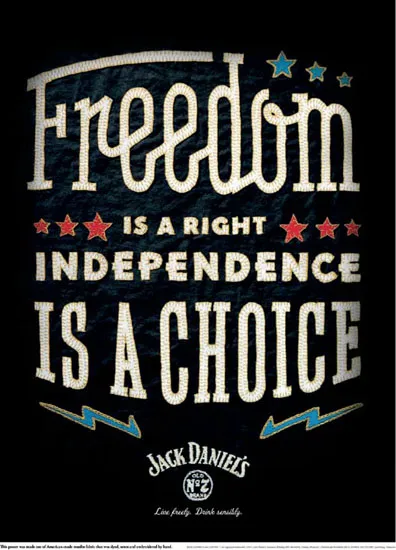
POSTER Design Helms Workshop and Travis Robertson, Austin and Boston Art Direction Helms Workshop and Travis Robertson Group Creative Officer Wade Dever Chief Creative Direction Pete Favat, Boston Agency Arnold Worldwide Client Jack Daniel’s Principal Type Custom
Dimensions Flag: 24 x 32 in. (61 x 81.3 cm); poster: 18 x 24 in. (45.7 x 61 cm)
To celebrate Independence Day in the United States, we focused on creating posters that used methods of true handcraft in their design and construction. In this instance, we designed the custom letterforms, then transferred, cut, and set each in hand-dyed muslin fabric. The custom typography uses a mix of slab and sans serif faces and even a unique slab-script (you don’t see those every day). The assembled poster was then sewn and embroidered by hand.
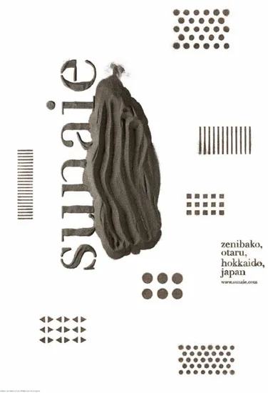
POSTER Design Masayuki Terashima, Sapporo, Japan Design Firm Terashima Design Co. Client Sunaie Principal Type Custom
Dimensions 28.7 x 40.6 in. (72.8 x 103 cm)
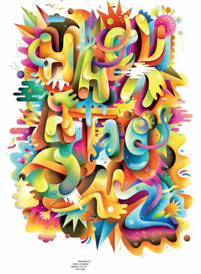
POSTER Design Brian Collins and Matt Luckhurst, New York Creative Direction Brian Collins Design Firm Collins: Client Ogilvy & Mather New York Principal Type Acta Display Book
Dimensions 24 x 36 in. (61 x 91.4 cm)
Designed for Ogilvy & Mather’s new Hackathon event series.
The poster takes an unorthodox approach to identity design, inspired by the messy, free-form thinking that is encouraged in these events. The typography serves as the backbone to an otherwise abstract form. This reflects an appreciation for surprise and reinvention rather than the need for legibility and linear communication design.
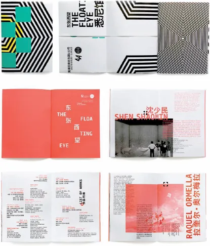
CATALOG Design Michael Boston, Erin Hoffman, Jason Little , and Alexis Waller, Sydney Design Direction Michael Boston Senior Design Sam Byrnes Junior Design Sam McGuiness Creative Direction Jason Little Client 4A Centre for Contemporary Asian Art Principal Type Fedra Mono Std and Hiragino Sans GB
Dimensions 5.8 x 8.3 in. (14.8 x 21 cm)
The Floating Eye™ was the curatorial theme of the Sydney Pavilion in the Shanghai Biennale, the largest international art event in mainland China, attracting more than 8 million visitors. Sydney was part of the Inter-City Pavilions, offering observations of a city’s shifting references and influences.
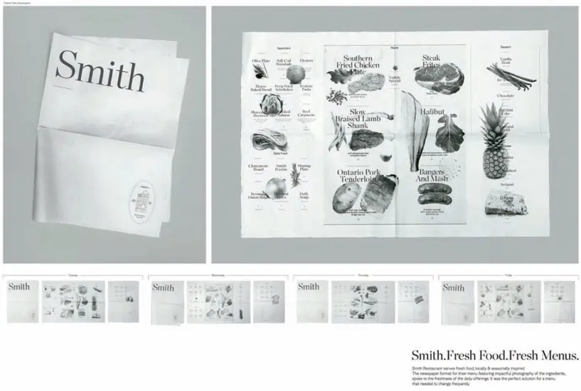
MENU Design Chris Duchaine, Scott Leder, and Tracy Ma, Toronto Creative Direction Lisa Greenberg Chief Creative Officer Judy John Photography David Picard Agency Leo Burnett, Toronto Client Smith Restaurant + Bar Principal Type Chronicle Display and Hudson
Dimensions 17 x 22.75 in. (43.3 x 57.8 cm)
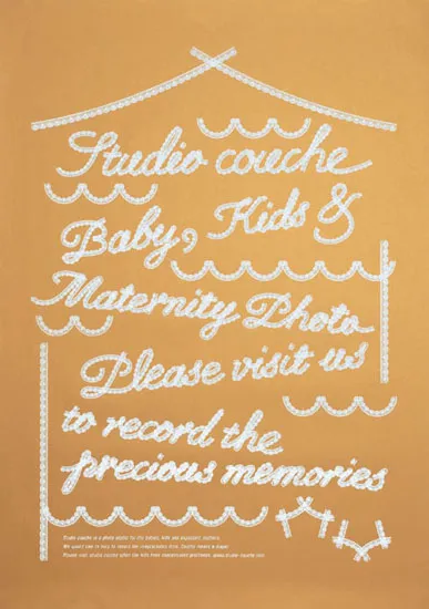
POSTER Art Direction Hiroko Sakai, Tokyo Design Firm coton design Client couche-studio Principal Type Lace Script
Dimensions 28.3 x 40.2 in. (72 x 102 cm)
Couche-studio is a photo studio for kids. The poster represents that this studio is a relaxing space, like a house.
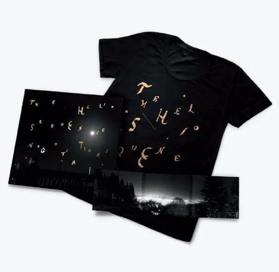
PACKAGING Design Jiri Adamik-Novak and Pavlina Summers, Stockholm and Portland, Oregon Art Direction Jiri Adamik-Novak Photography Pavlina Summers Client SubPop Records, Seattle Principal Type Handwritten and custom
Dimensions CD: 5.5 x 4.9 in. (14 x 12.5 cm); LPH: 12.3 x 12.3 in. (31.3 x 31.3 cm)
The theme of “night” is central to the identity of the new Helio Sequence album, Negotiations. It was over countless evenings that the songs came together and were written, recorded, and mixed. The hand-drawn typography on the cover is meant to evoke the starlit night sky, and at the same time subtly allude to the bright lights of the concert stage. The photographer took pictures of the band and their surroundings on the way to the studio on the final night of the recording sessions, emphasizing the documentary feeling of the recording process and letting the viewer inside the creative world of the band.
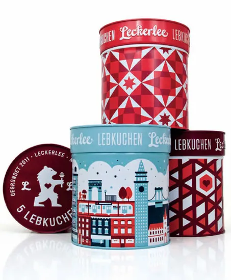
PACKAGING Design Christine Celic Strohl and Eric Janssen Strohl, San Francisco Design Firm Strohl Client Leckerlee, New York Principal Type Custom
Dimensions 4.75 x 5.25 in. (12 x 13.3 cm)
Reminiscent of gingerbread, Lebkuchen are traditional German holiday cookies that have been sold ...
Table of contents
- Contents
- TDC59 Communication Design Chairman’s Statement
- TDC59 Judges
- TDC59 Best in show and Student Design Awards
- TDC59 Judges’ Choices
- TDC59 Winners
- Typeface Design 2013
- Typeface Design 2013 Chairman’s Statement
- Typeface Design 2013 Judges
- Typeface Design 2013 Judges’ Choices
- Typeface Design 2013 Winners
- TDC10 Awards Catalog
- TDC Officers
- TDC Membership
- Acknowledgments
- Type Index
- Index
- Credits
- Copyright
- About the Publisher
Frequently asked questions
Yes, you can cancel anytime from the Subscription tab in your account settings on the Perlego website. Your subscription will stay active until the end of your current billing period. Learn how to cancel your subscription
No, books cannot be downloaded as external files, such as PDFs, for use outside of Perlego. However, you can download books within the Perlego app for offline reading on mobile or tablet. Learn how to download books offline
Perlego offers two plans: Essential and Complete
- Essential is ideal for learners and professionals who enjoy exploring a wide range of subjects. Access the Essential Library with 800,000+ trusted titles and best-sellers across business, personal growth, and the humanities. Includes unlimited reading time and Standard Read Aloud voice.
- Complete: Perfect for advanced learners and researchers needing full, unrestricted access. Unlock 1.4M+ books across hundreds of subjects, including academic and specialized titles. The Complete Plan also includes advanced features like Premium Read Aloud and Research Assistant.
We are an online textbook subscription service, where you can get access to an entire online library for less than the price of a single book per month. With over 1 million books across 990+ topics, we’ve got you covered! Learn about our mission
Look out for the read-aloud symbol on your next book to see if you can listen to it. The read-aloud tool reads text aloud for you, highlighting the text as it is being read. You can pause it, speed it up and slow it down. Learn more about Read Aloud
Yes! You can use the Perlego app on both iOS and Android devices to read anytime, anywhere — even offline. Perfect for commutes or when you’re on the go.
Please note we cannot support devices running on iOS 13 and Android 7 or earlier. Learn more about using the app
Please note we cannot support devices running on iOS 13 and Android 7 or earlier. Learn more about using the app
Yes, you can access Typography 34 by Type Directors Club in PDF and/or ePUB format, as well as other popular books in Art & Art Techniques. We have over one million books available in our catalogue for you to explore.