If you're from the "I don't know zip about color - but I know what I like" school of color theory, this book's for you. You won't find color wheels or lectures on color harmony here . . . just 500+ tried-and-true color combinations derived from actual design work - posters, packages, even giftware - created over the past century by designers, artists and color experts. You'll find historical color combinations from the Victorian period, Art Deco era, Far-out Sixties, Rave craze - plus current color combinations, such as limited color, "bad color" and much more. Even if you don't know what you're looking for, you'll know it when you see it here.
It's not just what colors you use, but how you use them. That's why the color combinations in this book are arranged in simple, sample layouts rather than pages of out-of-context swatches. Complete with color formulas in CMYK, these layouts show you which colors work for backgrounds, borders, type, outlines, panels and small text, so you can easily adapt them to your designs.
- 144 pages
- English
- ePUB (mobile friendly)
- Available on iOS & Android
eBook - ePub
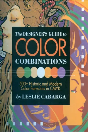
The Designer's Guide to Color Combinations
About this book
Trusted by 375,005 students
Access to over 1.5 million titles for a fair monthly price.
Study more efficiently using our study tools.
Information
Topic
ArteSubtopic
Arte generalTable of contents
- Cover Page
- Title Page
- Copyright Page
- Contents
- INTRODUCTION
- HOW TO USE THIS BOOK
- VICTORIAN COLOR
- ART DECO COLOR
- ATOMIC AGE COLOR
- FAR OUT SIXTIES COLOR
- CURRENT COLOR
- LIMITED COLOR
- BAD COLOR
- EARTH COLOR
- RAVE COLOR
Frequently asked questions
Yes, you can cancel anytime from the Subscription tab in your account settings on the Perlego website. Your subscription will stay active until the end of your current billing period. Learn how to cancel your subscription
No, books cannot be downloaded as external files, such as PDFs, for use outside of Perlego. However, you can download books within the Perlego app for offline reading on mobile or tablet. Learn how to download books offline
Perlego offers two plans: Essential and Complete
- Essential is ideal for learners and professionals who enjoy exploring a wide range of subjects. Access the Essential Library with 800,000+ trusted titles and best-sellers across business, personal growth, and the humanities. Includes unlimited reading time and Standard Read Aloud voice.
- Complete: Perfect for advanced learners and researchers needing full, unrestricted access. Unlock 1.5M+ books across hundreds of subjects, including academic and specialized titles. The Complete Plan also includes advanced features like Premium Read Aloud and Research Assistant.
We are an online textbook subscription service, where you can get access to an entire online library for less than the price of a single book per month. With over 1.5 million books across 990+ topics, we’ve got you covered! Learn about our mission
Look out for the read-aloud symbol on your next book to see if you can listen to it. The read-aloud tool reads text aloud for you, highlighting the text as it is being read. You can pause it, speed it up and slow it down. Learn more about Read Aloud
Yes! You can use the Perlego app on both iOS and Android devices to read anytime, anywhere — even offline. Perfect for commutes or when you’re on the go.
Please note we cannot support devices running on iOS 13 and Android 7 or earlier. Learn more about using the app
Please note we cannot support devices running on iOS 13 and Android 7 or earlier. Learn more about using the app
Yes, you can access The Designer's Guide to Color Combinations by Leslie Cabarga in PDF and/or ePUB format, as well as other popular books in Arte & Arte general. We have over 1.5 million books available in our catalogue for you to explore.