![]()
SECTION ONE
Existing Realities
![]()
CHAPTER 1
From Sprawl to Walkable
How Far Is That?
JULIA KOSCHINSKY AND EMILY TALEN
Key Points and Practice Takeaways
1. A primary objective of “fixing” sprawl is to transform it into places that are walkable and mixed-use.
2. We use a national neighborhood-level dataset of 359 metropolitan areas to address the question of walkable access to amenities and also to examine the tradeoffs between walkable access and socioeconomic neighborhood characteristics.
3. The vast majority of neighborhoods (82 percent) do not have walkable access. Even within cities, the vast majority of neighborhoods (73 percent) are not accessible.
4. Living in places with walkable access involves tradeoffs, as such neighborhoods tend to be more expensive. On average, accessible suburbs are more expensive to live in than accessible cities.
5. Suburbs have several assets that could be leveraged to increase the supply of walkable neighborhoods, including a range of residential density levels, higher-quality schools, and lower segregation levels.
Conceptually, life in walkable, mixed-use neighborhoods is easily contrasted with car-dependent sprawl. Recent books have popularized the contrast, and their titles reveal the high hopes associated with urbanism. Examples include The Option of Urbanism: Investing in a New American Dream and Walkable City: How Downtown Can Save America.1 Over 400 articles have recently been published on topics related to walkable access and walkability.2
A primary objective of “fixing” sprawl is to transform it into places that are walkable and mixed-use. This chapter quantifies how far we have to go: What is the extent of high-access (and therefore walkable) places in suburban and urban areas across all metropolitan areas in the United States? Are such places open to people of all income groups? In addition, we quantify the tradeoffs involved in this pursuit: Are high-access places always a good thing? What are the potential downsides?
Using a unique, comprehensive, national neighborhood-level dataset, this chapter addresses the question of what the supply of accessible neighborhoods and units looks like in urban and suburban areas, where affordable housing fits into this picture, and what the tradeoffs are between walkable access and socioeconomic neighborhood characteristics. Before presenting these findings, the data and measurement of walkable access are discussed. The chapter concludes with a summary and discussion of the implications.
Growing Demand for Mixed-Use and Walkable Neighborhoods
Several recent surveys indicate a growing demand for urban and mixed-use communities. For instance, the National Association of Realtors (NAR) found that 47 percent of respondents preferred living in urban or mixed-use suburban communities compared to 52 percent with a preference for residence-only suburbs, small towns, and rural areas. These numbers were corroborated by a 2014 survey of 10,000 people by the PEW Research Center, which found that 48 percent of respondents preferred “a community where the houses are smaller and closer to each other, but schools, stores, and restaurants are within walking distance,” while 49 percent preferred “a community where the houses are larger and farther apart, but schools, stores, and restaurants are several miles away.” In the NAR survey, of the residents with an urban or mixed-use preference, 8 percent would like to live in the downtown area of cities, 11 percent in urban residential areas, and 28 percent in mixed-use suburbs. In comparison, 12 percent like living in residence-only suburbs, 18 percent in small towns, and 22 percent in rural areas.3
Living in mixed-use walkable neighborhoods is even more popular among younger households: 55 percent of 18- to 34-year-olds would like to live in such areas. This preference is stronger among lower-income households (58 percent for households with less than 80 percent of area median income) than households with higher incomes (44 percent with >120 percent of area median income). Demand to be able to walk or bike to work (less than one mile) increased by 45 percent between 1995 and 2009 and even more so (59 percent) for being able to walk or bike to errands within less than one mile.4
However, despite this changing demand toward more urban, mixed-use, and accessible forms of living, the supply of these living options is still lagging behind: although 23 percent of households would like to walk or bike to work, the supply of such neighborhoods only consists of 4 percent. Similarly, the demand to be able to walk or bike for errands (22 percent) is met in less than half of all cases (10 percent).5
Arlie Adkins also found that for the residents he surveyed who expressed a preference for accessible neighborhoods, only 53 percent of higher-income respondents and 27 percent of low-income respondents were able to realize this preference and actually move to a very walkable area (as defined by Walkscore, see below). The proportion of residents with an access preference who were able to move to a somewhat walkable area is higher but still below demand: 76 percent of higher-income respondents and 60 percent of low-income respondents were able to move to such a neighborhood.6
Preferences and Compromises
Even though about half of all households express a preference for urban or suburban mixed-use communities, in practice households often face decisions that involve tradeoffs between this preference and other priorities, such as school quality, safety, or single-family homes, that might be more prevalent in residential suburban areas. For low-income households, these tradeoffs are accentuated since finding any affordable housing is challenging, let alone in accessible neighborhoods. This is especially true in strong housing markets where the quality of amenities within accessible reach (such as schools, parks, and retail) is often higher but where home values also reflect this added value.
One issue is that neighborhoods can be walkable in terms of urban form dimensions like small block size and land use diversity, but such neighborhoods might not be the ones that offer the most employment access, the lowest crime, or the best schools. Research that is just now surfacing seems to indicate that the most important factors for residents are low poverty and low crime, and that walkable, well-serviced, “sustainable” urban form is of secondary importance.7 In some neighborhoods, access to nearby parks and transit stops might coincide with higher crime risks, and land use mix might represent a higher likelihood of living near a variety of undesirable land uses.8 In other words, the same indicators of walkability that are appreciated in higher-income neighborhoods do not necessarily have the same value in neighborhoods where crime, poor quality of amenities, and undesirable land uses are prevalent.9
Further, the goals of “walkable” and “affordable” neighborhoods are often at odds. No longer is the goal a matter of producing affordable housing wherever cheap land is found, but affordability is sought in places where land, because of its accessibility, is likely to be more expensive. A few studies have documented these tradeoffs. One study of housing prices in New Urbanist development—a development form meant to be walkable—found that most projects were priced at above-market rates. Subsequent research has continued to support the finding that developers of walkable neighborhoods or “traditional neighborhood development” have been able to command a higher price in the marketplace. A survey of housing prices in 152 nonsubsidized New Urbanist developments found that few were affordable to low-income residents. Song and Knaap’s study of New Urbanist housing values found that a net 18 percent premium was being paid for design amenities like pedestrian quality and walkable access.10
Research is also confirming that demand for transit-served areas is rising, thus resulting in a decrease in affordability in these high-demand locations. These studies are motivated by a desire to preserve affordable housing in transit areas and employment centers, suggesting that the development of affordable housing in outlying suburbs not served by transit is problematic. With a focus on transit-oriented development (TOD), studies have found that although a substantial number of affordable apartments are located close to public transit, affordability for more than two-thirds will expire within the next five years. A recent study funded by the U.S. Department of Transportation found that many transit-oriented developments are becoming increasingly unaffordable.11
A new “place-conscious” federal urban policy has placed a stronger emphasis on the neighborhood context of federally subsidized housing, including a focus on so-called high-opportunity neighborhoods, walkable access, and mixed-income communities. Several new programs are supposed to promote these linkages and the location efficiency of affordable housing, for example, through HUD’S new Office of Sustainable Housing and Communities, the Choice Neighborhoods Initiative, and the Sustainable Communities Initiative. Housing choice vouchers have also been associated with policy hopes of moving more tenants to high-opportunity neighborhoods, even though the results of the Moving to Opportunity (MTO) Experiment were sobering in regards to employment and education outcomes.12
Finally, another potential tradeoff is between locating affordable housing in more central, urban, accessible neighborhoods, which often turn out to be more segregated, versus locating it in more racially integrated but also more suburban, less accessible communities. This tension is also expressed in different priorities in the fair housing and community development advocacy communities, which are respectively prioritizing desegregation (potentially at the expense of accessibility) and accessibility (potentially at the expense of segregation). Although much applied work on the “geography of opportunity” has been characterized by this dichotomy between “poverty neighborhoods” versus “fair housing,” recent studies have sought to maintain the multidimensionality of the tradeoffs between urban and suburban opportunity structures. In this context, a matrix of potentially countervailing opportunity components in neighborhoods is promoted as a better representation of this complexity than previous opportunity indices that collapse multiple dimensions into one.13
Data
2010 Census block groups within metro areas are the common unit of analysis (total of 174,186 block groups) in this chapter. Block groups are used as proxies for neighborhood units, with an average of 1,473 people per block group. To identify metropolitan areas, the analysis draws on the 2003 definition of Core Based Statistical Areas of the Office of Management and Budget (referred to as “metro areas” here).
To differentiate urban, suburban, and rural areas, the following definitions are applied. The 2010 Census defines 1,308 principal cities of metropolitan or micropolitan statistical areas.14 These include cities, towns, villages, boroughs, and other municipalities. This analysis is based on the subset of 1,187 principal cities in metro areas that the 2010 Census identifies as cities (i.e., excluding towns or villages).15 For the purpose of this analysis all other neighborhoods outside of these cities but within the metro area are identified as “suburban” if there are no housing units in rural parts of the neighborhood (i.e., any neighborhoods with rural housing units are excluded here).16 Figure 1.1 shows examples of rural, suburban, and principal city neighborhoods within the Chicago and Atlanta metro areas. To differentiate neighborhoods at varying density levels, the number of housing units (2010 Census) is divided by the total area (in acres) in a 2010 block group, which allows for the classification of neighborhoods into five density levels: 0–1, 1–2, 2–3, 3–4, and 4+ units per acre.
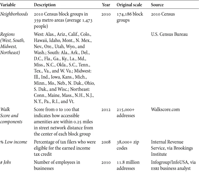
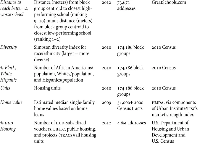
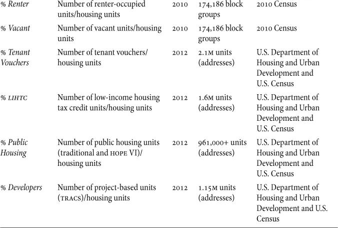
Table 1.1 summarizes the variables and data sources that the analysis is based on: 16.7 million addresses are aggregated at the block group level, including employee numbers of 11.8 million businesses; 4.6 million federally subsidized housing units; school quality data for 73,600+ schools; and 215,000+ accessibility scores (Walk Scores). In addition, home values for 51,000+ Census tracts and low-income household data for 38,000 zip codes are also summarized at the block group level (since tracts and zip codes larger than block groups within the same larger spatial unit share the same values but these data are not available at smaller resolutions). Data to characterize neighborhoods’ race/ethnicity and housing are derived from the 2010 Census at the block group level.
FIGURE 1.1. Rural, suburban, and principal city neighborhoods within the Chicago and Atlanta metro areas.
Maps by Julia Koschinsky.
TABLE 1.1. Data sources and variable description
Measurement of Walkable Access
Since this chapter is based on an analysis of national neighborhood-level data, it is only possible to measure walkable access at this scale (as opposed to the quality of the walking environment). For this purpose, we draw on data from Walkscore.com, which automatically generates a 0–100 score for every residential address in the United States based on an algorithm that measures the distance between an address and the number and types of amenities that can b...