
React Native Cookbook
Step-by-step recipes for solving common React Native development problems, 2nd Edition
- 618 pages
- English
- ePUB (mobile friendly)
- Available on iOS & Android
React Native Cookbook
Step-by-step recipes for solving common React Native development problems, 2nd Edition
About this book
Improve your React Native mobile development skills and transition from web to mobile development with this solution-packed guide
Key Features
- Learn strategies and techniques to face React Native mobile development challenges head-on
- Explore ways to use iOS and Android for React Native development to maximize code reuse and cohesion
- Build engaging user experiences with React Native
Book Description
If you are a developer looking to create mobile applications with maximized code reusability and minimized cost, React Native is what you need. With this practical guide, you'll be able to build attractive UIs, tackle common problems in mobile development, and achieve improved performance in mobile environments.
This book starts by covering the common techniques for React Native customization and helps you set up your development platforms. Over the course of the book, you'll work through a wide variety of recipes that help you create, style, and animate your apps with built-in React Native and custom third-party components. You'll also develop real-world browser-based authentication, build a fully functional audio player, and integrate Google Maps in your apps. This book will help you explore different strategies for working with data, including leveraging the popular Redux library and optimizing your app's dataflow. You'll also learn how to write native device functionality for new and existing React Native projects and how app deployment works.
By the end of this book, you'll be equipped with tips and tricks to write efficient code and have the skills to build full iOS and Android applications using React Native.
What you will learn
- Build UI features and components using React Native
- Create advanced animations for UI components
- Develop universal apps that run on phones and tablets
- Leverage Redux to manage application flow and data
- Expose both custom native UI components and application logic to React Native
- Employ open source third-party plugins to create React Native apps
Who this book is for
If you're a JavaScript developer looking for a practical guide for developing feature-rich mobile apps using React Native, this book is for you. Though not necessary, some experience of working with React will help you understand the React Native concepts covered in this book easily.
While React Native development can be done on a Windows machine, certain aspects, such as running your apps on iOS devices and in the iOS simulator, or editing native code with Xcode, can only be done with a Mac.
Tools to learn more effectively

Saving Books

Keyword Search

Annotating Text

Listen to it instead
Information
Implementing Complex User Interfaces - Part I
- Creating a reusable button with theme support
- Building a complex layout for tablets using flexbox
- Including custom fonts
- Using font icons
Creating a reusable button with theme support
Getting ready
How to do it...
- In the root of our new app, we'll need to create a new Button folder for our reusable button-related code. Let's also create index.js and styles.js in our new Button folder.
- We will start by importing the dependencies for our new component. In the Button/index.js file, we will be creating a Button component. This means we'll need to import the Text and TouchableOpacity components. You'll notice we're also importing styles that do not exist yet. We will define these styles in a different file later in this recipe. In the Button/index.js file, we should have these imports:
import React, { Component } from 'react';

import {
 Text,
 TouchableOpacity,
} from 'react-native';

import {
 Base,
 Default,
 Danger,
 Info,
 Success
} from './styles'; - Now that we have our dependencies imported, let's define the class for this component. We are going to need some properties and two methods. It's also required that we export this component so we can use it elsewhere:
export default class Button extends Component { getTheme() { // Defined in a later step } render() { // Defined in a later step } } - We need to select the styles to apply to our component based on the given properties. For this purpose, we will define the getTheme method. This method will check whether any of the properties are true and will return the appropriate styles. If none are true, it will return the Default style:
getTheme() { const { danger, info, success } = this.properties; if (info) { return Info; } if (success) { return Success; } if (danger) { return Danger; } return Default; } - It's required that all components have a render method. Here, we need to return the JSX elements for this component. In this case, we will get the styles for the given properties and apply them to the TouchableOpacity component.
We are also defining a label for the button. Inside this label, we will render the children property. If a callback function is received, then it will be executed when the user presses this component:
render() { const theme = this.getTheme(); const { children, onPress, style, rounded, } = this.properties; return ( <TouchableOpacity activeOpacity={0.8} style={[ Base.main, theme.main, rounded ? Base.rounded : null , style, ]} onPress={onPress} > <Text style={[Base.label, theme.label]}>{children}</Text> </TouchableOpacity> ); } - We are almost done with our Button component. We still need to define our styles, but first let's move over to the App.js file in the root of the project. We need to import the dependencies, including the Button component we have created.
We are going to display an alert message when the user clicks the button, therefore, we also need to import the Alert component:
import React from 'react'; import { Alert, StyleSheet, View } from 'react-native'; import Button from './Button'; - Once we have all the dependencies, let's define a stateless component that renders a few buttons. The first button will use the default style, and the second button will use the success style, which will add a nice green color to the button's background. The last button will display an alert when it gets pressed. For that, we need to define the callback function that will use the Alert component, just setting the title and message:
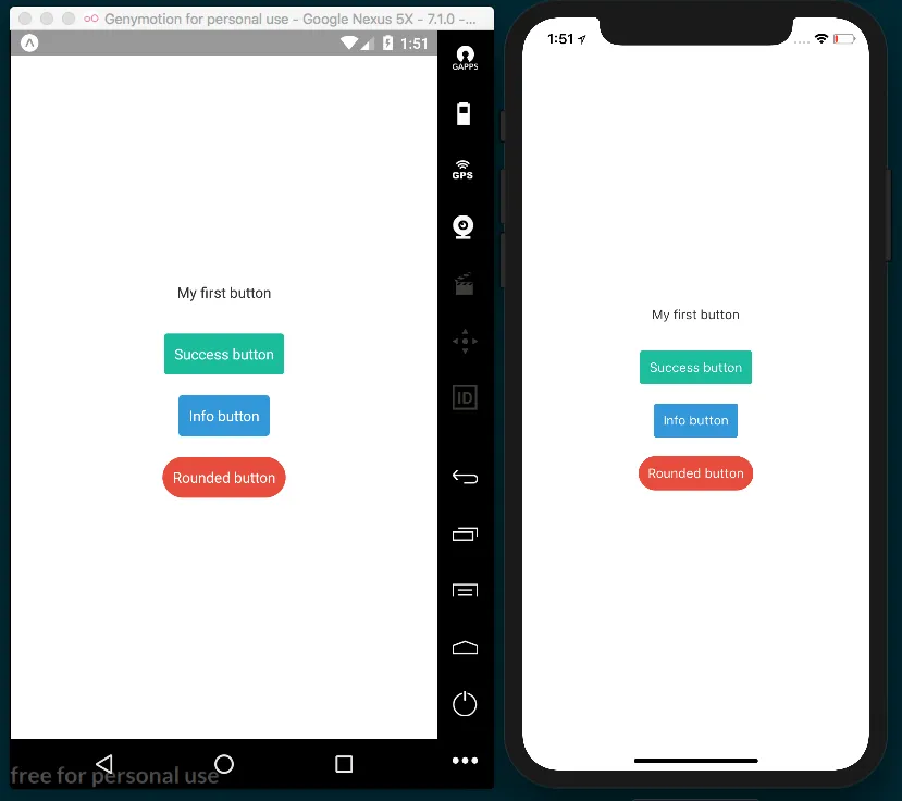
export default class App extends React.Component { handleButtonPress() { Alert.alert('Alert', 'You clicked this button!'); } render() { return( <View style={styles.container}> <Button style={styles.button}> My first button </Button> <Button success style={styles.button}> Success button </Button> <Button info style={styles.button}> Info button </Button> <Button danger rounded style={styles.button} onPress={this.handleButtonPress}> Rounded button </Button> </View> ); } } - We are going to add some styles for how the main layout should align and justify each button, along with some margins:
const styles = StyleSheet.create({ container: { flex: 1, alignItems: 'center', justifyContent: 'center', }, button: { margin: 10, }, }); - If we try to run the app now, we will get some errors. This is because we haven't declared the styles for our button. Let's work on that now. Inside the Button/styles.js file, we need to define the base styles. These styles will be applied to every instance of the button. Here, we will define a radius, padding, font color, and all the common styles that we need for this component:
import { StyleSheet } from 'react-native'; const Base = StyleSheet.create({ main: { padding: 10, borderRadius: 3, }, label: { color: '#fff', }, rounded: { borderRadius: 20, }, }); - Once we have the common styles for our button, we need to define the styles for the Danger, Info, Success, and Default themes. For this, we are going to define different objects for each theme. Inside each theme, we will use the same object but with specific styles for that theme.
To keep things simple, we are only going to change the backgroundColor, but we do have the option to use as many style properties as we want:
const Danger = StyleSheet.create({ main: { backgroundColor: '#e74c3c', }, }); const Info = StyleSheet.create({ main: { backgroundColor: '#3498db', }, }); const Success = StyleSheet.create({ main: { backgroundColor: '#1abc9c', }, }); const Default = StyleSheet.create({ main: { backgroundColor: 'rgba(0 ,0 ,0, 0)', }, label: { color: '#333', }, }); - Finally, let's export the styles. This step is necessary so that the Button component can import all the styles for each theme:
export { Base, Danger, Info, Success, Default, }; - If we open the app, we should be able to see our completed layout:
How it works...

Building a complex layout for tablets using flexbox
Table of contents
- Title Page
- Copyright and Credits
- About Packt
- Contributors
- Preface
- Setting Up Your Environment
- Creating a Simple React Native App
- Implementing Complex User Interfaces - Part I
- Implementing Complex User Interfaces - Part II
- Implementing Complex User Interfaces - Part III
- Adding Basic Animations to Your App
- Adding Advanced Animations to Your App
- Working with Application Logic and Data
- Implementing Redux
- App Workflow and Third-Party Plugins
- Adding Native Functionality - Part I
- Adding Native Functionality - Part II
- Integration with Native Applications
- Deploying Your App
- Optimizing the Performance of Your App
- Other Books You May Enjoy
Frequently asked questions
- Essential is ideal for learners and professionals who enjoy exploring a wide range of subjects. Access the Essential Library with 800,000+ trusted titles and best-sellers across business, personal growth, and the humanities. Includes unlimited reading time and Standard Read Aloud voice.
- Complete: Perfect for advanced learners and researchers needing full, unrestricted access. Unlock 1.4M+ books across hundreds of subjects, including academic and specialized titles. The Complete Plan also includes advanced features like Premium Read Aloud and Research Assistant.
Please note we cannot support devices running on iOS 13 and Android 7 or earlier. Learn more about using the app