Mathematics
Scatter Graphs
Scatter graphs are used to display the relationship between two sets of data. Each data point is represented by a dot on the graph, with the horizontal axis typically showing one set of values and the vertical axis showing the other. This type of graph is useful for identifying patterns or trends in the data.
Written by Perlego with AI-assistance
Related key terms
1 of 5
10 Key excerpts on "Scatter Graphs"
- eBook - PDF
- Sally Caldwell(Author)
- 2012(Publication Date)
- Cengage Learning EMEA(Publisher)
As a prelude to both, we’ll explore the use of scatter plots as a means to visually represent the association between two variables. Before We Begin As you encounter this twelfth and final chapter, I’m going to ask you to explore some additional dimensions related to relationships. First, you’re going to be introduced to the notions of the strength and direction of relationships. In doing so, you’ll deal with the question of how closely tied one variable is to the other, as well as how the variables vary together, so to speak. You’ll also be dealing with the matter of prediction—the idea that if you know something about the way two variables are related, you’re then in a position to make predictions. For example, if you have some knowledge as to the strength and direction of the relationship between two variables, X and Y , it is possible to make a prediction about the likely value of Y , given a certain value of X . All of that may strike you as a little bit abstract as we begin this chapter, but I can assure you that you’re already familiar with a lot of concepts that you’re going to encounter. Means, standard deviations, and Z scores are about to re-enter the picture. If you think you’re a little rusty on some of those concepts, particularly standard deviations or Z scores, take a little time to reread previous material on the topics. The review will serve you well. Scatter Plots A scatter plot is an extremely useful tool when it comes to looking at the association between two variables. In short, a scatter plot allows us to simul-taneously view the values of two variables on a case-by-case basis. A typi-cal example used to illustrate the utility of a scatter plot is one involving the association between height and weight. Table 12-1 shows a hypothetical distribution of values of those variables (height and weight) for 20 cases. A visual representation of the same data in the form of a scatter plot is shown in Figure 12-1. - eBook - PDF
Quick Answers to Quantitative Problems
A Pocket Primer
- G. William Page, Carl V. Patton(Authors)
- 2014(Publication Date)
- Academic Press(Publisher)
PART 2 Basic Ways to Analyze Data This page intentionally left blank Chapter 4 SCATTERPLOTS • · · · Definition Scatterplots are simple graphic techniques that are often valuable for discovering trends, patterns, and relationships in data. Scatterplots are also called scattergrams or scatter diagrams. Scatterplots are graphic representations of two variables: one is measured on the y (vertical) axis and the second variable is measured on the χ (horizontal) axis. Scatterplots assume that both variables are measured on an interval or ratio scale (see Chapter 1, Descriptive Statistics). Scatterplots may be modified to include additional information. Scatterplots are strongly recommended before doing any tests for associations or relationships between variables. A scatterplot can help us determine whether two variables are related. For instance, a city could use a scatterplot to find out if the level of noise in downtown parks and plazas is related to the use of those parks and plazas. Method Use graphic techniques in order to prepare a scatterplot as a first step in determining if noise levels and use of the parks are related. The procedure is as follows: 43 44 Basic Ways to Analyze Data Step 1. Establish and label the χ and y axes. The χ axis, the abscissa or horizontal axis, is assigned to average noise levels. By convention, the variable that is thought to be the independent variable, is assumed to be the one that causes or explains the variation in the dependent variable. The y axis, the ordinate or vertical axis, is by convention assigned to the dependent variable. In this example, we assign use of the parks to the y axis on the assumption that use may be in some sense dependent on the levels of noise (note that the opposite assumption is also reasonable in this example). Step 2. Scale the χ and y axes. The scatterplot requires sufficient detail in the scale of the axis for you to plot the data accurately (see Figure 1). - eBook - ePub
Compassionate Statistics
Applied Quantitative Analysis for Social Services (With exercises and instructions in SPSS)
- Vincent E. Faherty(Author)
- 2007(Publication Date)
- SAGE Publications, Inc(Publisher)
Chapter 11 , will introduce correlations used for inferential purposes.Scattergrams/Scatterplots
It would be perfectly legitimate to portray the existence of a numerical correlation between two variables in a standard table, as in Table 10.1 .Unfortunately, the true nature of this correlation is not easily apparent in a table format. Only partially revealed in Table 10.1 is the fact that the data indicate (surprisingly) that the longer clients stayed in treatment at this agency, the worse became their attitude about that agency’s effectiveness. It is for this reason that most researchers create scattergrams, rather than tables, to present correlations used solely for descriptive purposes.Table 10.1 Table of the Length of Client Contact (in Weeks) and Client Attitude Toward Agency Effectiveness (10 = Very High , 1 = Very Low )Client # Contact in Weeks Attitude Toward Agency 01 2 10 02 4 8 03 7 2 04 6 3 05 4 6 06 2 10 07 7 2 08 10 1 09 5 5 10 7 3 11 3 8 12 2 8 13 8 3 14 9 1 15 4 10 16 8 2 17 4 10 A scattergram , also called a scatterplot, offers a clear visual image of the intersection of the values contained in the two variables. Scattergrams are conceptually based on the image of the X axis and Y axis. You are undoubtedly familiar with this image since it is commonly used as a template in economics and business administration classes to display economic trends and forecasts.A scattergram literally pinpoints where individual cases (usually people) are placed on a grid bounded by the possible values of the two variables being analyzed, then scatters those points, thereby forming some variation of a pattern. These possible values start at an absolute zero point, where the X axis crosses the Y axis, and then continue to increase vertically and horizontally out from that zero point, as illustrated in Figure 10.4 - No longer available |Learn more
- Jessica Utts, Robert Heckard(Authors)
- 2015(Publication Date)
- Cengage Learning EMEA(Publisher)
Our ability to predict what happens for an individual depends on the amount of natural variability from that pattern.” Copyright 2014 Cengage Learning. All Rights Reserved. May not be copied, scanned, or duplicated, in whole or in part. Due to electronic rights, some third party content may be suppressed from the eBook and/or eChapter(s). Editorial review has deemed that any suppressed content does not materially affect the overall learning experience. Cengage Learning reserves the right to remove additional content at any time if subsequent rights restrictions require it. 70 Chapter 3 Unless otherwise noted, all content on this page is © Cengage Learning. 3.1 Looking for Patterns with Scatterplots A scatterplot is a two-dimensional graph of the measurements for two numerical vari-ables. A point on the graph represents the combination of measurements for an indi-vidual observation. The vertical axis, which is called the y axis, is used to locate the value of one of the variables. The horizontal axis, called the x axis , is used to locate the value of the other variable. As we learned in Chapter 2, when looking at relationships, we can often identify one of the variables as an explanatory variable that may explain or cause differences in the response variable . The term dependent variable is used as a synonym for response variable because the value for the response variable may depend on the value for the explanatory variable . In a scatterplot, the response variable is plotted on the vertical axis (the y axis), so it may also be called the y variable . The explanatory variable is plot-ted along the horizontal axis (the x axis) and may be called the x variable . - eBook - PDF
- Geoff Der, Brian S. Everitt(Authors)
- 2012(Publication Date)
- Chapman and Hall/CRC(Publisher)
Two elements of the shape of a scatter plot that are most useful in describing relationships between variables are measures of ‘location’ and ‘spread’. For example, location might be measured as a line or a curve that runs through the bulk of the data, while spread might be measured in terms of deviations of ( x, y ) points from the estimated location. 188 Applied Medical Statistics Using SAS The simple xy scatter plot has certainly been in use for a long time—at least from the eighteenth century, and it has many virtues, indeed, according to Tufte (1983): The relational graphic—in its barest form the scatterplot and its variants—is the greatest of all graphical designs. It links at least two variables encouraging and even imploring the viewer to assess the possible causal relationship between the plotted variables. It confronts causal theories that x causes y with empirical evidence as to the actual relationship between x and y. Now let’s have a look at an example of a scatter plot. For this we will use the data shown in Table 7.1, which were collected in a study investigating the pos-sible link between alcohol consumption and the death rate per 100,000 of the population from cirrhosis and alcoholism (data collected before West Germany ceased to exist as a separate country). - Michael Friendly, Howard Wainer(Authors)
- 2021(Publication Date)
- Harvard University Press(Publisher)
6 The Origin and Development of the Scatterplot As we saw in Chapter 5, most modern forms of data graphics—pie charts, line graphs, and bar charts—can generally be attributed to William Playfair in the period 1785–1805. All of these, even though presented as two-dimensional graphs, were essentially one-dimensional in their view of data. They showed a single quantitative variable (such as land area or value of trade) broken down by a categorical variable, as in a pie chart or bar chart, or plotted over time (perhaps with separate curves for imports and exports), as in a line graph. In the development of a language and taxonomy of graphs, Playfair’s graphs and other visual representations of data in this time can considered 1.5D— more than just a single variable shown, but not quite enough to qualify for 2D status. In Playfair’s visual understanding, the horizontal axis in his plots most often bound to time, forcing him to use other means to show relations with other variables. The next major invention in data graphics—the first fully two-dimensional one—was the scatterplot. Indeed, among all forms of statistical graphics, the scatterplot may be considered the most versatile and generally useful inven- tion in the entire history of statistical graphics. 1 Essential characteristics of a scatterplot are that two quantitative variables are measured on the same observational units (workers); the values are plotted as points referred to perpendicular axes; and the goal is to show something about the relation between these variables, typically how the ordinate variable, y, varies with the abscissa variable, x. Figure 6.1 shows a typical, if simplistic, modern scatterplot. It relates the number of years of experience of some workers on the horizontal (x) axis to their current annual salary on the vertical (y) axis. The experience and salary- eBook - ePub
- Bruce J. Chalmer(Author)
- 2020(Publication Date)
- CRC Press(Publisher)
11Describing Relationships Between Two Variables
11.1 A scatterplot shows the shape of a relationship between two variables.
Relationships between variables
Before we discuss ways of describing relationships between variables, we need to consider why we should bother. The answer is the same as it was when we considered group differences on a single variable: Many scientific hypotheses can be stated in terms of the relationship between two variables. In fact, the issue of group differences can itself be considered in terms of a relationship between two variables and some of the same techniques apply, as we will see.What do we mean by a “relationship” between variables? To say that two variables are related means that knowledge of an individual's score on one variable changes our best guess about the individual's score on the other variable.For example, yield of com per hectare and amount of rainfall during the growing season are presumably related to each other. If we knew nothing else about a given farm (besides the fact that com was planted there), our best guess about the yield we might expect from that farm would simply be the average com yield. But if we were given information about the rainfall at the farm, our guess would probably be affected. If we were told that there is almost no rain at the farm, then, in the absence of irrigation, we would expect a very low yield. If we were told that there is too much rain, we would similarly expect a low yield. If we were told that the amount of rain is just right for com, we would expect a high yield.Figure 11.1 shows a graphical representation of this type of relationship. By drawing such a picture, we can characterize the “shape” of a relationship. In this case it is curvilinear: High com yields are associated with moderate rainfall, with lower yields for very high or very low rainfall.Scatterplots
Of course, Figure 11.1 is unrealistic. Even though rainfall undoubtedly does affect com yield, it is not the only factor. Many other things matter also. Knowing the amount of rainfall would change our best guess about com yield, but we still would not be able to predict com yield perfectly - eBook - PDF
- Stephen Shennan(Author)
- 2014(Publication Date)
- Academic Press(Publisher)
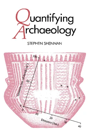
Nine Relationships between Two Numeric Variables : Correlation and Regression METHODS OF VISUAL DISPLAY! SCATTERGRAMS The investigation of relationships between two numeric variables has one great advantage over the study of relationships between nominal scale variables which we have seen in earlier chapters : the relationships can be presented in the form of a visual display, known as a scatter diagram or scattergram, where one variable is plotted against another. As always, such pictures can convey a great deal of information and prevent us from being misled, which can happen all too easily if we consider only numerical summaries of relationships. Table 9.1. Quantities of New Forest pottery recovered from sites at varying distances from the kilns. Site 1 2 3 4 5 Distance (km) 4 20 32 34 24 Quantity (sherds per m 3 of earth) 98 60 41 47 62 For each observation we have a value for one variable and a value for another. Thus, suppose we are interested in the relationship between the quantity of pottery from the Romano-British kilns of the New Forest, in southern England, reaching sites at varying distances from the source. We might have the information shown in table 9.1. We can then produce a scattergram and plot in the points, with distance as the horizontal axis and pottery quantity as the vertical axis. Each site is placed at the appropriate point above the 114 Correlation and Regression 115 horizontal axis and opposite the vertical axis corresponding to its values on the variables (figure 9.1 ). 100 -, CO -σ I x x ° 5 °H o x 3 X c cs O 0-1 1 1 1 1 0 10 20 30 40 Distance (km) Figure 9.1. Plot of the quantity of Romano-British pot-tery from the New Forest kilns reaching various sites, in relation to the distance of the sites from the kilns. This scattergram simply as it stands is extremely informative. We can see that the quantity of pottery decreases as distance from the source increases. - eBook - PDF
Experimental Methods for Science and Engineering Students
An Introduction to the Analysis and Presentation of Data
- Les Kirkup(Author)
- 2019(Publication Date)
- Cambridge University Press(Publisher)
3 Graphical Presentation of Data 3.1 Overview: The Importance of Graphs Our ability to absorb and process information when it is presented in the form of a picture is so good that it is natural to exploit this talent when analysing data obtained from an experiment. When data are presented pictorially, trends or fea- tures in the data can be detected that we would be unlikely to recognise if the data were given only in tabular form. This is especially true in situations where a set of data consists of hundreds or thousands of values, which is a common occurrence when a computer is used to assist in data gathering. Additionally, a pictorial representation of data in the form of a graph is an excellent way to summarise many of the important features of an experiment. A graph can indicate: (i) the quantities being studied (ii) the range of values obtained through measurement (iii) the uncertainty in each value (iv) the existence or absence of a trend in the data gathered (for example, plotted points may lie in a straight line or a curve, or may appear to be scattered randomly across the graph) (v) which plotted points do not follow the general trend exhibited by most of the data. x–y graphs (also known as scatter plots or Cartesian coordinate graphs) are used extensively in science and engineering to present experimental data, and it is those that we will concentrate on in this chapter. 3.2 Plotting Graphs An x–y graph possesses horizontal and vertical axes, referred to as the x and y axes, respectively. Each point plotted on the graph is specified by a pair of numbers termed the coordinates of the point. For example, point A in Figure 3.1 has the coordinates x = 20, y = 50. The coordinates of the point may be written in shorthand as (x,y), which in the case of point A on Figure 3.1 would be (20,50). To assist in the accurate plotting of data, graph paper may be used on which are drawn evenly spaced vertical and horizontal gridlines as shown in Figure 3.1. - eBook - PDF
Quantitative Reasoning
Tools for Today's Informed Citizen
- Alicia Sevilla, Kay Somers(Authors)
- 2012(Publication Date)
- Wiley(Publisher)
Sketch a scatterplot of the data collected from the class and discuss any trends. Which variable did you choose for the horizontal axis and which variable did you choose for the vertical axis? Does it matter? b. Discuss any problems associated with collecting these measurements. c. How can you indicate a student’s gender on the scatterplot? 7. The following table gives information from a sample of college students: gender; number of children in family of origin; and number of children in their ideal family, in which they may someday be a parent. Gender No. of Children in Family of Origin No. of Children in Ideal Family F 2 2 M 3 2 M 4 3 F 2 2 F 4 3 M 5 5 F 3 3 F 2 3 F 2 2 F 4 4 M 3 3 F 4 0 F 3 3 F 3 4 F 1 2 M 2 2 M 3 3 M 2 2 M 1 1 M 2 0 66 Topics ’ ’ ’ ’ ’ ’ ’ ’ ’ ’ ’ a. Sketch a scatterplot of the data collected from the students and discuss any trends. (Use the same scale on both axes.) Which variable did you choose for the horizontal axis and which variable did you choose for the vertical axis? Does it matter? b. Describe the role of the diagonal line y ¼ x and what it helps you see about the data. c. Do you think the data for males and the data for females should be considered sepa- rately? Why or why not? 8. The following table of data gives hockey star Eric Lindros’ career numbers for the eight seasons he played with the Philadelphia Flyers: Year Games Goals Assists Points 199394 65 44 53 97 199495 46 29 41 70 199596 73 47 68 115 199697 52 32 47 79 199798 63 30 41 71 199899 71 40 53 93 19992000 55 27 32 59 Totals 486 290 369 659 Source: The Internet Hockey Database, www.hockeyDB.com. a. Sketch a scatterplot of the two variables “number of games played in a season” and “number of points scored by Lindros,” and discuss any trends. b. Which variable did you choose for the horizontal axis and which variable did you choose for the vertical axis? Does it matter? c. Determine if there appears to be a relationship between goals and assists.
Index pages curate the most relevant extracts from our library of academic textbooks. They’ve been created using an in-house natural language model (NLM), each adding context and meaning to key research topics.
