Technology & Engineering
Control Chart
A control chart is a statistical tool used to monitor and analyze process variations over time. It helps identify whether a process is in a state of statistical control or if there are any unusual patterns or trends that may indicate a need for corrective action. By plotting data points on a chart with control limits, it provides a visual representation of process performance.
Written by Perlego with AI-assistance
Related key terms
1 of 5
12 Key excerpts on "Control Chart"
- eBook - ePub
- Larry Webber, Michael Wallace(Authors)
- 2011(Publication Date)
- For Dummies(Publisher)
What you really want to know through Statistical Process Control is whether your organization’s production process is making items correctly based on customer specifications. Control Charts are your best tools for tracking your process to detect variation that isn’t caused by normal variation in the process, but rather by some fundamental change in the process that needs your attention. The bare-bones procedure for creating and interpreting a Control Chart is as follows:1.Sample the process at some regular interval. 2.Plot whatever statistic you’re using on a Control Chart. 3.Look at the chart to see if the process is in control. 4.If the process isn’t in control, look for the cause and correct it.In the following sections, we show you the ideas behind Control Charts, and we let you know how to use Control Charts in order to verify that your process actually does what it should be doing.Detecting different types of variation
All Control Charts have the same basic purpose: to detect variation in a production process — unnatural variation that isn’t a part of the normal process. You deal with two different types of variation in a process:Common-cause variation: The variation inherent in the process. As long as the process doesn’t change, the common-cause variation stays the same. Common-cause variation is part of the production process for one or more reasons: because of the nature of the system, the way the process is operated, or the way the process is managed. You can change common-cause variation only by making a change to the process itself. For example, the precision of a machine used in drilling a hole determines how much variation is normal for that machine. If the machine is capable of centering the hole within 0.25 millimeters of the desired location, any variation within 0.25 millimeters of the desired location is the common-cause variation for that machine.Special-cause variation: - Amitava Mitra(Author)
- 2021(Publication Date)
- Wiley(Publisher)
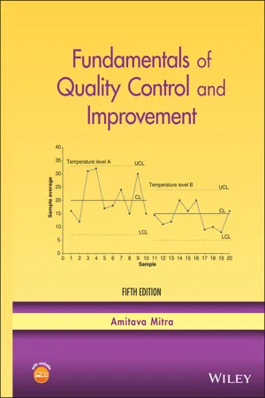
Control Charts are important management control tools. If management has some target value in mind for the process mean (say, average part strength), a Control Chart can be constructed with that target value as the centerline. Sample statistics, when plotted on the Control Chart, will show how close the actual process output comes to the desired standard. If the deviation is unsatisfactory, management will have to come up with remedial actions. Control Charts help management set realistic goals. For example, suppose the output of a process shows that the average part strength is 3000 kg, with a standard deviation of 100 kg. If management has a target average strength of at least 3500 kg, the Control Chart will indicate that such a goal is unrealistic and may not be feasible for the existing process. Major changes in the system and process, possibly only through action on the part of management, will be needed to create a process that will meet the desired goal. If a process is under statistical control, Control Chart information can estimate such process parameters as the mean, standard deviation, and proportion of nonconforming items 290 STATISTICAL PROCESS CONTROL USING Control ChartS (also known as fallout). These estimates can then be used to determine the capability of the process. Process capability refers to the ability of the process to produce within desirable specifications. Conclusions drawn from studies on process capability have a tremendous influence on major management decisions such as whether to make or buy, how to direct capital expenditures for machinery, how to select and control vendors, and how to implement process improvements to reduce variability. Process capability is discussed in Chapter 9. For variables, the value of a quality characteristic is measurable numerically. Control Charts for variables are constructed to show measures of central tendency as well as dispersion.- No longer available |Learn more
- Anthony Hayter(Author)
- 2012(Publication Date)
- Cengage Learning EMEA(Publisher)
Control Charts for the mean and variability of a variable of interest are considered in Section 16.3, and Control Charts for the number of defective items or the number of defects in an item are considered in Section 16.4. Finally, acceptance sampling procedures, which can be used to make decisions about the acceptability of batches of items, are discussed in Section 16.5. 16.2 Statistical Process Control Consider a manufacturing organization that is involved in the production of a large number of a certain kind of product, such as a metal part, a computer chip, or a chemical solution. These products are manufactured using a process that typically involves the input of raw materials, a series of procedures, and possibly the involvement of one or more operators. Statistical process control concerns the continuous assessment of the various stages of such a process to ascertain the “quality” of the product as it passes through the process. A key component of this assessment is the use of Control Charts. 16.2.1 Control Charts A Control Chart is a simple quality control tool in which certain measurements of products at a particular point in a manufacturing process are plotted against time. This simple graphical method allows a supervisor to detect when something unusual happens to the process. 736 Copyright 2011 Cengage Learning. All Rights Reserved. May not be copied, scanned, or duplicated, in whole or in part. Due to electronic rights, some third party content may be suppressed from the eBook and/or eChapter(s). Editorial review has deemed that any suppressed content does not materially affect the overall learning experience. Cengage Learning reserves the right to remove additional content at any time if subsequent rights restrictions require it. - Harrison M. Wadsworth, Kenneth S. Stephens, A. Blanton Godfrey(Authors)
- 2004(Publication Date)
- Wiley(Publisher)
They are useful to demonstrate the kind of variation one may expect when sampling results from a fixed population representing a stable process. Additionally, they are useful to demon- strate the ability of Control Charts to detect changes in the population, affording some de- gree of confidence and understanding in the use of Control Charts. The Control Chart The Control Chart is a useful tool for studying variation. It employs some of the statisti- cal theory discussed in Chapter 5 to place limits of expected variation for a fluctuating pattern. Typical is the Control Chart shown in Figure 6-6, which shows limits placed about the fluctuating pattern of Figure 6-1. These limits give the Control Chart analytical power to enable its user to determine whether a process can be considered stable and thus predictable or unstable and unpre- dictable. Such information about an important quality characteristic can enable one to continue to control, in the case of a stable process operating at an acceptable level, or gain control, in the case of an unstable process. This is accomplished by repeated rational sampling of the process and analysis of the data plotted on the Control Chart. Unstable patterns are often associated with special or sporadic causes in the process. Stable pat- terns operating at unacceptable levels are often associated with common or chronic causes in the process. 3 6-1 Variation and the Control Chart 167 Figure 6-6 Control Chart Display of Variation Deviation from specified nominal dimension –5 0 1 2 3 4 5 6 7 Order of sampling 8 9 10 11 12 13 14 15 –4 –3 –2 –1 0 1 2 3 4 5 3 The terms “special” and “common” are attributed to Ed Deming; the associated terms “sporadic” and “chronic,” respectively, are attributed to Joe Juran. A Control Chart is a graphic representation of the variation in the computed statistics being produced by the process. It has a decided advantage over the frequency distribution method of presenting data (e.g., Figure 6-2).- Douglas C. Wood, Sandra L. Furterer, Douglas C. Wood, Sandra L. Furterer(Authors)
- 2021(Publication Date)
- ASQ Quality Press(Publisher)
- How does downtime for this computer compare to other computers used within the same location, to similar computers used at other locations, and to different brands of computers?
As the previous example shows, tabular data do not as easily lend themselves to consistent interpretation. The power of statistics is that it can reduce the amount of data to be interpreted and also help to point out specific issues that may be more important. Simple statistics used to analyze groups of data are discussed earlier in this section.Types of Control Charts. A Control Chart is used to determine whether or not a process is stable , which means that it has predictable performance. By monitoring the output of a process over time, a Control Chart can be used to assess whether the application of process changes or other adjustments has resulted in improvements. If the process produces measurable parts, the average of a small sample of measurements, not individual measurements, should be plotted.There are several software packages that assist in Control Chart creation and maintenance. Care should be taken in using these that the fundamental process of Control Charts is understood. For example, most of these software packages allow the instant recalculation of the control limits as new data are added to the chart. This is a feature to aid in the creation of the control system. If this feature is not disabled after the control limits have been set from an in-control data set, the process will never leave the control region. Thus, the purpose of the Control Chart will be lost.- eBook - PDF
- J. A. John, D. Whitaker, D. Whitaker(Authors)
- 2005(Publication Date)
- Chapman and Hall/CRC(Publisher)
309 Chapter 12 Contr ol Charts 12.1 Introduction A Control Chart is a run chart on which the borders and centre line of the common cause highway have been drawn. In this chapter we consider how to construct Control Charts for different situations and types of data. We also discuss how to interpret the charts and how to use them to monitor a process. There are two main types of Control Charts: ■ Variables Control Charts • The individuals chart: A chart used for interval data, when it is feasible to get only one measurement in any time period. For example, in the debt recovery example in Section 1.3, data on the percentage of unre-covered debt was available only once a month. • The R and X-bar charts: Two Control Charts used for interval data, when a number of measurements can be obtained in a relatively short period of time. They are commonly used on data from the production floor, for example, the width of corrugated cardboard from a continuous process in the packaging industry, and the weight of cans of milk powder from a filling process in the dairy industry. ■ Attribute Control Charts • The p-chart : A chart used for proportions, where samples of a fixed size are taken regularly and the proportionate occurrence of some attribute is determined, for example, the proportion of leaky cartons used for orange drinks, or the proportion of faulty microchips produced by a computer component manufacturer. • The c-chart : A chart used for count data, where we observe regularly the number of times that an event or feature occurs, for example, the number of accidents or machine breakdowns, or the number of burrs in reels of woven cloth. 310 Statistical Thinking in Business Routines for drawing each of these Control Charts are provided in the STiBstat add-in. - eBook - ePub
- Irving W. Burr(Author)
- 2018(Publication Date)
- Routledge(Publisher)
4. Decreasing product variability. Careful watch of R or s chart and improving control of these charts and the x̄ chart usually greatly decreases variability.5. Determining repeatability of a measuring or analytical technique and its error. First step is to gain control on R or s chart for homogeneous material. Then R̄/d2 estimates σe . See Burr [26 ].6. Saving on scrap and rework costs. Control Charts can give aid in running at a safe level from both specification limits to minimize scrap relative to one limit and rework relative to the other. Also review 4 in this outline.7. Increasing tool and die life, determining when to retool or reset. See Section 7.2 again.8. Decreasing inspection for processes in control at satisfactory level. Process control samples can then be spaced farther apart and/or final inspection or customer’s receiving inspection reduced. Example 4 of Section 4.7 gives a case where the sampling was reduced to once in eight hours.9. Safer guaranteeing of product, reducing customer complaints. Processes in control are the basic ingredient. Enables Sales to know what to promise customers.10. Obtaining warning of impending trouble. In a woolen processing line a Control Chart would have given a warning right at the time of process change, whereas without such a chart, trouble was not noticed for six weeks resulting in fumbling for six months.11. Improving engineering-production relations. By production obtaining maximum economic performance of processes and reporting capabilities to engineering, more realistic specifications may be set and costs minimized.12. Improving producer-consumer relations, by more factual knowledge of process capabilities, and by making measurements and defect definitions compatible. 13. Decreasing defects on sub-assemblies. Many cases could be cited of improvement through p, c and u charts.14. Comparison of several inspectors, machines, processes, heads, spindles, orifices and so forth, by comparing one sample from each. See also Section 7.9 - Trevor L. Strome(Author)
- 2013(Publication Date)
- Wiley(Publisher)
Statistical process control (SPC) is a technique that QI teams use to improve, evaluate, predict, and control process through Control Charts. 14 In essence, an SPC chart is the chronological time series plot of an indicator, metric, or other important variable and is used for, among other things, analyzing the occurrence of variations within a process. Many statistics can be plotted on an SPC chart, including averages, proportions, rates, or other quantities of interest. 15 Rather than simply plotting values on a graph, one of the unique components of SPC charts is the addition of upper and lower reference thresholds, which are called control limits. The control limits are calculated based on the process data itself; the plotted points of data must almost always fall within the control limit boundaries, as the control limits specify the natural range of variation within the data. Points falling outside of the control limit boundaries “may indicate that all data were not produced by the same process, either because of a lack of standardization or because a change in the process may have occurred.” 16 When looking for changes in performance, then, a reduction in variation and/or a deliberate and consistent shift to values near (or outside of) the control limits may signal that changes in a process are occurring. Statistical Process Control Chart Basics Many analytics tools with even basic visualization capabilities can be used to generate SPC and run charts. There are some stand-alone software tools (as well as plug-ins for Microsoft Excel) that can generate excellent SPC and run charts (and provide other visualization tools for quality and performance improvement)- eBook - ePub
Problem Solving and Data Analysis Using Minitab
A Clear and Easy Guide to Six Sigma Methodology
- Rehman M. Khan(Author)
- 2013(Publication Date)
- Wiley(Publisher)
Chapter 7
Statistical Process Control
7.1 The Origins of Statistical Process Control
Dr Walter A. Shewart is credited as being the father of Statistical Process Control (SPC). It was in the 1920s when Shewart wrote to his boss and proposed his ideas. At that time he worked for the Western Electric Company at the Hawthorne Works. (Incidentally, this is the same Hawthorne Electrical Works where the famous Hawthorne Effect which relates to industrial psychology was recognised.)Later William Demming applied the Statistical Control techniques to the production of munitions and essentials during WWII. Demming also worked in postwar Japan applying the same techniques that helped shape Japan as an industrial giant.It was not until much later that Control Charts were used in nonmanufacturing environments, beginning with Computer Software.Dr Shewart recognised the importance of reducing variation in manufacturing processes. He also concluded that continual process adjustments by operators would in all likelihood increase variation and result in more defects.He looked at problems in terms of common cause and special cause variation. He concluded that every process displays common cause variation and set limits to when the variation was caused by new or additional factors which he called special cause variation.Dr Shewart used ±3 StDevs as the control limits to separate common cause variation from special cause variation. This figure shows a typical Control Chart indicating a process that is in control.7.2 Common Cause and Special Cause Variation
The Control Chart provides a simple way of detecting special cause variation. Usually the Control Limits that are calculated will be within the tolerance limits of the process. The aim is to react when the control limits are exceeded by investigating and rectifying the special cause. If we do this before we go out of the tolerance limits we avoid defects and waste. - eBook - ePub
- Ron Basu(Author)
- 2009(Publication Date)
- Routledge(Publisher)
The construction and interpretation of Control Charts require a good understanding of statistical process control. The concepts of variable data versus attribute data, common causes versus special causes and control limits are essential to the effective application of Control Charts. Hence a few hours of classroom training is recommended before the members start the application of this tool. Care should be taken not to confuse a Control Chart with a Run Chart.Final Thoughts
Control Charts are useful to identify data and their causes outside the control limits. However, nothing will change just because you charted it. You need to do something and eliminate the causes.M8 Flow Process Charts
Definition
A Flow Process Chart is a symbolic representation of a physical process linked to correspond to the sequence of operation. It was originally introduced as a classical industrial engineering tool with five symbols (collectively known as activities) as follows:Operation: An operation consists of an activity that changes or transforms an input Transport: A transport consists of the physical movement of an input Delay: A delay is caused when an input is waiting for the next activity Storage: A storage is created when an input is somewhere so that a decision is required to move it Inspection: An inspection is caused through a check on an input for possible conformance Application
Flow Process Charts have been used extensively in manufacturing and supply chain operations to identify:- The hierarchical structure of operations
- The sequence of activities
- Non-value added activities.
Over the years, many specialized forms of flow charts have evolved to analyse the hierarchical structure and sequence of activities. Two such specialised derivatives are Flow Diagrams (for data processing) and Process Mapping (for process sequencing). However, the classical Flow Process Charts are still being applied to identify non-value added activities: Their applications have also been extended to service and transaction activities. A more recent application of Flow Process Charts has been in the analysis of Lean Processes (Basu and Wright, 2003 - eBook - PDF
- John T. Burr(Author)
- 2004(Publication Date)
- CRC Press(Publisher)
6.7. COMPARISON OF A Control Chart WITH SPECIFICATIONS It is important to point out immediately in the discussion of Control Charts for measurements that one must be careful to distinguish between control and capability. Control is the ability of the process to be consistent. Capability is the ability of the process to provide a product that meets the require-ments of the customer. When using a measurements Control Chart with samples of two or more, one must be careful not to fall into the trap of comparing this chart to specification limits. To the uninitiated, it is not obvious that the Control Chart is a distribution of averages while the specifications are set on the distribution of individuals. Our customers are not purchasing products which are averages of a distribution; rather they are purchasing individual items. A much expanded discussion of this is in Chapter 7. 6.8. CONTINUING THE CHARTS In the early stages of a Control Chart application, we are primarily concerned with letting the process do the talking, telling us how it is doing. That is, we collect the sample data, plot them, calculate the central lines and control limits, draw them in, and interpret the results to all involved. As a conse-quence of indicated lack of control, we seek out the assignable causes responsible and may possibly find one or more from the preliminary run of data. In any case, we face the problem of continuing the charts. Usually, we merely extend the control lines on both the x -bar and R (or s ) charts. There arises the question, however, as to whether to include the data corre-sponding to points that lay outside the control band. Data pro-duced while assignable causes were operating should be eliminated, and x -double bar and R -bar revised only if both of the following are met: (1) The assignable cause for such Control Charts for Measurements 147 9052-9 Burr Ch06 R2 072604 - Douglas C. Montgomery, George C. Runger(Authors)
- 2018(Publication Date)
- Wiley(Publisher)
452 CHAPTER 15 Statistical Quality Control The chart for individuals can be interpreted much like an ordinary X Control Chart. A shift in the process average results in either a point (or points) outside the control limits or a pattern consisting of a run on one side of the center line. Some care should be exercised in interpreting patterns on the moving-range chart. The mov- ing ranges are correlated, and this correlation may often induce a pattern of runs or cycles on the chart. The individual measurements are assumed to be uncorrelated, however, and any apparent pattern on the individuals’ Control Chart should be carefully investigated. The Control Chart for individuals is not very sensitive to small shifts in the process mean. For example, if the size of the shift in the mean is 1 standard deviation, the average number of points to detect this shift is 43.9. This result is shown later in the chapter. Although the performance of the Control Chart for individuals is much better for large shifts, in many situations the shift of interest is not large and more rapid shift detection is desirable. In these cases, we recommend time-weighted charts such as the cumulative sum Control Chart or an exponentially weighted moving-average chart (discussed in Section 15.8). Some individuals have suggested that limits narrower than 3-sigma be used on the chart for individuals to enhance its ability to detect small process shifts. This is a dangerous suggestion, for narrower limits dramatically increase false alarms and the charts may be ignored and become useless. If you are interested in detecting small shifts, consider the time-weighted charts in Section 15.8. 15.5 Process Capability It is usually necessary to obtain some information about the process capability, that is, the perfor- mance of the process when it is operating in control. Two graphical tools, the tolerance chart (or tier chart) and the histogram, are helpful in assessing process capability.
Index pages curate the most relevant extracts from our library of academic textbooks. They’ve been created using an in-house natural language model (NLM), each adding context and meaning to key research topics.
